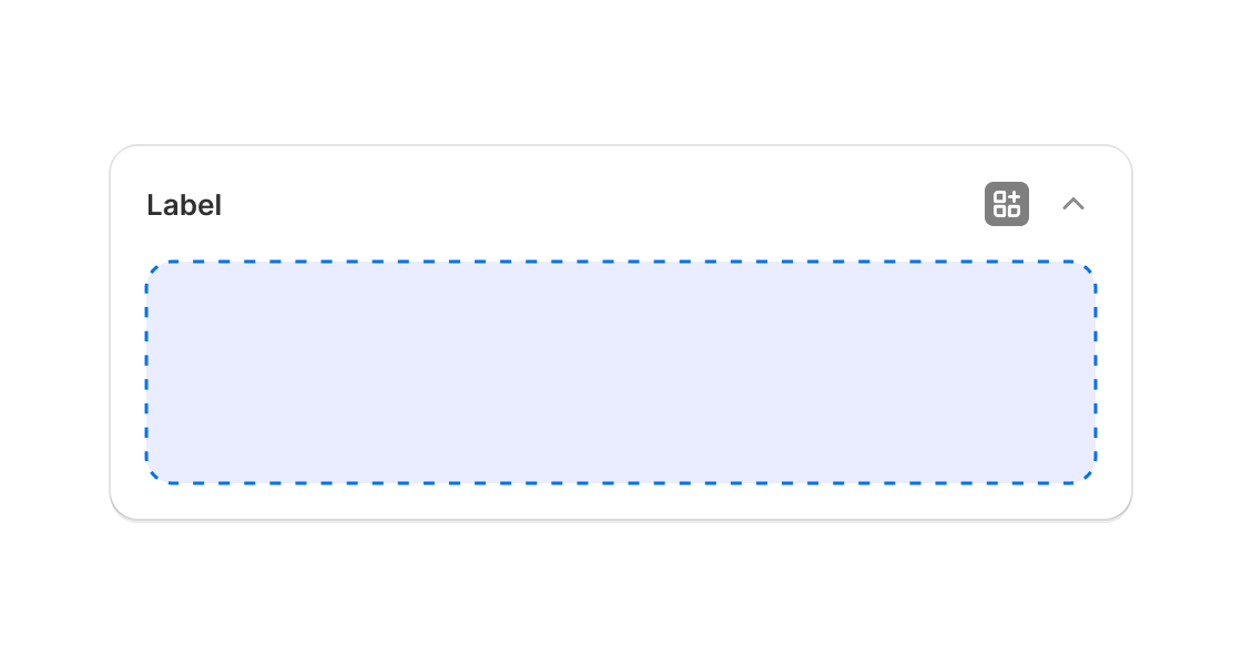
---
title: AdminBlock
description: >-
This component is similar to the AdminBlock, providing a deeper integration
with the container your UI is rendered into. However, this only applies to
Block Extensions which render inline on a resource page.
api_version: 2023-10
api_name: admin-extensions
source_url:
html: >-
https://shopify.dev/docs/api/admin-extensions/2023-10/components/other/adminblock
md: >-
https://shopify.dev/docs/api/admin-extensions/2023-10/components/other/adminblock.md
---
# AdminBlock
This component is similar to the AdminBlock, providing a deeper integration with the container your UI is rendered into. However, this only applies to Block Extensions which render inline on a resource page.
## AdminBlockProps
* title
string
The title to display at the top of the app block. If not provided, the name of the extension will be used. Titles longer than 40 characters will be truncated.
* summary
string
The summary to display when the app block is collapsed. If not provided, no summary will be displayed. No summary is shown when the app block is expanded. Summaries longer than 40 characters will be truncated.
### Examples
* #### Simple AdminBlock implementation
##### React
```tsx
import React from 'react';
import {reactExtension, AdminBlock} from '@shopify/ui-extensions-react/admin';
function App() {
return (
Block content
);
}
export default reactExtension('Playground', () => );
```
##### JS
```js
import {extension, AdminBlock, Button} from '@shopify/ui-extensions/admin';
export default extension('Playground', (root) => {
const adminBlock = root.createComponent(AdminBlock, {
title: 'My App Block',
summary: '',
}, '5 items active');
root.appendChild(adminBlock);
root.mount();
});
```
## Preview

## Related
[- Adminaction](https://shopify.dev/docs/api/admin-extensions/components/other/adminaction)