---
title: DatePicker
description: >-
Date pickers let merchants choose dates from a visual calendar that’s
consistently applied wherever dates need to be selected across Shopify.
api_version: 2024-04
api_name: admin-extensions
source_url:
html: >-
https://shopify.dev/docs/api/admin-extensions/2024-04/components/forms/datepicker
md: >-
https://shopify.dev/docs/api/admin-extensions/2024-04/components/forms/datepicker.md
---
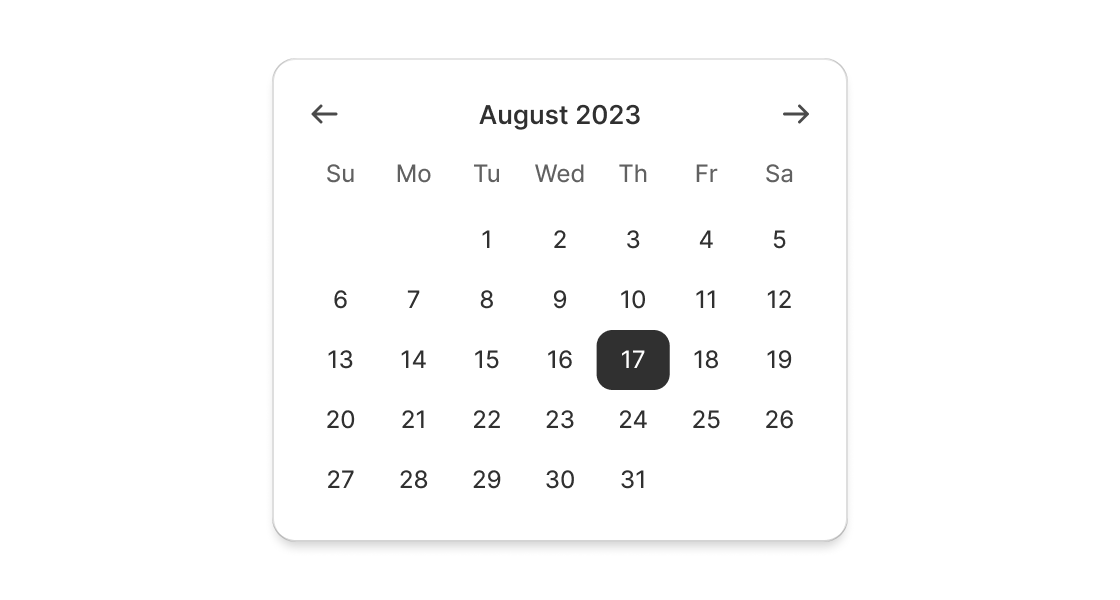
# DatePicker
Date pickers let merchants choose dates from a visual calendar that’s consistently applied wherever dates need to be selected across Shopify.
## DatePickerProps
* yearMonth
string | { year: number; month: number; }
[Controlled](https://reactjs.org/docs/forms.html#controlled-components) year and month to display. Use in combination with `onYearMonthChange`. Makes year/month navigation [controlled](https://reactjs.org/docs/forms.html#controlled-components).
* defaultYearMonth
string | { year: number; month: number; }
Default [uncontrolled](https://reactjs.org/docs/forms.html#controlled-components) year and month to display. Ignored when year/month navigation is [controlled](https://reactjs.org/docs/forms.html#controlled-components).
* disabled
boolean | Disabled | Disabled\[]
Disabled dates, days, and/or ranges, or the date picker. Unbound range disables all dates either from `start` date or to `end` date. `true` disables the date picker.
* readOnly
boolean
Whether the date picker is read-only.
* selected
T
A date, an array of dates, or a range object with `start` and/or `end` keys indicating the selected dates. When a range is set, dates between the boundaries will be selected. Passed `undefined` or `string` allows user to select a single date, an empty array or an array of dates allows selecting multiple dates, an empty object or a Range object allows selecting a range of dates.
* onChange
(selected: T) => void
A callback that is run whenever a date is selected or unselected. This callback is called with a string, an array of strings or a range object representing the selected dates. This component is [controlled](https://reactjs.org/docs/forms.html#controlled-components), so you must store these values in state and reflect it back in the `selected` props.
* onYearMonthChange
(yearMonth: { year: number; month: number; }) => void
A callback that is run whenever the month is changed. This callback is called with an object indicating the year/month the UI should change to. When year/month navigation is controlled you must store these values in state and reflect it back in the `yearMonth` prop.
### Disabled
```ts
DateString | Range | Day
```
### DateString
A date string using the simplified ISO 8601 format (\`YYYY-MM-DD\`)
```ts
string
```
### Range
* start
First day (inclusive) of the selected range
```ts
DateString
```
* end
Last day (inclusive) of the selected range
```ts
DateString
```
```ts
export interface Range {
/**
* First day (inclusive) of the selected range
*/
start?: DateString;
/**
* Last day (inclusive) of the selected range
*/
end?: DateString;
}
```
### Day
```ts
'Sunday' | 'Monday' | 'Tuesday' | 'Wednesday' | 'Thursday' | 'Friday' | 'Saturday'
```
Examples
## Preview
### Examples
* #### Add a single-date DatePicker
##### React
```tsx
import React, { useState } from 'react';
import {
render,
DatePicker,
type Selected
} from '@shopify/ui-extensions-react/admin';
render('Playground', () => );
function App() {
const [selected, setSelected] = useState('2023-11-08')
return (
);
}
```
##### JS
```js
import {extend, DatePicker} from '@shopify/ui-extensions/admin';
extend('Playground', (root) => {
const datePicker = root.createComponent(
DatePicker,
{},
'DatePicker',
);
root.appendChild(datePicker);
});
```
* #### Add a multi-date DatePicker
##### Description
Use this when merchants need to select multiple dates.
##### React
```tsx
import React from 'react';
import {
render,
DatePicker,
type Selected,
} from '@shopify/ui-extensions-react/admin';
render('Playground', () => );
function App() {
const [selected, setSelected] = React.useState(['2023-11-08']);
return (
);
}
```
##### JS
```js
import {extend, DatePicker} from '@shopify/ui-extensions/admin';
extend('Playground', (root) => {
const datePicker = root.createComponent(
DatePicker,
{ selected: ['2023-11-08'] },
'DatePicker',
);
root.appendChild(datePicker);
});
```
* #### Add a range DatePicker
##### Description
Use this when merchants need to select a range of dates.
##### React
```tsx
import React from 'react';
import {
render,
DatePicker,
type Selected
} from '@shopify/ui-extensions-react/admin';
render('Playground', () => );
function App() {
const [selected, setSelected] = React.useState({start: '2023-11-08', end: '2023-11-10' });
return (
);
}
```
##### JS
```js
import {extend, DatePicker} from '@shopify/ui-extensions/admin';
extend('Playground', (root) => {
const datePicker = root.createComponent(
DatePicker,
{ selected: {start: '2023-11-08', end: '2023-11-10' } },
'DatePicker',
);
root.appendChild(datePicker);
});
```