---
title: TextField
description: >-
This is your go-to component when you need to let users input textual
information.
api_version: 2024-07
api_name: admin-extensions
source_url:
html: >-
https://shopify.dev/docs/api/admin-extensions/2024-07/components/forms/textfield
md: >-
https://shopify.dev/docs/api/admin-extensions/2024-07/components/forms/textfield.md
---
# TextField
This is your go-to component when you need to let users input textual information.
## TextFieldProps
* label
string
required
Content to use as the field label.
* autocomplete
\| AutocompleteField | \`${AutocompleteSection} ${AutocompleteField}\` | \`${AutocompleteGroup} ${AutocompleteField}\` | \`${AutocompleteSection} ${AutocompleteGroup} ${AutocompleteField}\` | boolean
A hint as to the intended content of the field.
When set to `true`, this property indicates that the field should support autofill, but you do not have any more semantic information on the intended contents.
When set to `false`, you are indicating that this field contains sensitive information, or contents that are never saved, like one-time codes.
Alternatively, you can provide value which describes the specific data you would like to be entered into this field during autofill.
* defaultValue
string | string\[]
A default value to populate for uncontrolled components.
* disabled
boolean
Whether the field can be modified.
* error
string
Indicate an error to the user. The field will be given a specific stylistic treatment to communicate problems that have to be resolved immediately.
* id
string
A unique identifier for the field.
* maxLength
number
Specifies the maximum number of characters allowed.
* minLength
number
Specifies the min number of characters allowed.
* name
string
An identifier for the field that is unique within the nearest containing `Form` component.
* onBlur
() => void
Callback when focus is removed.
* onChange
(value: string) => void
Callback when the user has **finished editing** a field. Unlike `onChange` callbacks you may be familiar with from React component libraries, this callback is **not** run on every change to the input. Text fields are “partially controlled” components, which means that while the user edits the field, its state is controlled by the component. Once the user has signalled that they have finished editing the field (typically, by blurring the field), `onChange` is called if the input actually changed from the most recent `value` property. At that point, you are expected to store this “committed value” in state, and reflect it in the text field’s `value` property.
This state management model is important given how UI Extensions are rendered. UI Extension components run on a separate thread from the UI, so they can’t respond to input synchronously. A pattern popularized by [controlled React components](https://reactjs.org/docs/forms.html#controlled-components) is to have the component be the source of truth for the input `value`, and update the `value` on every user input. The delay in responding to events from a UI extension is only a few milliseconds, but attempting to strictly store state with this delay can cause issues if a user types quickly, or if the user is using a lower-powered device. Having the UI thread take ownership for “in progress” input, and only synchronizing when the user is finished with a field, avoids this risk.
It can still sometimes be useful to be notified when the user makes any input in the field. If you need this capability, you can use the `onInput` prop. However, never use that property to create tightly controlled state for the `value`.
This callback is called with the current value of the field. If the value of a field is the same as the current `value` prop provided to the field, the `onChange` callback will not be run.
* onFocus
() => void
Callback when input is focused.
* onInput
(value: string) => void
Callback when the user makes any changes in the field. As noted in the documentation for `onChange`, you **must not** use this to update `value` — use the `onChange` callback for that purpose. Use the `onInput` prop when you need to do something as soon as the user makes a change, like clearing validation errors that apply to the field as soon as the user begins making the necessary adjustments.
This callback is called with the current value of the field.
* placeholder
string
A short hint that describes the expected value of the field.
* readOnly
boolean
Whether the field is read-only.
* required
boolean
Whether the field needs a value. This requirement adds semantic value to the field, but it will not cause an error to appear automatically. If you want to present an error when this field is empty, you can do so with the `error` prop.
* value
T
The current value for the field. If omitted, the field will be empty. You should update this value in response to the `onChange` callback.
### AutocompleteSection
The “section” scopes the autocomplete data that should be inserted to a specific area of the page. Commonly used when there are multiple fields with the same autocomplete needs in the same page. For example: 2 shipping address forms in the same page.
```ts
`section-${string}`
```
### AutocompleteGroup
The contact information group the autocomplete data should be sourced from.
```ts
'shipping' | 'billing'
```
Examples
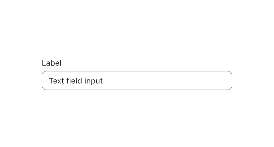
## Preview
### Examples
* #### Simple TextField example
##### React
```tsx
import {render, TextField} from '@shopify/ui-extensions-react/admin';
render('Playground', () => );
function App() {
return ;
}
```
##### JS
```js
import {extend, TextField} from '@shopify/ui-extensions/admin';
extend('Playground', (root) => {
const textfield = root.createComponent(TextField, {
label: 'Enter some text',
});
root.appendChild(textfield);
});
```
## Related
[- EmailField](https://shopify.dev/docs/api/admin-extensions/components/forms/emailfield)
[- NumberField](https://shopify.dev/docs/api/admin-extensions/components/forms/numberfield)
[- Form](https://shopify.dev/docs/api/admin-extensions/components/forms/form)