---
title: Banner
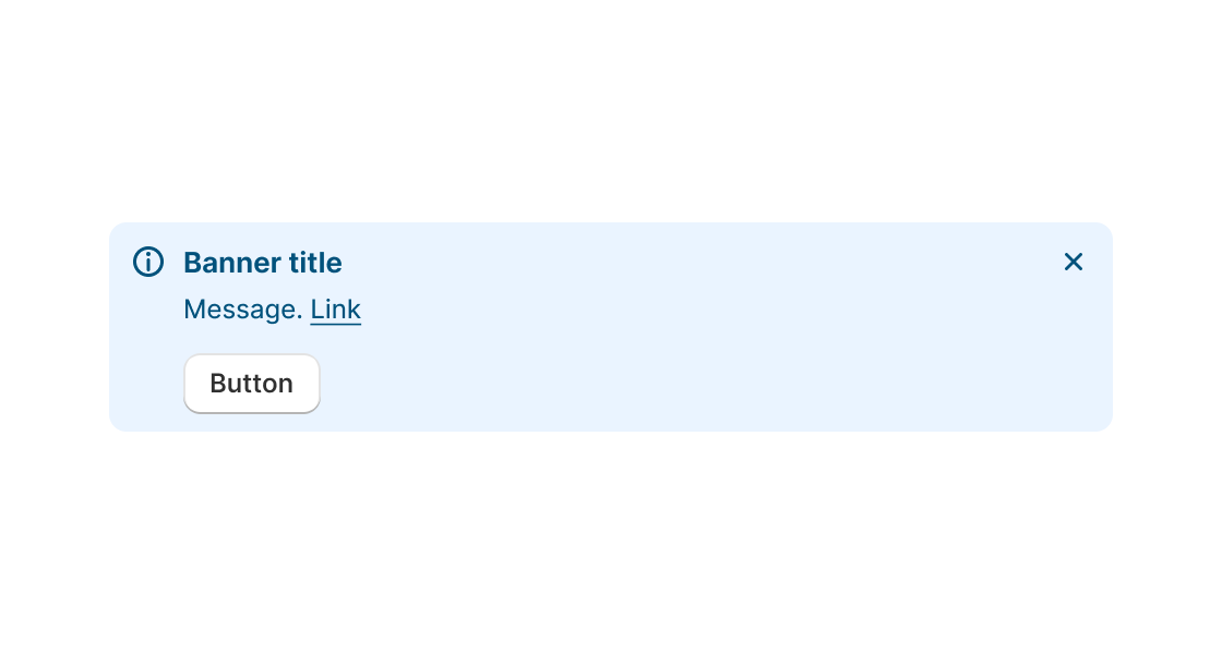
description: Use this component if you need to communicate to merchants in a prominent way.
api_version: 2025-01
api_name: admin-extensions
source_url:
html: https://shopify.dev/docs/api/admin-extensions/2025-01/components/banner
md: https://shopify.dev/docs/api/admin-extensions/2025-01/components/banner.md
---
# Banner
Use this component if you need to communicate to merchants in a prominent way.
## BannerProps
* dismissible
boolean
Whether or not the banner can be dismissed
* id
string
A unique identifier for the element.
* onDismiss
() => void
Function invoked when the banner is dismissed
* primaryAction
RemoteFragment
Sets the Primary action button of the container. This component must be a button component.
* secondaryAction
RemoteFragment
Sets the Secondary action button of the container. This component must be a button component.
* title
string
Message to display inside the banner
* tone
Tone
Adjusts the color and icon of the banner
### Tone
```ts
'info' | 'success' | 'warning' | 'critical'
```
Examples
## Preview
### Examples
* #### Simple Banner example
##### React
```tsx
import React from 'react';
import {
render,
Banner,
Paragraph,
} from '@shopify/ui-extensions-react/admin';
render('Playground', () => );
function App() {
return (
console.log('dismissed banner')}>
Your store may be affected
);
}
```
##### JS
```js
import {extend, Banner} from '@shopify/ui-extensions/admin';
extend('Playground', (root) => {
const banner = root.createComponent(Banner, {
title: 'Shipping rates changed',
dismissible: true,
onDismiss: () => console.log('dismissed banner')
}, 'Your store may be affected');
root.appendChild(banner);
});
```