---
title: DateField
description: This is a form field that lets users select a date using the DatePicker component.
api_version: 2025-04
api_name: admin-extensions
source_url:
html: https://shopify.dev/docs/api/admin-extensions/2025-04/components/datefield
md: https://shopify.dev/docs/api/admin-extensions/2025-04/components/datefield.md
---
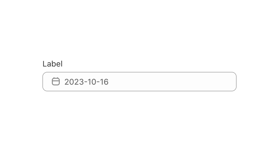
# DateField
This is a form field that lets users select a date using the DatePicker component.
## DateFieldProps
* label
string
required
Content to use as the field label.
* defaultYearMonth
{year: Year; month: Month} | YearMonthString
Default [uncontrolled](https://reactjs.org/docs/forms.html#controlled-components) year and month to display. Ignored when year/month navigation is [controlled](https://reactjs.org/docs/forms.html#controlled-components).
* disabled
Disabled | Disabled\[] | boolean
Disabled dates, days, and/or ranges, or the date picker. Unbound range disables all dates either from `start` date or to `end` date. `true` disables the date picker.
* error
string
Indicate an error to the user. The field will be given a specific stylistic treatment to communicate problems that have to be resolved immediately.
* id
string
A unique identifier for the field.
* name
string
An identifier for the field that is unique within the nearest containing `Form` component.
* onBlur
() => void
Callback when focus is removed.
* onChange
(value: string) => void
Callback when the user has **finished editing** a field. Unlike `onChange` callbacks you may be familiar with from React component libraries, this callback is **not** run on every change to the input. Text fields are “partially controlled” components, which means that while the user edits the field, its state is controlled by the component. Once the user has signalled that they have finished editing the field (typically, by blurring the field), `onChange` is called if the input actually changed from the most recent `value` property. At that point, you are expected to store this “committed value” in state, and reflect it in the text field’s `value` property.
This state management model is important given how UI Extensions are rendered. UI Extension components run on a separate thread from the UI, so they can’t respond to input synchronously. A pattern popularized by [controlled React components](https://reactjs.org/docs/forms.html#controlled-components) is to have the component be the source of truth for the input `value`, and update the `value` on every user input. The delay in responding to events from a UI extension is only a few milliseconds, but attempting to strictly store state with this delay can cause issues if a user types quickly, or if the user is using a lower-powered device. Having the UI thread take ownership for “in progress” input, and only synchronizing when the user is finished with a field, avoids this risk.
It can still sometimes be useful to be notified when the user makes any input in the field. If you need this capability, you can use the `onInput` prop. However, never use that property to create tightly controlled state for the `value`.
This callback is called with the current value of the field. If the value of a field is the same as the current `value` prop provided to the field, the `onChange` callback will not be run.
* onFocus
() => void
Callback when input is focused.
* onInput
(value: string) => void
Callback when the user makes any changes in the field. As noted in the documentation for `onChange`, you **must not** use this to update `value` — use the `onChange` callback for that purpose. Use the `onInput` prop when you need to do something as soon as the user makes a change, like clearing validation errors that apply to the field as soon as the user begins making the necessary adjustments.
This callback is called with the current value of the field.
* onYearMonthChange
(yearMonth: { year: number; month: number; }) => void
A callback that is run whenever the month is changed. This callback is called with an object indicating the year/month the UI should change to. When year/month navigation is controlled you must store these values in state and reflect it back in the `yearMonth` prop.
* readOnly
boolean
Whether the field is read-only.
* value
T
The current value for the field. If omitted, the field will be empty. You should update this value in response to the `onChange` callback.
* yearMonth
{year: Year; month: Month} | YearMonthString
[Controlled](https://reactjs.org/docs/forms.html#controlled-components) year and month to display. Use in combination with `onYearMonthChange`. Makes year/month navigation [controlled](https://reactjs.org/docs/forms.html#controlled-components).
### Year
```ts
number
```
### Month
Month in 1-12 range
```ts
number
```
### YearMonthString
A year/month string using the simplified ISO 8601 format (\`YYYY-MM\`)
```ts
string
```
### Disabled
```ts
DateString | Range | Day
```
### DateString
A date string using the simplified ISO 8601 format (\`YYYY-MM-DD\`)
```ts
string
```
### Range
* end
Last day (inclusive) of the selected range
```ts
DateString
```
* start
First day (inclusive) of the selected range
```ts
DateString
```
```ts
export interface Range {
/**
* First day (inclusive) of the selected range
*/
start?: DateString;
/**
* Last day (inclusive) of the selected range
*/
end?: DateString;
}
```
### Day
```ts
'Sunday' | 'Monday' | 'Tuesday' | 'Wednesday' | 'Thursday' | 'Friday' | 'Saturday'
```
Examples
## Preview
### Examples
* #### Add a single-date DateField
##### React
```tsx
import React, {useState} from 'react';
import {
render,
DateField,
} from '@shopify/ui-extensions-react/admin';
render('Playground', () => );
function App() {
const [value, setValue] =
useState('2023-11-08');
return (
);
}
```
##### JS
```js
import {extend, DateField} from '@shopify/ui-extensions/admin';
extend('Playground', (root) => {
const dateField = root.createComponent(
DateField,
{
label: 'Date',
value: '2023-11-08',
},
'DateField',
);
root.appendChild(dateField);
});
```