App window
The app window component displays a fullscreen modal window for complex workflows that need dedicated screen space. The content is specified by the src property and should point to a route within your app. The app window covers the entire screen, with a top bar controlled by the Shopify admin that allows users to exit.
For most dialogs, we recommend using the Polaris modal component, which automatically determines whether the modal should display inside your app or as a fullscreen overlay and removes the need for separate App Bridge API control.
Anchor to PropertiesProperties
Attributes for the app window element. This element displays a fullscreen modal window in the Shopify admin.
- Anchor to srcsrcsrcstringstringrequiredrequired
The URL of the content to display within the app window. Must point to a route within your app that renders the window content. The URL is loaded in an iframe when the window opens. Commonly used for multi-step workflows, bulk editors, or detailed views that need full-screen space.
- Anchor to idididstringstring
A unique identifier you assign to the app window element. Used when connecting buttons via
or accessing the element with. Choose a descriptive name like"settings-window"or"edit-modal".
Anchor to Instance methodsInstance methods
Instance properties and methods available on the app window element for programmatic control.
- Anchor to addEventListeneradd
Event Listeneradd Event Listener (type: "show" | "hide", listener: EventListenerOrEventListenerObject) => void(type: "show" | "hide", listener: EventListenerOrEventListenerObject) => void Adds an event listener for app window lifecycle events. Supported events:
showfires when the window opens,hidefires when the window closes. Commonly used for tracking analytics, updating UI state, or cleaning up resources when the window closes.- Anchor to contentWindowcontent
Windowcontent Window Window | nullWindow | null Returns the Window object of the app window iframe, or
nullif the window is closed. Use this to communicate with the iframe content viaor access its document. Only accessible when the app window is open.- Anchor to hidehidehide() => Promise<void>() => Promise<void>
Closes the app window. Returns a Promise that resolves when the window is fully hidden. Any unsaved changes in forms with
data-save-barwill prompt the user before closing. Commonly used for programmatic close after completing a workflow.- Anchor to removeEventListenerremove
Event Listenerremove Event Listener (type: "show" | "hide", listener: EventListenerOrEventListenerObject) => void(type: "show" | "hide", listener: EventListenerOrEventListenerObject) => void Removes a previously added event listener. Pass the same event type and listener function that was used with
. Commonly used for cleanup when a component unmounts to prevent memory leaks.- Anchor to showshowshow() => Promise<void>() => Promise<void>
Opens the app window and displays the content from the
srcURL. Returns a Promise that resolves when the window is fully visible. Useawaitor.then()to run code after the window opens. Commonly used for launching workflows triggered by user actions.- Anchor to srcsrcsrcstringstring
Gets or sets the URL of the content displayed in the app window. Changing this value while the window is open navigates to the new URL. Commonly used for dynamic navigation within an open window.
- Anchor to toggletoggletoggle() => Promise<void>() => Promise<void>
Toggles the app window between open and closed states. Returns a Promise that resolves when the transition completes. Opens the window if closed, closes it if open. Commonly used for toggle buttons that control window visibility.
Anchor to ExamplesExamples
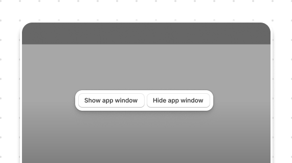
Anchor to Show and hideShow and hide
Open a fullscreen modal for complex workflows. This example uses the command attribute on a button to toggle the app window.
Show and hide
 attribute on a button to toggle the app window.](https://shopify-assets.shopifycdn.com/shopifycloud/shopify-dev/production/assets/assets/images/templated-apis-screenshots/admin/app-bridge-web-components/app-window-show-hide-BAfeZlKz.png)
html
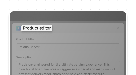
Anchor to Title bar headingTitle bar heading
Add context to fullscreen workflows. This example sets a title using the page component with the heading attribute.
Title bar heading
html
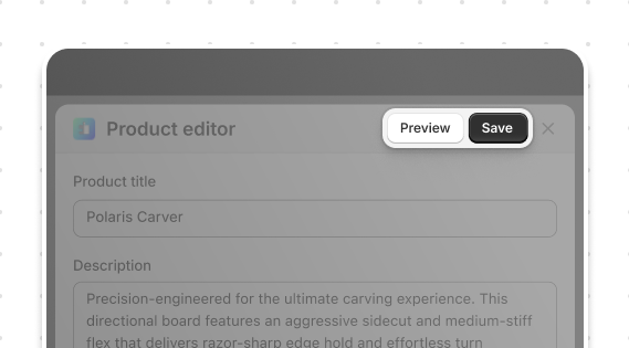
Anchor to Title bar actionsTitle bar actions
Provide actions in fullscreen workflows. This example adds primary and secondary action buttons to the title bar using page slots.
Title bar actions
html
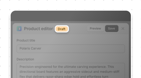
Anchor to Title bar accessory badgeTitle bar accessory badge
Show status in fullscreen workflows. This example displays a status badge using the accessory slot with tone for color.
Title bar accessory badge
html
Add icons and dropdown menus to actions. This example pairs icon buttons with commandFor to create dropdown menus.
Title bar icons and menus
 to create dropdown menus.](https://shopify-assets.shopifycdn.com/shopifycloud/shopify-dev/production/assets/assets/images/templated-apis-screenshots/admin/app-bridge-web-components/app-window-title-bar-icons-menus-KSDHKHn5.png)
html
Anchor to Instance methodsInstance methods
Control the app window programmatically. This example calls the show(), hide(), and toggle() methods.
Instance methods
html
Anchor to Command attributeCommand attribute
Control the app window declaratively. This example uses the command and commandFor attributes on buttons.
Command attribute
 and [`commandFor`](/docs/api/app-home/polaris-web-components/actions/button#properties-propertydetail-commandFor) attributes on buttons.](https://shopify-assets.shopifycdn.com/shopifycloud/shopify-dev/production/assets/assets/images/templated-apis-screenshots/admin/app-bridge-web-components/app-window-command-attribute-CQQ5zI-J.png)
html
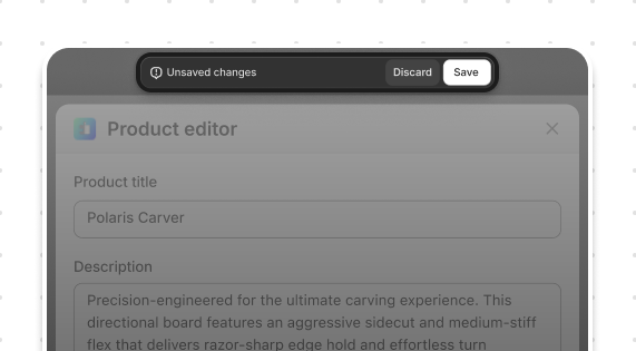
Anchor to Form with save barForm with save bar
Prevent data loss in fullscreen forms. This example integrates the save bar using data-save-bar to track unsaved changes.
Form with save bar
html
Anchor to Best practicesBest practices
- Open only via explicit user action: Launch app windows from buttons that clearly indicate a fullscreen experience will open. Never open automatically on page load.
- Set descriptive titles: Use the page component inside your app window content to set a heading that clearly describes the current task.
- Handle unsaved changes: Add
data-save-barto forms to automatically prompt merchants before they exit with unsaved changes. See Save Bar API. - Return to context on close: Ensure closing the app window returns merchants to where they started. Don't navigate them elsewhere unexpectedly.