---
title: Title bar
description: >-
The page component lets you customize the title bar that appears at the top of
your app. Use it to display the current page context, provide action buttons
for saving or canceling changes, and add breadcrumb links for navigation.
api_version: v1.0
source_url:
html: >-
https://shopify.dev/docs/api/app-home/latest/app-bridge-web-components/title-bar
md: >-
https://shopify.dev/docs/api/app-home/latest/app-bridge-web-components/title-bar.md
api_name: app-home
---
# Title bar
**Info:**
App Bridge isn't versioned with Polaris. App Bridge APIs and web components are identical in every App Home reference version.
The page component lets you customize the title bar that appears at the top of your app. Use it to display the current page context, provide action buttons for saving or canceling changes, and add breadcrumb links for navigation. The title bar helps merchants understand where they are in your app and what actions they can take.
Use this component when you need to set the admin's native title bar (title, breadcrumbs, actions) without a styled page layout. For apps that need a complete page layout with Polaris styling, use the [Polaris page component](https://shopify.dev/docs/api/app-home/latest/web-components/layout-and-structure/page) instead.
To trigger navigation programmatically (such as navigating after a user action), use the [Navigation API](https://shopify.dev/docs/api/app-home/latest/apis/user-interface-and-interactions/navigation-api).
#### Use cases
* **Page context:** Display the current page title so merchants understand where they are in your app.
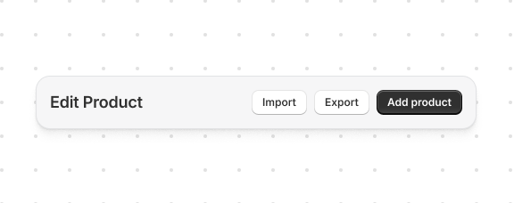
* **Action buttons:** Add primary and secondary action buttons for page-level operations like saving or creating resources.
* **Breadcrumb navigation:** Provide breadcrumb links to help merchants navigate back to parent pages.
* **Status indicators:** Show page status using badge accessories in the title bar for at-a-glance context.
***
## Properties
Properties for the page element. This element configures the title bar in the Shopify admin.
* **children**
**SPageChildren**
Child elements that populate the title bar slots. Use slots to add action buttons, breadcrumb navigation, and status badges to the title bar.
* **heading**
**string**
The page title displayed in the title bar. Use a clear, descriptive heading that helps merchants understand the current context, such as "Edit Product" or "Order #1234".
### SPageChildren
Available slots for the page component. Each slot accepts specific elements that appear in designated areas of the title bar.
* accessory
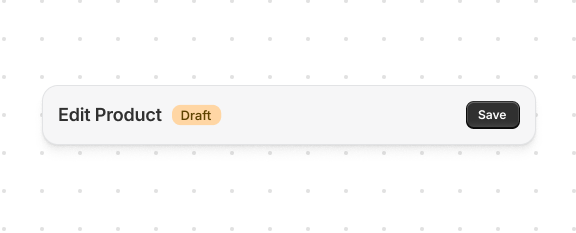
A status badge displayed next to the page heading. Use to indicate page state such as "Draft", "Published", or "Archived". Use \`slot="accessory"\` on an \`s-badge\` element with a \`tone\` attribute (\`info\`, \`success\`, \`warning\`, or \`critical\`) to convey status.
```ts
HTMLElement
```
* breadcrumbActions
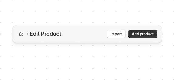
A navigation link that appears before the page heading, typically used for "Back" navigation. Helps merchants understand their location and return to parent pages. Use \`slot="breadcrumb-actions"\` on a Link element with an \`href\` attribute.
```ts
HTMLElement
```
* primaryAction
The main call-to-action button, typically "Save" or "Create". Appears prominently on the right side of the title bar. Only one primary action should be used per page to maintain clear visual hierarchy. Use \`slot="primary-action"\` on an \`s-button\` element.
```ts
HTMLElement
```
* secondaryActions
Additional action buttons that appear next to the primary action. Use for secondary operations like "Cancel", "Delete", or grouped actions using \`s-menu\`. Multiple buttons can be added. Use \`slot="secondary-actions"\` on \`s-button\` elements. For dropdown menus, combine with \[\`commandFor\`]\(/docs/api/app-home/latest/web-components/actions/button#properties-propertydetail-commandFor) attribute and an \`s-menu\` element.
```ts
HTMLElement[]
```
***
## Examples
### Primary and secondary actions
Configure the title bar for your page. This example sets a heading and adds primary and secondary action buttons.
## Primary and secondary actions
## html
```html
Add productImportExport
```
### Accessory badge
Show page status in the title bar. This example displays a status badge using the `accessory` slot with `s-badge` and `tone`.
## Accessory badge
## html
```html
DraftSave
```
### Grouped secondary actions
Organize multiple actions in a dropdown menu. This example groups secondary actions using `s-menu` with the [`commandFor`](https://shopify.dev/docs/api/app-home/latest/web-components/actions/button#properties-propertydetail-commandFor) attribute.
## Grouped secondary actions
 attribute.](https://shopify.dev/assets/assets/images/templated-apis-screenshots/admin/app-bridge-web-components/title-bar-grouped-secondary-DKcZrsFM.png)
## html
```html
SaveMore actionsPreviewImportExport
```
### Breadcrumb actions
Help users navigate back to previous pages. This example adds breadcrumb navigation using the `breadcrumb-actions` slot.
## Breadcrumb actions
## html
```html
Add productImportHome
```
### Complete example
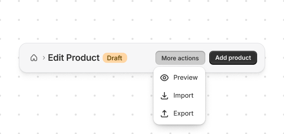
Build a complete title bar configuration. This example combines heading, actions, badges, and breadcrumbs.
## Complete example
## html
```html
DraftAdd productMore actionsPreviewImportExportHome
```
***
## Best practices
* **Use descriptive headings**: The page heading should clearly describe the current context.
* **Limit primary actions**: Only one primary action per page for clear hierarchy.
* **Group related secondary actions**: Use `s-menu` with [`commandfor`](https://developer.mozilla.org/en-US/docs/Web/API/HTMLButtonElement/commandForElement) to group related actions in dropdowns.
* **Use breadcrumbs for navigation**: Help users understand where they are and how to go back.
* **Add status badges when relevant**: Use the `accessory` slot with `s-badge` to show page status.
***
## Limitations
Anchor tags (``) aren't supported in Remix apps. Use Remix's `` component instead.
***