Homepage
The app URL specified in the Partner Dashboard should point to your app homepage. The home page of your app is the first thing merchants will see, and it should provide daily value to them. Design the page to provide status updates and show merchants what actions they can take.
Used to | Examples |
---|---|
Teach merchants how to use the app | Onboarding, how-to guides |
Display app functionalities | Call-to-actions to app features, resource tables |
Show updates | Status banners, company news |
This pattern uses Badge
, Banner
, Box
, Button
, Checkbox
, Clickable
, Divider
, Grid
, Heading
, Image
, Link
, Paragraph
, Section
, Stack
, and Text
components.
Design guidelines
Your app home page should be designed to provide users with relevant, timely information like quick statistics, status updates, or information that’s immediately actionable.
Onboarding
The onboarding experience quickly introduces users to your app's essential features. A good onboarding should be self-guided, easy to follow and make users feel they understand how the app works after finishing it. If the onboarding is long or complex, give users the option to complete it at a later time to avoid stopping their workflow.
- Onboarding must be brief and direct. Provide clear instructions and guide users to completion
- Only request information from users if it's necessary
- If your onboarding isn't essential, then make it dismissible
- Don't have more than five steps in your onboarding process. This can lead users to drop off and not use your app
Visual design
- Design your app to be responsive and adapt to different screen sizes and devices. This ensures a seamless user experience across various platforms.
- Use looser spacing for low-density layouts. Use tighter spacing for high-density layouts.
- Use high-resolution photos and images to ensure a professional, high-quality experience.
Homepage
examples
Homepage
JSX
// === // Home page pattern // === import React, { useState } from "react"; export default function HomePage() { const [visible, setVisible] = useState({ banner: true, setupGuide: true, calloutCard: true, featuredApps: true, }); const [expanded, setExpanded] = useState({ setupGuide: true, step1: false, step2: false, step3: false, }); const [progress, setProgress] = useState(0); return ( <s-page inlineSize="small"> {/* === */} {/* Title Bar */} {/* The ui-title-bar on the homepage should not have a title attribute */} {/* Note: ui-title-bar requires AppBridge to render correctly */} {/* === */} <ui-title-bar> <button variant="primary">Create puzzle</button> <section> <button>Browse templates</button> <button>Import image</button> </section> </ui-title-bar> {/* === */} {/* Banner */} {/* Use banners sparingly. Only one banner should be visible at a time. */} {/* If dismissed, use local storage or a database entry to avoid showing this section again to the same user. */} {/* === */} {visible.banner && ( <s-banner dismissible onDismiss={() => setVisible({ ...visible, banner: false })} > 3 of 5 puzzles created.{" "} <s-link href="#">Upgrade to Puzzlify Pro</s-link> to create unlimited puzzles. </s-banner> )} {/* === */} {/* Setup Guide */} {/* Keep instructions brief and direct. Only ask merchants for required information. */} {/* If dismissed, use local storage or a database entry to avoid showing this section again to the same user. */} {/* === */} {visible.setupGuide && ( <s-section> <s-grid gap="base"> {/* Header */} <s-grid gap="small-200"> <s-grid gridTemplateColumns="1fr auto auto" gap="small-300" alignItems="center" > <s-heading>Setup Guide</s-heading> <s-button accessibilityLabel="Dismiss Guide" onClick={() => setVisible({ ...visible, setupGuide: false })} variant="tertiary" tone="neutral" icon="x" ></s-button> <s-button accessibilityLabel="Toggle setup guide" onClick={(e) => setExpanded({ ...expanded, setupGuide: !expanded.setupGuide, }) } variant="tertiary" tone="neutral" icon={expanded.setupGuide ? "chevron-up" : "chevron-down"} ></s-button> </s-grid> <s-paragraph> Use this personalized guide to get your store ready for sales. </s-paragraph> <s-stack direction="inline" gap="small-200" alignItems="center"> <s-paragraph tone="subdued"> {progress} out of 3 steps completed </s-paragraph> </s-stack> </s-grid> {/* Steps Container */} <s-box borderRadius="base" border="base" background="base" display={expanded.setupGuide ? "auto" : "none"} > {/* Step 1 */} <s-box> <s-box padding="small"> <s-grid gridTemplateColumns="1fr auto" gap="base"> <s-checkbox label="Upload an image for your puzzle" onInput={(e) => setProgress((prev) => e.target.checked ? prev + 1 : prev - 1, ) } ></s-checkbox> <s-button onClick={(e) => { console.log("Toggle step 1 details"); setExpanded({ ...expanded, step1: !expanded.step1 }); } } accessibilityLabel="Toggle step 1 details" variant="tertiary" icon={expanded.step1 ? "chevron-up" : "chevron-down"} ></s-button> </s-grid> </s-box> <s-box padding="small" paddingBlockStart="none" display={expanded.step1 ? "auto" : "none"} > <s-box padding="base" background="subdued" borderRadius="base" > <s-grid gridTemplateColumns="1fr auto" gap="base" alignItems="center"> <s-grid gap="small-200"> <s-paragraph> Start by uploading a high-quality image that will be used to create your puzzle. For best results, use images that are at least 1200x1200 pixels. </s-paragraph> <s-stack direction="inline" gap="small-200"> <s-button variant="primary"> Upload image </s-button> <s-button variant="tertiary" tone="neutral"> Image requirements </s-button> </s-stack> </s-grid> <s-box maxBlockSize="80px" maxInlineSize="80px"> <s-image src="https://cdn.shopify.com/s/assets/admin/checkout/settings-customizecart-705f57c725ac05be5a34ec20c05b94298cb8afd10aac7bd9c7ad02030f48cfa0.svg" alt="Customize checkout illustration" ></s-image> </s-box> </s-grid> </s-box> </s-box> </s-box> {/* Step 2 */} <s-divider></s-divider> <s-box> <s-box padding="small"> <s-grid gridTemplateColumns="1fr auto" gap="base"> <s-checkbox label="Choose a puzzle template" onInput={(e) => setProgress((prev) => e.target.checked ? prev + 1 : prev - 1, ) } ></s-checkbox> <s-button onClick={(e) => setExpanded({ ...expanded, step2: !expanded.step2 }) } accessibilityLabel="Toggle step 2 details" variant="tertiary" icon={expanded.step2 ? "chevron-up" : "chevron-down"} ></s-button> </s-grid> </s-box> <s-box padding="small" paddingBlockStart="none" display={expanded.step2 ? "auto" : "none"} > <s-box padding="base" background="subdued" borderRadius="base" > <s-grid gridTemplateColumns="1fr auto" gap="base" alignItems="center"> <s-grid gap="small-200"> <s-paragraph> Select a template for your puzzle - choose between 9-piece (beginner), 16-piece (intermediate), or 25-piece (advanced) layouts. </s-paragraph> <s-stack direction="inline" gap="small-200"> <s-button variant="primary">Choose template</s-button> <s-button variant="tertiary" tone="neutral"> See all templates </s-button> </s-stack> </s-grid> <s-box maxBlockSize="80px" maxInlineSize="80px"> <s-image src="https://cdn.shopify.com/s/assets/admin/checkout/settings-customizecart-705f57c725ac05be5a34ec20c05b94298cb8afd10aac7bd9c7ad02030f48cfa0.svg" alt="Customize checkout illustration" ></s-image> </s-box> </s-grid> </s-box> </s-box> </s-box> {/* Step 3 */} <s-divider></s-divider> <s-box> <s-box padding="small"> <s-grid gridTemplateColumns="1fr auto" gap="base"> <s-checkbox label="Customize puzzle piece shapes" onInput={(e) => setProgress((prev) => e.target.checked ? prev + 1 : prev - 1, ) } ></s-checkbox> <s-button onClick={(e) => setExpanded({ ...expanded, step3: !expanded.step3 }) } accessibilityLabel="Toggle step 3 details" variant="tertiary" icon={expanded.step3 ? "chevron-up" : "chevron-down"} ></s-button> </s-grid> </s-box> <s-box padding="small" paddingBlockStart="none" display={expanded.step3 ? "auto" : "none"} > <s-box padding="base" background="subdued" borderRadius="base" > <s-grid gridTemplateColumns="1fr auto" gap="base" alignItems="center"> <s-grid gap="small-200"> <s-paragraph> Make your puzzle unique by customizing the shapes of individual pieces. Choose from classic, curved, or themed piece styles. </s-paragraph> <s-stack direction="inline" gap="small-200"> <s-button variant="primary"> Customize pieces </s-button> <s-button variant="tertiary" tone="neutral"> Learn about piece styles </s-button> </s-stack> </s-grid> <s-box maxBlockSize="80px" maxInlineSize="80px"> <s-image src="https://cdn.shopify.com/s/assets/admin/checkout/settings-customizecart-705f57c725ac05be5a34ec20c05b94298cb8afd10aac7bd9c7ad02030f48cfa0.svg" alt="Customize checkout illustration" ></s-image> </s-box> </s-grid> </s-box> </s-box> </s-box> {/* Add additional steps here... */} </s-box> </s-grid> </s-section> )} {/* === */} 
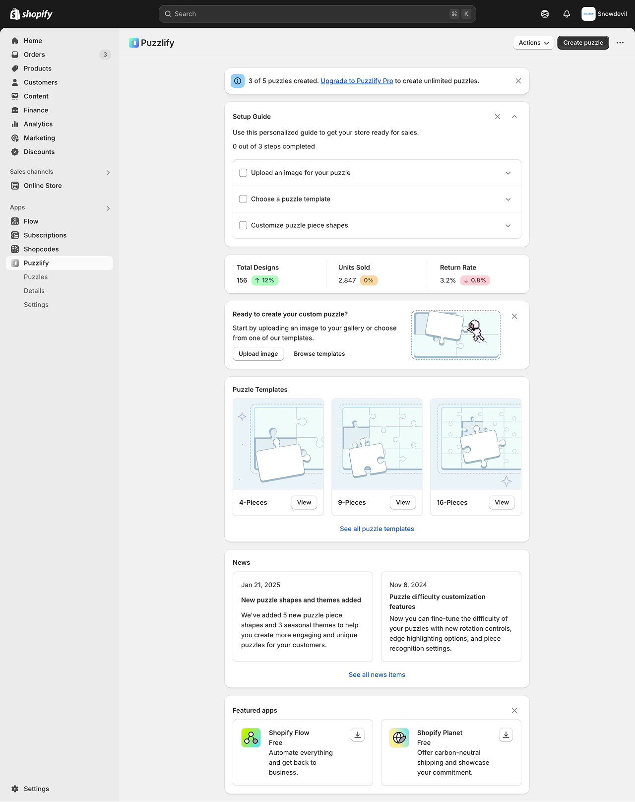
{/* Metrics cards */} {/* Your app homepage should provide merchants with quick statistics or status updates that help them understand how the app is performing for them. */} {/* === */} <s-section padding="none"> <s-box padding="small"> <s-grid gridTemplateColumns="@container (inline-size <= 400px) 1fr, 1fr auto 1fr auto 1fr" gap="small" > <s-clickable href="#" paddingBlock="small-400" paddingInline="small-100" borderRadius="base" > <s-grid gap="small-300"> <s-heading>Total Designs</s-heading> <s-stack direction="inline" gap="small-200"> <s-text>156</s-text> <s-badge tone="success" icon="arrow-up"> 12% </s-badge> </s-stack> </s-grid> </s-clickable> <s-divider direction="block"></s-divider> <s-clickable href="#" paddingBlock="small-400" paddingInline="small-100" borderRadius="base" > <s-grid gap="small-300"> <s-heading>Units Sold</s-heading> <s-stack direction="inline" gap="small-200"> <s-text>2,847</s-text> <s-badge tone="warning">0%</s-badge> </s-stack> </s-grid> </s-clickable> <s-divider direction="block"></s-divider> <s-clickable href="#" paddingBlock="small-400" paddingInline="small-100" borderRadius="base" > <s-grid gap="small-300"> <s-heading>Return Rate</s-heading> <s-stack direction="inline" gap="small-200"> <s-text>3.2%</s-text> <s-badge tone="critical" icon="arrow-down"> 0.8% </s-badge> </s-stack> </s-grid> </s-clickable> </s-grid> </s-box> </s-section> {/* === */} {/* Callout Card */} {/* If dismissed, use local storage or a database entry to avoid showing this section again to the same user. */} {/* === */} {visible.calloutCard && ( <s-section> <s-grid gridTemplateColumns="1fr auto" gap="small-400" alignItems="start" > <s-grid gridTemplateColumns="@container (inline-size <= 480px) 1fr, auto auto" gap="base" alignItems="center" > <s-grid gap="small-200"> <s-heading>Ready to create your custom puzzle?</s-heading> <s-paragraph> Start by uploading an image to your gallery or choose from one of our templates. </s-paragraph> <s-stack direction="inline" gap="small-200" wrap="nowrap"> <s-button onClick={() => console.log("Handle upload here")}> Upload image </s-button> <s-button tone="neutral" variant="tertiary"> Browse templates </s-button> </s-stack> </s-grid> <s-stack alignItems="center"> <s-box maxInlineSize="200px" borderRadius="base" overflow="hidden" > <s-image src="https://cdn.shopify.com/static/images/polaris/patterns/callout.png" alt="Customize checkout illustration" aspectRatio="1/0.5" ></s-image> </s-box> </s-stack> </s-grid> <s-button onClick={() => setVisible({ ...visible, calloutCard: false })} icon="x" tone="neutral" variant="tertiary" accessibilityLabel="Dismiss card" ></s-button> </s-grid> </s-section> )} {/* === */} {/* Puzzle templates */} {/* === */} <s-section> <s-heading>Puzzle Templates</s-heading> <s-grid gridTemplateColumns="repeat(auto-fit, minmax(155px, 1fr))" gap="base" > {/* Featured template 1 */} <s-box border="base" borderRadius="base" overflow="hidden"> <s-clickable href="/puzzles/4-piece" accessibilityLabel="4-pieces puzzle template" > <s-image aspectRatio="1/1" objectFit="cover" alt="Illustration of characters with a 4-piece puzzle" src="https://cdn.shopify.com/static/images/polaris/patterns/4-pieces.png" ></s-image> </s-clickable> <s-divider></s-divider> <s-grid gridTemplateColumns="1fr auto" background="base" padding="small" gap="small" alignItems="center" > <s-heading>4-Pieces</s-heading> <s-button href="/puzzles/4-piece" accessibilityLabel="View 4-pieces puzzle template" > View </s-button> </s-grid> </s-box> {/* Featured template 2 */} <s-box border="base" borderRadius="base" background="transparent" overflow="hidden" > <s-clickable href="/puzzles/9-piece" accessibilityLabel="9-pieces puzzle template" > <s-image aspectRatio="1/1" objectFit="cover" src="https://cdn.shopify.com/static/images/polaris/patterns/9-pieces.png" ></s-image> </s-clickable> <s-divider></s-divider> <s-grid gridTemplateColumns="1fr auto" background="base" padding="small" gap="small" alignItems="center" > <s-heading>9-Pieces</s-heading> <s-button href="/puzzles/9-piece" accessibilityLabel="View 9-pieces puzzle template" > View </s-button> </s-grid> </s-box> {/* Featured template 3 */} <s-box border="base" borderRadius="base" background="transparent" overflow="hidden" > <s-clickable href="/puzzles/16-piece" accessibilityLabel="16-pieces puzzle template" > <s-image aspectRatio="1/1" objectFit="cover" src="https://cdn.shopify.com/static/images/polaris/patterns/16-pieces.png" ></s-image> </s-clickable> <s-divider></s-divider> <s-grid gridTemplateColumns="1fr auto" background="base" padding="small" gap="small" alignItems="center" > <s-heading>16-Pieces</s-heading> <s-button href="/puzzles/16-piece" accessibilityLabel="View 16-pieces puzzle template" > View </s-button> </s-grid> </s-box> </s-grid> <s-stack direction="inline" alignItems="center" justifyContent="center" paddingBlockStart="base" > <s-link href="/puzzles">See all puzzle templates</s-link> </s-stack> </s-section> {/* === */} {/* News */} {/* === */} <s-section> <s-heading>News</s-heading> <s-grid gridTemplateColumns="repeat(auto-fit, minmax(240px, 1fr))" gap="base" > {/* News item 1 */} <s-grid background="base" border="base" borderRadius="base" padding="base" gap="small-400" > <s-text>Jan 21, 2025</s-text> <s-link href="/news/new-shapes-and-themes"> <s-heading>New puzzle shapes and themes added</s-heading> </s-link> <s-paragraph> We've added 5 new puzzle piece shapes and 3 seasonal themes to help you create more engaging and unique puzzles for your customers. </s-paragraph> </s-grid> {/* News item 2 */} <s-grid background="base" border="base" borderRadius="base" padding="base" gap="small-400" > <s-text>Nov 6, 2024</s-text> <s-link href="/news/puzzle-difficulty-customization"> <s-heading>Puzzle difficulty customization features</s-heading> </s-link> <s-paragraph> Now you can fine-tune the difficulty of your puzzles with new rotation controls, edge highlighting options, and piece recognition settings. </s-paragraph> </s-grid> </s-grid> <s-stack direction="inline" alignItems="center" justifyContent="center" paddingBlockStart="base" > <s-link href="/news">See all news items</s-link> </s-stack> </s-section> {/* === */} {/* Featured apps */} {/* If dismissed, use local storage or a database entry to avoid showing this section again to the same user. */} {/* === */} {visible.featuredApps && ( <s-section> <s-grid gridTemplateColumns="1fr auto" alignItems="center" paddingBlockEnd="small-400" > <s-heading>Featured apps</s-heading> <s-button onClick={() => setVisible({ ...visible, featuredApps: false })} icon="x" tone="neutral" variant="tertiary" accessibilityLabel="Dismiss featured apps section" ></s-button> </s-grid> <s-grid gridTemplateColumns="repeat(auto-fit, minmax(240px, 1fr))" gap="base" > {/* Featured app 1 */} <s-clickable href="https://apps.shopify.com/flow" border="base" borderRadius="base" padding="base" inlineSize="100%" accessibilityLabel="Download Shopify Flow" > <s-grid gridTemplateColumns="auto 1fr auto" alignItems="stretch" gap="base" > <s-box border="base" borderRadius="base" overflow="hidden" maxInlineSize="40px" maxBlockSize="40px" > <s-image src="https://cdn.shopify.com/app-store/listing_images/15100ebca4d221b650a7671125cd1444/icon/CO25r7-jh4ADEAE=.png" alt="Shopify Flow icon" ></s-image> </s-box> <s-box> <s-heading>Shopify Flow</s-heading> <s-paragraph>Free</s-paragraph> <s-paragraph> Automate everything and get back to business. </s-paragraph> </s-box> <s-stack justifyContent="start"> <s-button href="https://apps.shopify.com/flow" icon="download" accessibilityLabel="Download Shopify Flow" ></s-button> </s-stack> </s-grid> </s-clickable> {/* Featured app 2 */} <s-clickable href="https://apps.shopify.com/planet" border="base" borderRadius="base" padding="base" inlineSize="100%" accessibilityLabel="Download Shopify Planet" > <s-grid gridTemplateColumns="auto 1fr auto" alignItems="stretch" gap="base" > <s-box border="base" borderRadius="base" overflow="hidden" maxInlineSize="40px" maxBlockSize="40px" > <s-image src="https://cdn.shopify.com/app-store/listing_images/87176a11f3714753fdc2e1fc8bbf0415/icon/CIqiqqXsiIADEAE=.png" alt="Shopify Planet icon" ></s-image> </s-box> <s-box> <s-heading>Shopify Planet</s-heading> <s-paragraph>Free</s-paragraph> <s-paragraph> Offer carbon-neutral shipping and showcase your commitment. </s-paragraph> </s-box> <s-stack justifyContent="start"> <s-button href="https://apps.shopify.com/planet" icon="download" accessibilityLabel="Download Shopify Planet" ></s-button> </s-stack> </s-grid> </s-clickable> </s-grid> </s-section> )} </s-page> ); }
HTML
<!DOCTYPE html> <html lang="en"> <head> <meta charset="UTF-8" /> <meta name="viewport" content="width=device-width, initial-scale=1.0" /> <script src="https://cdn.shopify.com/shopifycloud/app-bridge-ui-experimental.js"></script> <title>Pattern</title> <script> // Simple global object to store handlers window.puzzleApp = { progress: 0, // Banner handlers dismissBanner: function(bannerElement) { if (bannerElement) { bannerElement.style.display = 'none'; } }, // Guide handlers dismissGuide: function(guideSection) { if (guideSection) { guideSection.style.display = 'none'; } }, toggleGuide: function(button, container) { if (button && container) { const isExpanded = container.style.display !== 'none'; container.style.display = isExpanded ? 'none' : 'block'; button.setAttribute('icon', isExpanded ? 'chevron-down' : 'chevron-up'); } }, // Step handlers toggleStep: function(button, detailsContainer) { if (button && detailsContainer) { const isExpanded = detailsContainer.style.display !== 'none'; detailsContainer.style.display = isExpanded ? 'none' : 'block'; button.setAttribute('icon', isExpanded ? 'chevron-down' : 'chevron-up'); } }, // Checkbox handlers updateProgress: function(checkbox, progressElement) { if (checkbox && progressElement) { this.progress += checkbox.checked ? 1 : -1; progressElement.textContent = `${this.progress} out of 3 steps completed`; } }, // Section dismissal handlers dismissSection: function(section) { if (section) { section.style.display = 'none'; } } }; </script> </head> <body> <!-- === --> <!-- Home page pattern --> <!-- === --> <s-page inlineSize="small"> <!-- === --> <!-- Title Bar --> <!-- The ui-title-bar on the homepage should not have a title attribute --> <!-- Note: ui-title-bar requires AppBridge to render correctly --> <!-- === --> <ui-title-bar> <button variant="primary">Create puzzle</button> <section> <button>Browse templates</button> <button>Import image</button> </section> </ui-title-bar> <!-- === --> <!-- Banner --> <!-- Use banners sparingly. Only one banner should be visible at a time. --> <!-- If dismissed, use local storage or a database entry to avoid showing this section again to the same user. --> <!-- === --> <s-banner id="upgrade-banner" dismissible onDismiss="window.puzzleApp.dismissBanner(this)" > 3 of 5 puzzles created. <s-link href="#">Upgrade to Puzzlify Pro</s-link> to create unlimited puzzles. </s-banner> <!-- === --> <!-- Setup Guide --> <!-- Keep instructions brief and direct. Only ask merchants for required information. --> <!-- If dismissed, use local storage or a database entry to avoid showing this section again to the same user. --> <!-- === --> <s-section id="setup-guide-section"> <s-grid gap="base"> <!-- Header --> <s-grid gap="small-200"> <s-grid gridTemplateColumns="1fr auto auto" gap="small-300" alignItems="center"> <s-heading>Setup Guide</s-heading> <s-button accessibilityLabel="Dismiss Guide" onClick="window.puzzleApp.dismissGuide(document.getElementById('setup-guide-section'))" variant="tertiary" tone="neutral" icon="x" ></s-button> <s-button id="toggle-guide-button" accessibilityLabel="Toggle setup guide" onClick="window.puzzleApp.toggleGuide(this, document.getElementById('steps-container'))" variant="tertiary" tone="neutral" icon="chevron-up" ></s-button> </s-grid> <s-paragraph> Use this personalized guide to get your store ready for sales. </s-paragraph> <s-stack direction="inline" gap="small-200" alignItems="center"> <s-paragraph id="progress-text" tone="subdued">0 out of 3 steps completed</s-paragraph> </s-stack> </s-grid> <!-- Steps Container --> <s-box id="steps-container" borderRadius="base" border="base" background="base"> <!-- Step 1 --> <s-box> <s-box padding="small"> <s-grid gridTemplateColumns="1fr auto" gap="base"> <s-checkbox label="Upload an image for your puzzle" onInput="window.puzzleApp.updateProgress(this, document.getElementById('progress-text'))" ></s-checkbox> <s-button id="toggle-step1-button" onClick="window.puzzleApp.toggleStep(this, document.getElementById('step1-details'))" accessibilityLabel="Toggle step 1 details" variant="tertiary" icon="chevron-down" ></s-button> </s-grid> </s-box> <s-box id="step1-details" padding="small" paddingBlockStart="none" style="display: none;"> <s-box padding="base" background="subdued" borderRadius="base"> <s-grid gridTemplateColumns="1fr auto" gap="base" alignItems="center"> <s-grid gap="small-200"> <s-paragraph> Start by uploading a high-quality image that will be used to create your puzzle. For best results, use images that are at least 1200x1200 pixels. </s-paragraph> <s-stack direction="inline" gap="small-200"> <s-button variant="primary" onClick="console.log('clicked')"> Upload image </s-button> <s-button variant="tertiary" tone="neutral"> Image requirements </s-button> </s-stack> </s-grid> <s-box maxBlockSize="80px" maxInlineSize="80px"> <s-image src="https://cdn.shopify.com/s/assets/admin/checkout/settings-customizecart-705f57c725ac05be5a34ec20c05b94298cb8afd10aac7bd9c7ad02030f48cfa0.svg" alt="Customize checkout illustration" ></s-image> </s-box> </s-grid> </s-box> </s-box> </s-box> <!-- Step 2 --> <s-divider></s-divider> <s-box> <s-box padding="small"> <s-grid gridTemplateColumns="1fr auto" gap="base"> <s-checkbox label="Choose a puzzle template" onInput="window.puzzleApp.updateProgress(this, document.getElementById('progress-text'))" ></s-checkbox> <s-button id="toggle-step2-button" onClick="window.puzzleApp.toggleStep(this, document.getElementById('step2-details'))" accessibilityLabel="Toggle step 2 details" variant="tertiary" icon="chevron-down" ></s-button> </s-grid> </s-box> <s-box id="step2-details" padding="small" paddingBlockStart="none" style="display: none;"> <s-box padding="base" background="subdued" borderRadius="base"> <s-grid gridTemplateColumns="1fr auto" gap="base" alignItems="center"> <s-grid gap="small-200"> <s-paragraph> Select a template for your puzzle - choose between 9-piece (beginner), 16-piece (intermediate), or 25-piece (advanced) layouts. </s-paragraph> <s-stack direction="inline" gap="small-200"> <s-button variant="primary">Choose template</s-button> <s-button variant="tertiary" tone="neutral"> See all templates </s-button> </s-stack> </s-grid> <s-box maxBlockSize="80px" maxInlineSize="80px"> <s-image src="https://cdn.shopify.com/s/assets/admin/checkout/settings-customizecart-705f57c725ac05be5a34ec20c05b94298cb8afd10aac7bd9c7ad02030f48cfa0.svg" alt="Customize checkout illustration" ></s-image> </s-box> </s-grid> </s-box> </s-box> </s-box> <!-- Step 3 --> <s-divider></s-divider> <s-box> <s-box padding="small"> <s-grid gridTemplateColumns="1fr auto" gap="base"> <s-checkbox label="Customize puzzle piece shapes" onInput="window.puzzleApp.updateProgress(this, document.getElementById('progress-text'))" ></s-checkbox> <s-button id="toggle-step3-button" onClick="window.puzzleApp.toggleStep(this, document.getElementById('step3-details'))" accessibilityLabel="Toggle step 3 details" variant="tertiary" icon="chevron-down" ></s-button> </s-grid> </s-box> <s-box id="step3-details" padding="small" paddingBlockStart="none" style="display: none;"> <s-box padding="base" background="subdued" borderRadius="base"> <s-grid gridTemplateColumns="1fr auto" gap="base" alignItems="center"> <s-grid gap="small-200"> <s-paragraph> Make your puzzle unique by customizing the shapes of individual pieces. Choose from classic, curved, or themed piece styles. </s-paragraph> <s-stack direction="inline" gap="small-200"> <s-button variant="primary"> Customize pieces </s-button> <s-button variant="tertiary" tone="neutral"> Learn about piece styles </s-button> </s-stack> </s-grid> <s-box maxBlockSize="80px" maxInlineSize="80px"> <s-image src="https://cdn.shopify.com/s/assets/admin/checkout/settings-customizecart-705f57c725ac05be5a34ec20c05b94298cb8afd10aac7bd9c7ad02030f48cfa0.svg" alt="Customize checkout illustration" ></s-image> </s-box> </s-grid> </s-box> </s-box> </s-box> <!-- Add additional steps here... --> </s-box> </s-grid> </s-section> <!-- === --> <!-- Metrics cards --> <!-- Your app homepage should provide merchants with quick statistics or status updates that help them understand how the app is performing for them. --> <!-- === --> <s-section padding="none"> <s-box padding="small"> <s-grid gridTemplateColumns="@container (inline-size <= 400px) 1fr, 1fr auto 1fr auto 1fr" gap="small" > <s-clickable href="#" paddingBlock="small-400" paddingInline="small-100" borderRadius="base" > <s-grid gap="small-300"> <s-heading>Total Designs</s-heading> <s-stack direction="inline" gap="small-200"> <s-text>156</s-text> <s-badge tone="success" icon="arrow-up"> 12% </s-badge> </s-stack> </s-grid> </s-clickable> <s-divider direction="block"></s-divider> <s-clickable href="#" paddingBlock="small-400" paddingInline="small-100" borderRadius="base" > <s-grid gap="small-300"> <s-heading>Units Sold</s-heading> <s-stack direction="inline" gap="small-200"> <s-text>2,847</s-text> <s-badge tone="warning">0%</s-badge> </s-stack> </s-grid> </s-clickable> <s-divider direction="block"></s-divider> <s-clickable href="#" paddingBlock="small-400" paddingInline="small-100" borderRadius="base" > <s-grid gap="small-300"> <s-heading>Return Rate</s-heading> <s-stack direction="inline" gap="small-200"> <s-text>3.2%</s-text> <s-badge tone="critical" icon="arrow-down"> 0.8% </s-badge> </s-stack> </s-grid> </s-clickable> </s-grid> </s-box> </s-section> <!-- === --> <!-- Callout Card --> <!-- If dismissed, use local storage or a database entry to avoid showing this section again to the same user. --> <!-- === --> <s-section id="callout-section"> <s-grid gridTemplateColumns="1fr auto" gap="small-400" alignItems="start"> <s-grid gridTemplateColumns="@container (inline-size <= 480px) 1fr, auto auto" gap="base" alignItems="center" > <s-grid gap="small-200"> <s-heading>Ready to create your custom puzzle?</s-heading> <s-paragraph> Start by uploading an image to your gallery or choose from one of our templates. </s-paragraph> <s-stack direction="inline" gap="small-200" wrap="nowrap"> <s-button onClick="console.log('clicked')"> Upload image </s-button> <s-button tone="neutral" variant="tertiary"> Browse templates </s-button> </s-stack> </s-grid> <s-stack alignItems="center"> <s-box maxInlineSize="200px" borderRadius="base" overflow="hidden"> <s-image src="https://cdn.shopify.com/static/images/polaris/patterns/callout.png" alt="Customize checkout illustration" aspectRatio="1/0.5" ></s-image> </s-box> </s-stack> </s-grid> <s-button onClick="window.puzzleApp.dismissSection(document.getElementById('callout-section'))" icon="x" tone="neutral" variant="tertiary" accessibilityLabel="Dismiss card" ></s-button> </s-grid> </s-section> <!-- === --> <!-- Puzzle templates --> <!-- === --> <s-section> <s-heading>Puzzle Templates</s-heading> <s-grid gridTemplateColumns="repeat(auto-fit, minmax(155px, 1fr))" gap="base"> <!-- Featured template 1 --> <s-box border="base" borderRadius="base" overflow="hidden"> <s-clickable href="/puzzles/4-piece" accessibilityLabel="4-pieces puzzle template"> <s-image aspectRatio="1/1" objectFit="cover" alt="Illustration of characters with a 4-piece puzzle" src="https://cdn.shopify.com/static/images/polaris/patterns/4-pieces.png" ></s-image> </s-clickable> <s-divider></s-divider> <s-grid gridTemplateColumns="1fr auto" background="base" padding="small" gap="small" alignItems="center" > <s-heading>4-Pieces</s-heading> <s-button href="/puzzles/4-piece" accessibilityLabel="View 4-pieces puzzle template"> View </s-button> </s-grid> </s-box> <!-- Featured template 2 --> <s-box border="base" borderRadius="base" background="transparent" overflow="hidden"> <s-clickable href="/puzzles/9-piece" accessibilityLabel="9-pieces puzzle template"> <s-image aspectRatio="1/1" objectFit="cover" src="https://cdn.shopify.com/static/images/polaris/patterns/9-pieces.png" ></s-image> </s-clickable> <s-divider></s-divider> <s-grid gridTemplateColumns="1fr auto" background="base" padding="small" gap="small" alignItems="center" > <s-heading>9-Pieces</s-heading> <s-button href="/puzzles/9-piece" accessibilityLabel="View 9-pieces puzzle template"> View </s-button> </s-grid> </s-box> <!-- Featured template 3 --> <s-box border="base" borderRadius="base" background="transparent" overflow="hidden"> <s-clickable href="/puzzles/16-piece" accessibilityLabel="16-pieces puzzle template"> <s-image aspectRatio="1/1" objectFit="cover" src="https://cdn.shopify.com/static/images/polaris/patterns/16-pieces.png" ></s-image> </s-clickable> <s-divider></s-divider> <s-grid gridTemplateColumns="1fr auto" background="base" padding="small" gap="small" alignItems="center" > <s-heading>16-Pieces</s-heading> <s-button href="/puzzles/16-piece" accessibilityLabel="View 16-pieces puzzle template" > View </s-button> </s-grid> </s-box> </s-grid> <s-stack direction="inline" alignItems="center" justifyContent="center" paddingBlockStart="base" > <s-link href="/puzzles">See all puzzle templates</s-link> </s-stack> </s-section> <!-- === --> <!-- News --> <!-- === --> <s-section> <s-heading>News</s-heading> <s-grid gridTemplateColumns="repeat(auto-fit, minmax(240px, 1fr))" gap="base"> <!-- News item 1 --> <s-grid background="base" border="base" borderRadius="base" padding="base" gap="small-400" > <s-text>Jan 21, 2025</s-text> <s-link href="/news/new-shapes-and-themes"> <s-heading>New puzzle shapes and themes added</s-heading> </s-link> <s-paragraph> We've added 5 new puzzle piece shapes and 3 seasonal themes to help you create more engaging and unique puzzles for your customers. </s-paragraph> </s-grid> <!-- News item 2 --> <s-grid background="base" border="base" borderRadius="base" padding="base" gap="small-400" > <s-text>Nov 6, 2024</s-text> <s-link href="/news/puzzle-difficulty-customization"> <s-heading>Puzzle difficulty customization features</s-heading> </s-link> <s-paragraph> Now you can fine-tune the difficulty of your puzzles with new rotation controls, edge highlighting options, and piece recognition settings. </s-paragraph> </s-grid> </s-grid> <s-stack direction="inline" alignItems="center" justifyContent="center" paddingBlockStart="base" > <s-link href="/news">See all news items</s-link> </s-stack> </s-section> <!-- === --> <!-- Featured apps --> <!-- If dismissed, use local storage or a database entry to avoid showing this section again to the same user. --> <!-- === --> <s-section id="featured-apps-section"> <s-grid gridTemplateColumns="1fr auto" alignItems="center" paddingBlockEnd="small-400"> <s-heading>Featured apps</s-heading> <s-button onClick="window.puzzleApp.dismissSection(document.getElementById('featured-apps-section'))" icon="x" tone="neutral" variant="tertiary" accessibilityLabel="Dismiss featured apps section" ></s-button> </s-grid> <s-grid gridTemplateColumns="repeat(auto-fit, minmax(240px, 1fr))" gap="base"> <!-- Featured app 1 --> <s-clickable href="https://apps.shopify.com/flow" border="base" borderRadius="base" padding="base" inlineSize="100%" accessibilityLabel="Download Shopify Flow" > <s-grid gridTemplateColumns="auto 1fr auto" alignItems="stretch" gap="base"> <s-box border="base" borderRadius="base" overflow="hidden" maxInlineSize="40px" maxBlockSize="40px" > <s-image src="https://cdn.shopify.com/app-store/listing_images/15100ebca4d221b650a7671125cd1444/icon/CO25r7-jh4ADEAE=.png" alt="Shopify Flow icon" ></s-image> </s-box> <s-box> <s-heading>Shopify Flow</s-heading> <s-paragraph>Free</s-paragraph> <s-paragraph> Automate everything and get back to business. </s-paragraph> </s-box> <s-stack justifyContent="start"> <s-button href="https://apps.shopify.com/flow" icon="download" accessibilityLabel="Download Shopify Flow" ></s-button> </s-stack> </s-grid> </s-clickable> <!-- Featured app 2 --> <s-clickable href="https://apps.shopify.com/planet" border="base" borderRadius="base" padding="base" inlineSize="100%" accessibilityLabel="Download Shopify Planet" > <s-grid gridTemplateColumns="auto 1fr auto" alignItems="stretch" gap="base"> <s-box border="base" borderRadius="base" overflow="hidden" maxInlineSize="40px" maxBlockSize="40px" > <s-image src="https://cdn.shopify.com/app-store/listing_images/87176a11f3714753fdc2e1fc8bbf0415/icon/CIqiqqXsiIADEAE=.png" alt="Shopify Planet icon" ></s-image> </s-box> <s-box> <s-heading>Shopify Planet</s-heading> <s-paragraph>Free</s-paragraph> <s-paragraph> Offer carbon-neutral shipping and showcase your commitment. </s-paragraph> </s-box> <s-stack justifyContent="start"> <s-button href="https://apps.shopify.com/planet" icon="download" accessibilityLabel="Download Shopify Planet" ></s-button> </s-stack> </s-grid> </s-clickable> </s-grid> </s-section> </s-page> </body> </html>