Checkbox
The checkbox component provides a clear way for users to make selections, such as agreeing to terms, enabling settings, or choosing multiple items from a list. Use checkbox to create binary on/off controls or multi-select interfaces where users can select any combination of options.
Checkboxes support labels, help text, error states, and an indeterminate state for "select all" functionality when working with grouped selections. For settings that take effect immediately, use switch instead.
Supported targets
- purchase.
checkout. actions. render-before - purchase.
checkout. block. render - purchase.
checkout. cart-line-item. render-after - purchase.
checkout. cart-line-list. render-after - purchase.
checkout. contact. render-after - purchase.
checkout. delivery-address. render-after - purchase.
checkout. delivery-address. render-before - purchase.
checkout. footer. render-after - purchase.
checkout. header. render-after - purchase.
checkout. payment-method-list. render-after - purchase.
checkout. payment-method-list. render-before - purchase.
checkout. pickup-location-list. render-after - purchase.
checkout. pickup-location-list. render-before - purchase.
checkout. pickup-location-option-item. render-after - purchase.
checkout. pickup-point-list. render-after - purchase.
checkout. pickup-point-list. render-before - purchase.
checkout. reductions. render-after - purchase.
checkout. reductions. render-before - purchase.
checkout. shipping-option-item. details. render - purchase.
checkout. shipping-option-item. render-after - purchase.
checkout. shipping-option-list. render-after - purchase.
checkout. shipping-option-list. render-before - purchase.
thank-you. announcement. render - purchase.
thank-you. block. render - purchase.
thank-you. cart-line-item. render-after - purchase.
thank-you. cart-line-list. render-after - purchase.
thank-you. customer-information. render-after - purchase.
thank-you. footer. render-after - purchase.
thank-you. header. render-after
Anchor to propertiesProperties
- Anchor to accessibilityLabelaccessibilityLabelaccessibilityLabelstringstring
A label used for users using assistive technologies like screen readers. When set, any children or
labelsupplied will not be announced. This can also be used to display a control without a visual label, while still providing context to users using screen readers.- Anchor to checkedcheckedcheckedbooleanbooleanDefault: falseDefault: false
Whether the control is active.
- Anchor to commandcommandcommand'--auto' | '--show' | '--hide' | '--toggle''--auto' | '--show' | '--hide' | '--toggle'Default: '--auto'Default: '--auto'
Sets the action the
should take when this clickable is activated.See the documentation of particular components for the actions they support.
--auto: a default action for the target component.--show: shows the target component.--hide: hides the target component.--toggle: toggles the target component.--copy: copies the target ClipboardItem.
- Anchor to commandForcommandForcommandForstringstring
ID of a component that should respond to activations (e.g. clicks) on this component.
See
commandfor how to control the behavior of the target.- Anchor to defaultCheckeddefaultCheckeddefaultCheckedbooleanbooleanDefault: falseDefault: false
Whether the control is active by default.
- Anchor to disableddisableddisabledbooleanbooleanDefault: falseDefault: false
Disables the control, disallowing any interaction.
- Anchor to errorerrorerrorstringstring
Indicate an error to the user. The field will be given a specific stylistic treatment to communicate problems that have to be resolved immediately.
- Anchor to idididstringstring
A unique identifier for the element.
- Anchor to labellabellabelstringstring
Visual content to use as the control label.
- Anchor to namenamenamestringstring
An identifier for the control that is unique within the nearest containing
Formcomponent.- Anchor to requiredrequiredrequiredbooleanbooleanDefault: falseDefault: false
Whether the field needs a value. This requirement adds semantic value to the field, but it will not cause an error to appear automatically. If you want to present an error when this field is empty, you can do so with the
errorproperty.- Anchor to valuevaluevaluestringstring
The value used in form data when the control is checked.
Anchor to eventsEvents
Learn more about registering events.
- Anchor to changechangechangeCallbackEventListener<typeof tagName>CallbackEventListener<typeof tagName>
A callback that is run whenever the control is changed.
CallbackEventListener
(EventListener & {
    (event: CallbackEvent<TTagName, Event> & TData): void;
}) | null
CallbackEvent
TEvent & {
    currentTarget: HTMLElementTagNameMap[TTagName];
}Preview
Examples
Code
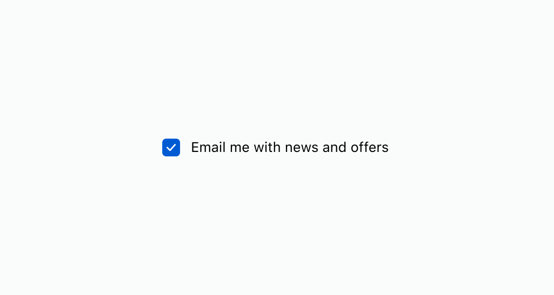
Default
<s-checkbox defaultChecked label="Email me with news and offers"></s-checkbox>