---
title: ChoiceList
description: >-
Use choice lists to present a list of choices where buyers can make a single
selection or multiple selections.
api_version: 2024-10
api_name: checkout-ui-extensions
source_url:
html: >-
https://shopify.dev/docs/api/checkout-ui-extensions/2024-10/components/forms/choicelist
md: >-
https://shopify.dev/docs/api/checkout-ui-extensions/2024-10/components/forms/choicelist.md
---
# ChoiceList
Use choice lists to present a list of choices where buyers can make a single selection or multiple selections.
## ChoiceListProps
* **name**
**string**
**required**
A unique identifier for the field in the closest `Form` component.
* **onChange**
**(value: T) => void**
**required**
A callback that is run whenever the choice list is changed. This callback is called with a string or array of strings indicating the ids of choices that should now be selected. This component is [controlled](https://reactjs.org/docs/forms.html#controlled-components), so you must store this value in state and reflect it back in the `value` prop.
* **value**
**T**
**required**
A `string` or `string[]` indicating the ids of selected choices. **When a string is set, choices render as radios. When a string array is set, choices render as checkboxes**.
* **variant**
**'base' | 'group'**
**Default: 'base'**
Toggle between `base` and `group` look.
Check the [best practices](#best-practices) to learn more about the variants.
Examples
## Preview

### Examples
* #### Basic ChoiceList
##### React
```tsx
import {
reactExtension,
BlockStack,
Choice,
ChoiceList,
Icon,
InlineStack,
} from '@shopify/ui-extensions-react/checkout';
export default reactExtension(
'purchase.checkout.block.render',
() => ,
);
function Extension() {
return (
{
console.log(
`onChange event with value: ${value}`,
);
}}
>
}
id="ship"
>
Ship
}
id="ship-to-pickup-point"
>
Ship to pickup point
}
id="pick-up"
>
Pick up in store
{
console.log(
`onChange event with value: ${value}`,
);
}}
>
Save this information for next time
Email me with news and offers
Text me with news and offers
);
}
```
##### JS
```js
import {
extension,
InlineStack,
ChoiceList,
Choice,
BlockStack,
Icon,
} from '@shopify/ui-extensions/checkout';
export default extension('purchase.checkout.block.render', (root) => {
const inlineStack = root.createComponent(InlineStack, undefined, [
root.createComponent(
ChoiceList,
{
name: 'group-single',
variant: 'group',
value: 'ship',
onChange: (value) => {
console.log(`onChange event with value: ${value}`);
},
},
[
root.createComponent(
Choice,
{
secondaryContent: root.createComponent(Icon, {source: 'truck'}),
id: 'ship',
},
'Ship',
),
root.createComponent(
Choice,
{
secondaryContent: root.createComponent(Icon, {source: 'marker'}),
id: 'ship-to-pickup-point',
},
'Ship to pickup point',
),
root.createComponent(
Choice,
{
secondaryContent: root.createComponent(Icon, {source: 'store'}),
id: 'pick-up',
},
'Pick up in store',
),
],
),
root.createComponent(
ChoiceList,
{
name: 'base-multiple',
value: ['remember-me'],
onChange: (value) => {
console.log(`onChange event with value: ${value}`);
},
},
[
root.createComponent(BlockStack, undefined, [
root.createComponent(
Choice,
{id: 'remember-me'},
'Save this information for next time',
),
root.createComponent(
Choice,
{id: 'email-me'},
'Email me with news and offers',
),
root.createComponent(
Choice,
{id: 'text-me'},
'Text me with news and offers',
),
]),
],
),
]);
root.appendChild(inlineStack);
});
```
* #### Custom survey using the base variant
##### Description
The base variant’s flexibility allows for the creation of Likert scales using the ChoiceList component. By utilizing layout components, you can easily structure rows and columns for this purpose.
##### React
```jsx
import {
reactExtension,
Choice,
ChoiceList,
Grid,
TextBlock,
View,
} from '@shopify/ui-extensions-react/checkout';
export default reactExtension(
'purchase.checkout.block.render',
() => ,
);
function Extension() {
return (
Strongly disagree
Disagree
Neutral
Agree
Strongly agree
{
console.log(
`onChange event with value: ${value}`,
);
}}
>
I recommend Plant to others.
{
console.log(
`onChange event with value: ${value}`,
);
}}
>
I have had a positive experience
purchasing from Plant.
{
console.log(
`onChange event with value: ${value}`,
);
}}
>
I would purchase from Plant again.
);
}
```
##### JavaScript
```js
import {
extension,
Choice,
ChoiceList,
Grid,
TextBlock,
View,
} from '@shopify/ui-extensions/checkout';
export default extension(
'purchase.checkout.block.render',
(root) => {
const grid = root.createComponent(
Grid,
{
columns: [
'fill',
'13%',
'13%',
'13%',
'13%',
'13%',
],
rows: 'auto',
spacing: 'none',
border: 'base',
cornerRadius: 'base',
overflow: 'hidden',
},
[
root.createComponent(View, {}, []),
root.createComponent(
View,
{
padding: ['tight', 'extraTight'],
blockAlignment: 'center',
accessibilityVisibility: 'hidden',
},
root.createComponent(
TextBlock,
{inlineAlignment: 'center'},
'Strongly disagree',
),
),
root.createComponent(
View,
{
padding: ['tight', 'extraTight'],
blockAlignment: 'center',
accessibilityVisibility: 'hidden',
},
root.createComponent(
TextBlock,
{inlineAlignment: 'center'},
'Disagree',
),
),
root.createComponent(
View,
{
padding: ['tight', 'extraTight'],
blockAlignment: 'center',
accessibilityVisibility: 'hidden',
},
root.createComponent(
TextBlock,
{inlineAlignment: 'center'},
'Neutral',
),
),
root.createComponent(
View,
{
padding: ['tight', 'extraTight'],
blockAlignment: 'center',
accessibilityVisibility: 'hidden',
},
root.createComponent(
TextBlock,
{inlineAlignment: 'center'},
'Agree',
),
),
root.createComponent(
View,
{
padding: ['tight', 'extraTight'],
blockAlignment: 'center',
accessibilityVisibility: 'hidden',
},
root.createComponent(
TextBlock,
{inlineAlignment: 'center'},
'Strongly agree',
),
),
// Then create the ChoiceList for 'question1'
root.createComponent(
ChoiceList,
{
name: 'question1',
value: '',
onChange: (value) => {
console.log(
`onChange event with value: ${value}`,
);
},
},
[
root.createComponent(
View,
{
background: 'subdued',
padding: 'base',
blockAlignment: 'center',
},
root.createComponent(
TextBlock,
{},
'I recommend Plant to others.',
),
),
root.createComponent(
View,
{
background: 'subdued',
blockAlignment: 'center',
inlineAlignment: 'center',
},
root.createComponent(Choice, {
id: 'question1-1',
accessibilityLabel:
'Strongly disagree',
}),
),
root.createComponent(
View,
{
background: 'subdued',
blockAlignment: 'center',
inlineAlignment: 'center',
},
root.createComponent(Choice, {
id: 'question1-2',
accessibilityLabel: 'Disagree',
}),
),
root.createComponent(
View,
{
background: 'subdued',
blockAlignment: 'center',
inlineAlignment: 'center',
},
root.createComponent(Choice, {
id: 'question1-3',
accessibilityLabel: 'Neutral',
}),
),
root.createComponent(
View,
{
background: 'subdued',
blockAlignment: 'center',
inlineAlignment: 'center',
},
root.createComponent(Choice, {
id: 'question1-4',
accessibilityLabel: 'Agree',
}),
),
root.createComponent(
View,
{
background: 'subdued',
blockAlignment: 'center',
inlineAlignment: 'center',
},
root.createComponent(Choice, {
id: 'question1-5',
accessibilityLabel:
'Strongly agree',
}),
),
],
),
// Then create the ChoiceList for 'question2'
root.createComponent(
ChoiceList,
{
name: 'question2',
value: '',
onChange: (value) => {
console.log(
`onChange event with value: ${value}`,
);
},
},
[
root.createComponent(
View,
{
padding: 'base',
blockAlignment: 'center',
},
root.createComponent(
TextBlock,
{},
'I have had a positive experience purchasing from Plant.',
),
),
root.createComponent(
View,
{
blockAlignment: 'center',
inlineAlignment: 'center',
},
root.createComponent(Choice, {
id: 'question2-1',
accessibilityLabel:
'Strongly disagree',
}),
),
root.createComponent(
View,
{
blockAlignment: 'center',
inlineAlignment: 'center',
},
root.createComponent(Choice, {
id: 'question2-2',
accessibilityLabel: 'Disagree',
}),
),
root.createComponent(
View,
{
blockAlignment: 'center',
inlineAlignment: 'center',
},
root.createComponent(Choice, {
id: 'question2-3',
accessibilityLabel: 'Neutral',
}),
),
root.createComponent(
View,
{
blockAlignment: 'center',
inlineAlignment: 'center',
},
root.createComponent(Choice, {
id: 'question2-4',
accessibilityLabel: 'Agree',
}),
),
root.createComponent(
View,
{
blockAlignment: 'center',
inlineAlignment: 'center',
},
root.createComponent(Choice, {
id: 'question2-5',
accessibilityLabel:
'Strongly agree',
}),
),
],
),
// Then create the ChoiceList for 'question3'
root.createComponent(
ChoiceList,
{
name: 'question3',
value: '',
onChange: (value) => {
console.log(
`onChange event with value: ${value}`,
);
},
},
[
root.createComponent(
View,
{
background: 'subdued',
padding: 'base',
blockAlignment: 'center',
},
root.createComponent(
TextBlock,
{},
'I would purchase from Plant again.',
),
),
root.createComponent(
View,
{
background: 'subdued',
blockAlignment: 'center',
inlineAlignment: 'center',
},
root.createComponent(Choice, {
id: 'question3-1',
accessibilityLabel:
'Strongly disagree',
}),
),
root.createComponent(
View,
{
background: 'subdued',
blockAlignment: 'center',
inlineAlignment: 'center',
},
root.createComponent(Choice, {
id: 'question3-2',
accessibilityLabel: 'Disagree',
}),
),
root.createComponent(
View,
{
background: 'subdued',
blockAlignment: 'center',
inlineAlignment: 'center',
},
root.createComponent(Choice, {
id: 'question3-3',
accessibilityLabel: 'Neutral',
}),
),
root.createComponent(
View,
{
background: 'subdued',
blockAlignment: 'center',
inlineAlignment: 'center',
},
root.createComponent(Choice, {
id: 'question3-4',
accessibilityLabel: 'Agree',
}),
),
root.createComponent(
View,
{
background: 'subdued',
blockAlignment: 'center',
inlineAlignment: 'center',
},
root.createComponent(Choice, {
id: 'question3-5',
accessibilityLabel:
'Strongly agree',
}),
),
],
),
],
);
root.appendChild(grid);
},
);
```
* #### Collecting additional information
##### Description
The ChoiceList’s group variant, combined with the details property, allows for the conditional display of information when needed.
##### React
```jsx
import {
reactExtension,
BlockStack,
Choice,
ChoiceList,
DatePicker,
TextBlock,
TextField,
View,
} from '@shopify/ui-extensions-react/checkout';
export default reactExtension(
'purchase.checkout.block.render',
() => ,
);
function Extension() {
return (
{
console.log(
`onChange event with value: ${value}`,
);
}}
>
Choose a delivery date
The more detailed the delivery
instructions are, the best we
can make the delivery experience
for you.
}
>
Use white glove delivery service
);
}
```
##### JavaScript
```js
import {
extension,
BlockStack,
Choice,
ChoiceList,
DatePicker,
TextBlock,
TextField,
View,
} from '@shopify/ui-extensions/checkout';
export default extension(
'purchase.checkout.block.render',
(root) => {
const choiceList = root.createComponent(
ChoiceList,
{
name: 'white-glove',
value: ['white-glove-1'],
onChange: (nextValue) => {
console.log(
`onChange event with value: ${nextValue}`,
);
},
},
[
root.createComponent(
Choice,
{id: 'white-glove-1'},
[
root.createComponent(
BlockStack,
{spacing: 'base'},
[
root.createComponent(
BlockStack,
{spacing: 'extraTight'},
[
root.createComponent(
TextBlock,
{},
'Choose a delivery date',
),
root.createComponent(
View,
{
background: 'base',
border: 'base',
cornerRadius: 'base',
padding: 'base',
},
root.createComponent(
DatePicker,
{selected: ''},
),
),
],
),
root.createComponent(
BlockStack,
{spacing: 'extraTight'},
[
root.createComponent(
TextField,
{
label:
'Additional instructions',
value: '',
},
),
root.createComponent(
TextBlock,
{
appearance: 'subdued',
size: 'small',
},
'The more detailed the delivery instructions are, the best we can make the delivery experience for you.',
),
],
),
],
),
],
),
],
);
root.appendChild(choiceList);
},
);
```
* #### Displaying a short list of time choices
##### Description
The ChoiceList component is great for presenting a concise list of options, particularly when showcasing time ranges due to its ample horizontal space. However, if there’s more than 5 choices, use the \[Select]\(/docs/api/checkout-ui-extensions/components/forms/select) component instead.
##### React
```jsx
import {
reactExtension,
BlockStack,
ChoiceList,
Choice,
} from '@shopify/ui-extensions-react/checkout';
export default reactExtension(
'purchase.checkout.block.render',
() => ,
);
function Extension() {
return (
{
console.log(
`onChange event with value: ${value}`,
);
}}
>
9:00 AM - 12:00 PM
12:00 PM - 3:00 PM
3:00 PM - 5:00 PM
);
}
```
##### JavaScript
```js
import {
extension,
BlockStack,
ChoiceList,
Choice,
} from '@shopify/ui-extensions/checkout';
export default extension(
'purchase.checkout.block.render',
(root) => {
const choiceList = root.createComponent(
ChoiceList,
{
name: 'time',
value: '',
onChange: (value) => {
console.log(
`onChange event with value: ${value}`,
);
},
},
[
root.createComponent(BlockStack, {}, [
root.createComponent(
Choice,
{id: 'morning'},
'9:00 AM - 12:00 PM',
),
root.createComponent(
Choice,
{id: 'afternoon'},
'12:00 PM - 3:00 PM',
),
root.createComponent(
Choice,
{id: 'evening'},
'3:00 PM - 5:00 PM',
),
]),
],
);
root.appendChild(choiceList);
},
);
```
## Best Practices
### Content
* Include a title that either tells customers what to do or explains their available options.
* Label options clearly based on what the option will do.
* Avoid options that contradict each other when you’re allowing for multiple selections.
### Types of choices
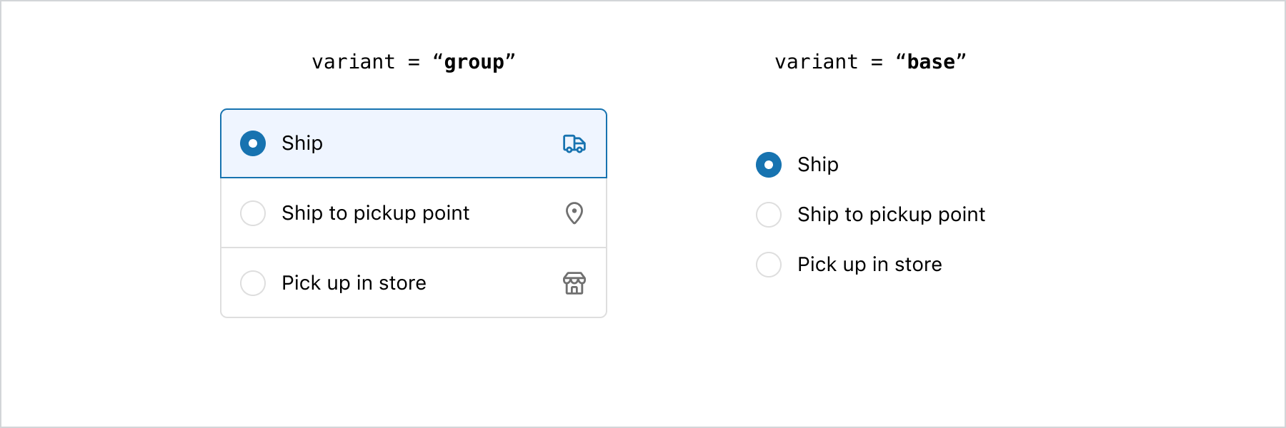
* The `base` variant is suitable for straightforward options, such as binary choices like 'yes' or 'no' answers. For simple options that require minimal visual emphasis, the base variant is the recommended choice.
* The `group` variant provides increased emphasis on choices through the use of colors, borders, and dividers. If the goal is to draw attention to the available options, the group variant is the ideal choice.
### Flexibility vs. cohesive experience
* The `base` variant offers the flexibility to compose ChoiceLists with custom layouts, allowing for greater design composition possibilities.
* Given the high level of flexibility offered by the `base` variant, prioritizing accessibility in the implementation is crucial. It is recommended to avoid using buttons or pressable components within the choices.
* The `group` variant adheres to a defined structure and provides excellent adaptability to align with the merchant’s brand. It is the ideal choice when strong cohesion with the merchant’s branding is required. Additionally, depending on the placement of the `ChoiceList`, Checkout will automatically update its appearance to seamlessly adapt to the surface it is on.
### Using details
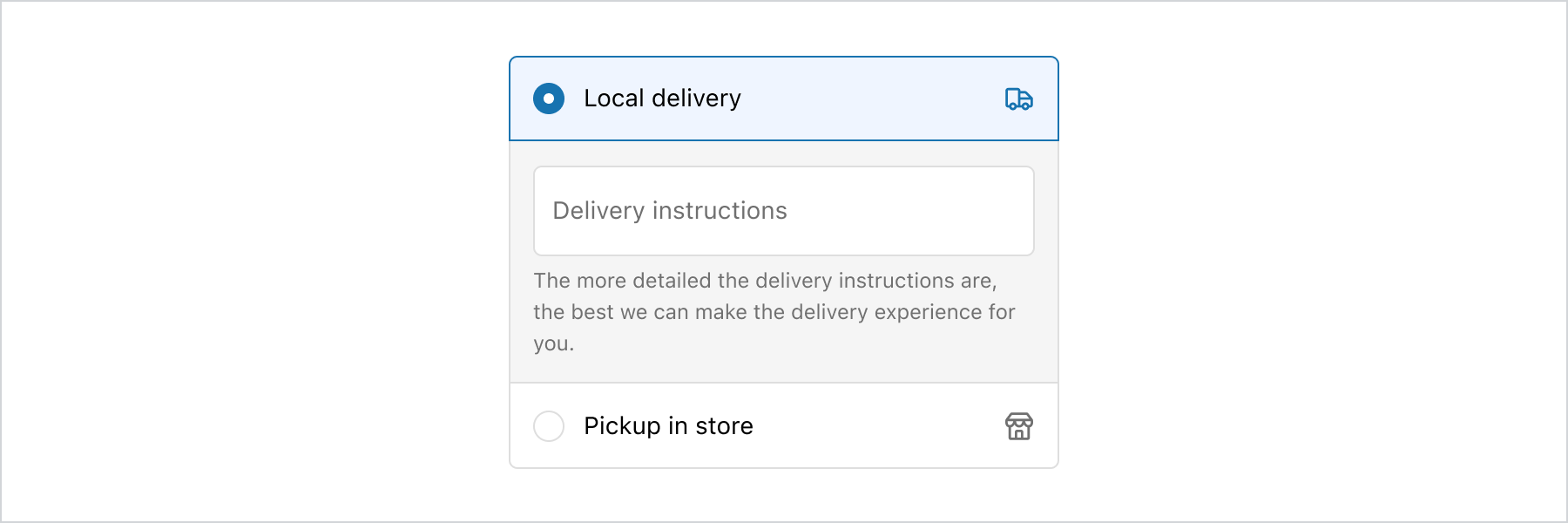
* The `details` area should be used only when additional input is required from the customer, specifically related to the choice they have made.
* If the `details` area contains lengthy content, consider placing it outside of the `ChoiceList` to ensure that customers can easily digest the information.
### Long lists of options
* When faced with a considerable number of options, customers may feel overwhelmed, and it can consume valuable interface space. To address this, consider utilizing components like the [Select](https://shopify.dev/docs/api/checkout-ui-extensions/components/forms/select) component to condense options, or employ the [Disclosure](https://shopify.dev/docs/api/checkout-ui-extensions/components/interactive/disclosure) component to progressively reveal more choices upon customer request. Strategies such as paging, filtering, and searching can be employed to enhance usability.
### Clickable rows
* If an entire row needs to be clickable, utilize the `group` variant, as it is specifically designed to enable clickable rows. In this scenario, the base variant may not provide the desired functionality, as only its content elements can be clicked, not the entire row. Attempting to use buttons or pressables to make an entire row clickable could lead to accessibility issues.
## Related
[Component - Choice](choice)
[Component - Checkbox](checkbox)