---
title: Form
description: >-
The form component should be used to wrap one or more form controls. This
component provides an "implicit submit" behavior, where customers can submit
the form from any input by pressing "Enter" on their keyboards. This behavior
is widely expected, and should be respected as often as possible.
Unlike an HTML `form` element, this component does not support configuring the
descendant fields to be submitted via HTTP automatically. Instead, you must
provide an `onSubmit` callback that will perform the necessary HTTP requests
in JavaScript.
api_version: 2025-07
api_name: checkout-ui-extensions
source_url:
html: >-
https://shopify.dev/docs/api/checkout-ui-extensions/2025-07/components/forms/form
md: >-
https://shopify.dev/docs/api/checkout-ui-extensions/2025-07/components/forms/form.md
---
# Form
The form component should be used to wrap one or more form controls. This component provides an "implicit submit" behavior, where customers can submit the form from any input by pressing "Enter" on their keyboards. This behavior is widely expected, and should be respected as often as possible.
Unlike an HTML `form` element, this component does not support configuring the descendant fields to be submitted via HTTP automatically. Instead, you must provide an `onSubmit` callback that will perform the necessary HTTP requests in JavaScript.
## FormProps
* onSubmit
() => void
required
A callback that is run when the form is submitted.
* disabled
boolean
Whether the form is able to be submitted. When set to `true`, this will disable the implicit submit behavior of the form.
* id
string
An optional override for the autogenerated form ID.
### Examples
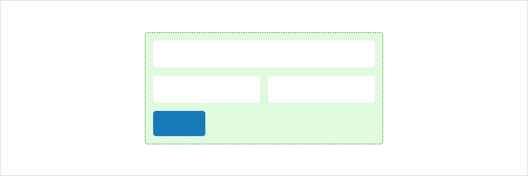
* #### Basic Form
##### React
```tsx
import {
reactExtension,
BlockSpacer,
Button,
Form,
Grid,
GridItem,
TextField,
View,
} from '@shopify/ui-extensions-react/checkout';
export default reactExtension(
'purchase.checkout.block.render',
() => ,
);
function Extension() {
return (
);
}
```
##### JS
```js
import {
extension,
BlockSpacer,
Button,
Form,
Grid,
GridItem,
TextField,
View,
} from '@shopify/ui-extensions/checkout';
export default extension('purchase.checkout.block.render', (root) => {
const fields = root.createComponent(
Grid,
{columns: ['50%', '50%'], spacing: 'base'},
[
root.createComponent(
View,
undefined,
root.createComponent(TextField, {label: 'First name'}),
),
root.createComponent(
View,
undefined,
root.createComponent(TextField, {label: 'Last name'}),
),
root.createComponent(
GridItem,
{columnSpan: 2},
root.createComponent(TextField, {label: 'Company'}),
),
],
);
const spacer = root.createComponent(BlockSpacer, {spacing: 'base'});
const button = root.createComponent(
Button,
{accessibilityRole: 'submit'},
'Submit',
);
const form = root.createComponent(
Form,
{onSubmit: () => console.log('onSubmit event')},
[fields, spacer, button],
);
root.appendChild(form);
});
```
## Preview
## Best Practices
* Wrap around all form input elements.
* Forms can have only one submit button and it must be at the end of the form.