Button
The button component triggers actions or events, such as submitting forms, opening dialogs, or navigating to other pages. Use buttons to let buyers perform specific tasks or initiate interactions throughout the interface.
Buttons support various visual styles, tones, and interaction patterns to communicate intent and hierarchy. They can also function as links, guiding buyers to internal or external destinations. For navigation-focused interactions within text, use link. For grouping multiple related buttons, use button group.
Supported targets
- purchase.
checkout. actions. render-before - purchase.
checkout. block. render - purchase.
checkout. cart-line-item. render-after - purchase.
checkout. cart-line-list. render-after - purchase.
checkout. contact. render-after - purchase.
checkout. delivery-address. render-after - purchase.
checkout. delivery-address. render-before - purchase.
checkout. footer. render-after - purchase.
checkout. header. render-after - purchase.
checkout. payment-method-list. render-after - purchase.
checkout. payment-method-list. render-before - purchase.
checkout. pickup-location-list. render-after - purchase.
checkout. pickup-location-list. render-before - purchase.
checkout. pickup-location-option-item. render-after - purchase.
checkout. pickup-point-list. render-after - purchase.
checkout. pickup-point-list. render-before - purchase.
checkout. reductions. render-after - purchase.
checkout. reductions. render-before - purchase.
checkout. shipping-option-item. details. render - purchase.
checkout. shipping-option-item. render-after - purchase.
checkout. shipping-option-list. render-after - purchase.
checkout. shipping-option-list. render-before - purchase.
thank-you. announcement. render - purchase.
thank-you. block. render - purchase.
thank-you. cart-line-item. render-after - purchase.
thank-you. cart-line-list. render-after - purchase.
thank-you. customer-information. render-after - purchase.
thank-you. footer. render-after - purchase.
thank-you. header. render-after
Anchor to PropertiesProperties
Configure the following properties on the button component.
- stringstring
A label that describes the purpose or content of the button for users of assistive technologies such as screen readers. Use this when the visible content alone doesn't provide enough context.
- '--auto' | '--show' | '--hide' | '--toggle' | '--copy''--auto' | '--show' | '--hide' | '--toggle' | '--copy'Default: '--auto'Default: '--auto'
Sets the action the
target should take when this component is activated. Available options:'--auto': Performs the default action appropriate for the target component.'--show': Displays the target component if it's currently hidden.'--hide': Conceals the target component from view.'--toggle': Alternates the target component between visible and hidden states.'--copy': Copies the target clipboard item.
The supported actions vary by target component type. Learn more about the
commandattribute.- stringstring
The ID of the component to control when this component is activated. Pair with the
commandproperty to specify what action to perform on the target component. Learn more about theattribute.When both
andhrefare set,takes precedence. The command runs and the link doesn't navigate.- booleanbooleanDefault: falseDefault: false
Whether the button is disabled, preventing it from being clicked or receiving focus.
- stringstring
The URL to navigate to when clicked. The
clickevent fires first, then navigation occurs. Ifis also set, the command executes instead of navigation.- stringstring
A unique identifier for the element. Use this to reference the element in JavaScript, link labels to form controls, or target specific elements for styling or scripting.
- 'auto' | 'fill' | 'fit-content''auto' | 'fill' | 'fit-content'Default: 'auto'Default: 'auto'
The inline width of the button component.
'auto': The size depends on the surface and context.'fill': The button takes up 100% of the available inline size.'fit-content': The button takes up the minimum inline size required to fit its content.
- stringstring
The ID of the component to show when users hover over or focus on this component. Pair with a target component that supports interest-based interactions. Learn more about the interestFor attribute.
- booleanbooleanDefault: falseDefault: false
Whether the button is in a loading state, which replaces the button content with a loading indicator while a background action is being performed. This also disables the button.
- 'auto' | '_blank''auto' | '_blank'Default: 'auto'Default: 'auto'
Specifies where to display the linked URL. Learn more about the target attribute.
'auto': Opens the URL in the current frame or a new tab, depending on the context.'_blank': Opens the URL in a new tab or window.
- 'auto' | 'neutral' | 'critical''auto' | 'neutral' | 'critical'Default: 'auto'Default: 'auto'
The semantic meaning and color treatment of the button.
'auto': Automatically determined based on context.'neutral': General information without specific intent.'critical': Urgent problems or destructive actions.
- 'submit' | 'button''submit' | 'button'Default: 'button'Default: 'button'
The behavioral type of the button component, which determines what action it performs when activated.
submit: Submits the nearest containing form.button: Performs no default action, relying on theclickevent handler for behavior.
This property is ignored if
hrefor/commandis set.- 'auto' | 'primary' | 'secondary''auto' | 'primary' | 'secondary'Default: 'auto'Default: 'auto'
The visual style variant of the button component, which controls its prominence and emphasis.
'auto': Automatically determined by the button's context.'primary': High-emphasis style for the main action.'secondary': Medium-emphasis style for supporting actions.'tertiary': Low-emphasis style for less prominent actions.
Anchor to EventsEvents
The button component provides event callbacks for handling user interactions. Learn more about handling events.
- CallbackEventListener<typeof tagName>CallbackEventListener<typeof tagName>
A callback fired when the button is clicked. This will be called before the action indicated by
type.Learn more about the click event.
CallbackEventListener
A typed event listener for custom element events. The listener receives a `CallbackEvent` with the correct `currentTarget` type for the associated custom element tag.
(EventListener & {
    (event: CallbackEvent<TTagName, Event> & TData): void;
}) | null
CallbackEvent
An event type that narrows the `currentTarget` to the specific HTML element associated with the custom element tag. This provides type-safe event handling in callback listeners.
TEvent & {
    currentTarget: HTMLElementTagNameMap[TTagName];
}
Anchor to ExamplesExamples
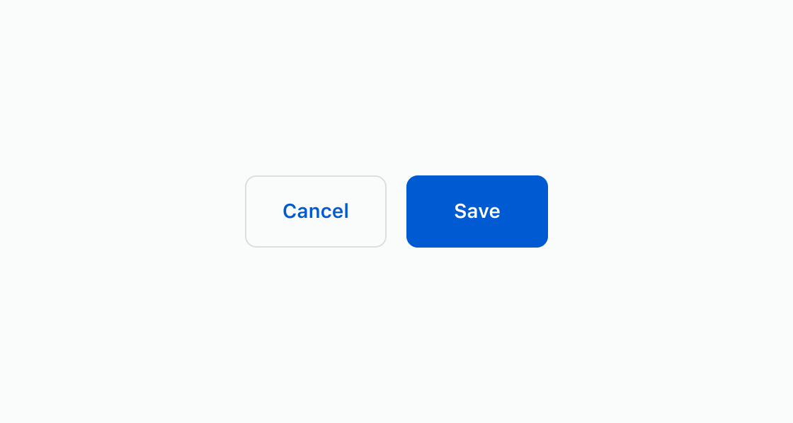
Create a save and cancel button pair to highlight the primary action. This example shows two
s-button elements with variant set to primary and secondary.Add primary and secondary buttons
html
Anchor to Show a loading stateShow a loading state
Prevent duplicate submissions by showing a loading indicator while an operation completes. This example displays buttons with the loading attribute across primary and secondary variants.html
Anchor to Open an external pageOpen an external page
Navigate to an external page by adding the href attribute to a button. This example renders an s-button with href and target="_blank" to open the destination in a new tab.html
Anchor to Best practicesBest practices
- Write action-oriented text: Use specific, actionable language like "Apply discount" or "Save preferences" rather than vague terms like "OK" or "Click here."
- Choose appropriate variants: Use
primaryfor the main action andsecondaryfor supporting actions. Limit each context to one primary button. - Show loading states: Set
loadingtotrueduring async operations to prevent duplicate submissions and provide visual feedback. - Structure hierarchies clearly: Group related actions together. Use
tone="critical"for destructive actions to prevent accidental activation.