---
title: Banner
description: Use banners to communicate important messages to customers in a prominent way.
api_version: 2025-07
api_name: checkout-ui-extensions
source_url:
html: >-
https://shopify.dev/docs/api/checkout-ui-extensions/2025-07/components/feedback/banner
md: >-
https://shopify.dev/docs/api/checkout-ui-extensions/2025-07/components/feedback/banner.md
---
# Banner
Use banners to communicate important messages to customers in a prominent way.
## BannerProps
* collapsible
boolean
Default: false
Makes the content collapsible. A collapsible banner will conceal child elements initially, but allow the user to expand the banner to see them.
* id
string
A unique identifier for the component.
* onDismiss
() => void
Callback when banner is dismissed. This component is [controlled](https://reactjs.org/docs/forms.html#controlled-components), so you must manage the visibility of the banner in state by using the onDismiss callback.
* status
Status
Default: 'info'
Sets the status of the banner.
* title
string
Banners have an optional title. Use a title to grab the buyer’s attention with a short, concise message. Banners with no title should have child elements to convey the banner’s purpose to the buyer.
### Status
```ts
'info' | 'success' | 'warning' | 'critical'
```
Examples
## Preview
### Examples
* #### Basic Banner
##### React
```tsx
import {
reactExtension,
Banner,
} from '@shopify/ui-extensions-react/checkout';
export default reactExtension(
'purchase.checkout.block.render',
() => ,
);
function Extension() {
return (
);
}
```
##### JS
```js
import {extension, Banner} from '@shopify/ui-extensions/checkout';
export default extension('purchase.checkout.block.render', (root) => {
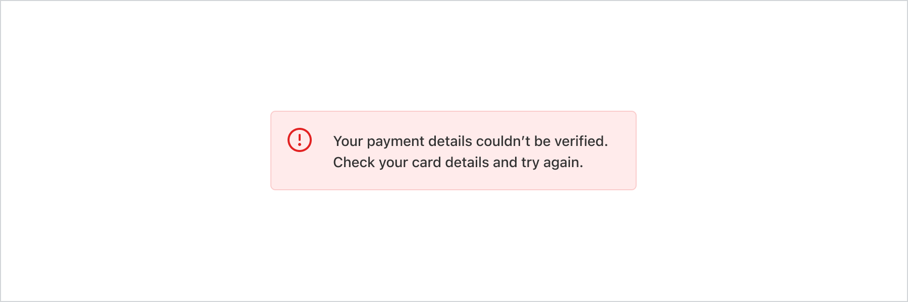
const banner = root.createComponent(Banner, {
status: 'critical',
title:
'Your payment details couldn’t be verified. Check your card details and try again.',
});
root.appendChild(banner);
});
```
## Best Practices
* Use banners thoughtfully and sparingly, and only for the most important information. Too many banners distract customers from completing checkout.
* Banners are typically displayed at the top of a page or a section, if they relate to specific content. Place banners below the relevant page or section header.
* Include a Button component with next steps when possible.
* Make banners dismissible, unless they contain critical information or an important step that customers need to take.
* Use the `info` banner to update customers about a change or to give them advice.
* Use the `warning` banner to display information that needs attention or that customers need to take action on. Warning banners can be stressful for customers, so be cautious about using them.
* Use the `critical` banner to communicate problems that customers need to resolve immediately to complete checkout.
## Status
| Value | Description |
| - | - |
| `"info"` | Convey general information or actions that aren’t critical or tied to a particular action.. |
| `"success"` | Use rarely, only if you need additional visual confirmation that a non-standard action has been completed successfully, for example adding an item to an order as an upsell. |
| `"warning"` | Display information that needs attention or that customers should take action on. Seeing these banners can be stressful for customers so be cautious about using them. Should not block progress to next step. |
| `"critical"` | Communicate problems that have to be resolved immediately for customers to complete a task. For example, using a different payment method if card details couldn’t be processed. Seeing these banners can be stressful for customers so be cautious about using them. |