---
title: Card
description: >-
Group related content and functionality together in a familiar and consistent
style, for customers to scan, read, and get things done.
api_version: 2025-04
api_name: customer-account-ui-extensions
source_url:
html: >-
https://shopify.dev/docs/api/customer-account-ui-extensions/2025-04/components/card
md: >-
https://shopify.dev/docs/api/customer-account-ui-extensions/2025-04/components/card.md
---
# Card
Group related content and functionality together in a familiar and consistent style, for customers to scan, read, and get things done.
## CardProps
* padding
boolean
Adjust the padding of all edges.
`true` applies a default padding that is appropriate for the component.
Examples
## Preview
### Examples
* #### Basic Card
##### React
```tsx
import {
Card,
Grid,
BlockStack,
Heading,
Text,
TextBlock,
View,
Icon,
InlineLayout,
reactExtension,
} from '@shopify/ui-extensions-react/customer-account';
import React from 'react';
export default reactExtension(
'customer-account.page.render',
() => ,
);
function App() {
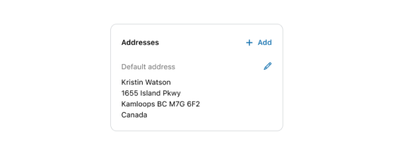
return (
Addresses
Default address
Kristin Watson
1655 Island Pkwy
Kamloops BC M7G 672
Canada
Add
);
}
```
##### JS
```js
import {
Card,
Grid,
extension,
} from '@shopify/ui-extensions/customer-account';
export default extension(
'customer-account.page.render',
(root, api) => {
renderApp(root, api);
},
)
function renderApp(root, api) {
const card = root.createComponent(
Card,
{padding: true},
[
root.createComponent(Grid, {columns: ['1fr', 'auto'],
spacing: "base",
minInlineSize: "fill",
blockAlignment: "start"}, [
root.createComponent('BlockStack', {spacing: 'loose'}, [
root.createComponent('Heading', undefined, 'Addresses'),
root.createComponent('BlockStack', {spacing: 'base'}, [
root.createComponent('Text', {appearance: "subdued"}, 'Default address'),
root.createComponent('BlockStack', {spacing: 'extraTight'}, [
root.createComponent('TextBlock',{}, 'Kristin Watson'),
root.createComponent('TextBlock', {}, '1655 Island Pkwy'),
root.createComponent('TextBlock', {}, 'Kamloops BC M7G 672'),
root.createComponent('TextBlock', {}, 'Canada'),
]),
]),
]),
root.createComponent('BlockStack', {spacing: 'loose'}, [
root.createComponent('InlineLayout', {blockAlignment: "center"}, [
root.createComponent('Icon', {source: "plus", size: "small", appearance: "accent"}),
root.createComponent('Text', {appearance: "accent"}, 'Add'),
]),
root.createComponent('View', {inlineAlignment: "end"}, [
root.createComponent('Icon', {source: "pen", size: "small", appearance: "accent"}),
]),
]),
]),
])
root.append(card);
}
```
## Best Practices
* Group related information.
* Use headings that set clear expectations about the card’s purpose.
* Display information in a way that emphasizes and prioritizes what the customer needs to know first.