---
title: CustomerAccountAction
description: >-
A modal to complete an order action flow. This component can only be used to
populate the
[customer-account.order.action.render](/docs/api/customer-account-ui-extensions/2025-04/targets/order-action-menu/customer-account-order-action-render)
extension target, which renders as a result of the customer clicking the order
action button rendered via the
[customer-account.order.action.menu-item.render](/docs/api/customer-account-ui-extensions/2025-04/targets/order-action-menu/customer-account-order-action-menu-item-render)
extension target.
api_version: 2025-04
api_name: customer-account-ui-extensions
source_url:
html: >-
https://shopify.dev/docs/api/customer-account-ui-extensions/2025-04/components/customeraccountaction
md: >-
https://shopify.dev/docs/api/customer-account-ui-extensions/2025-04/components/customeraccountaction.md
---
# CustomerAccountAction
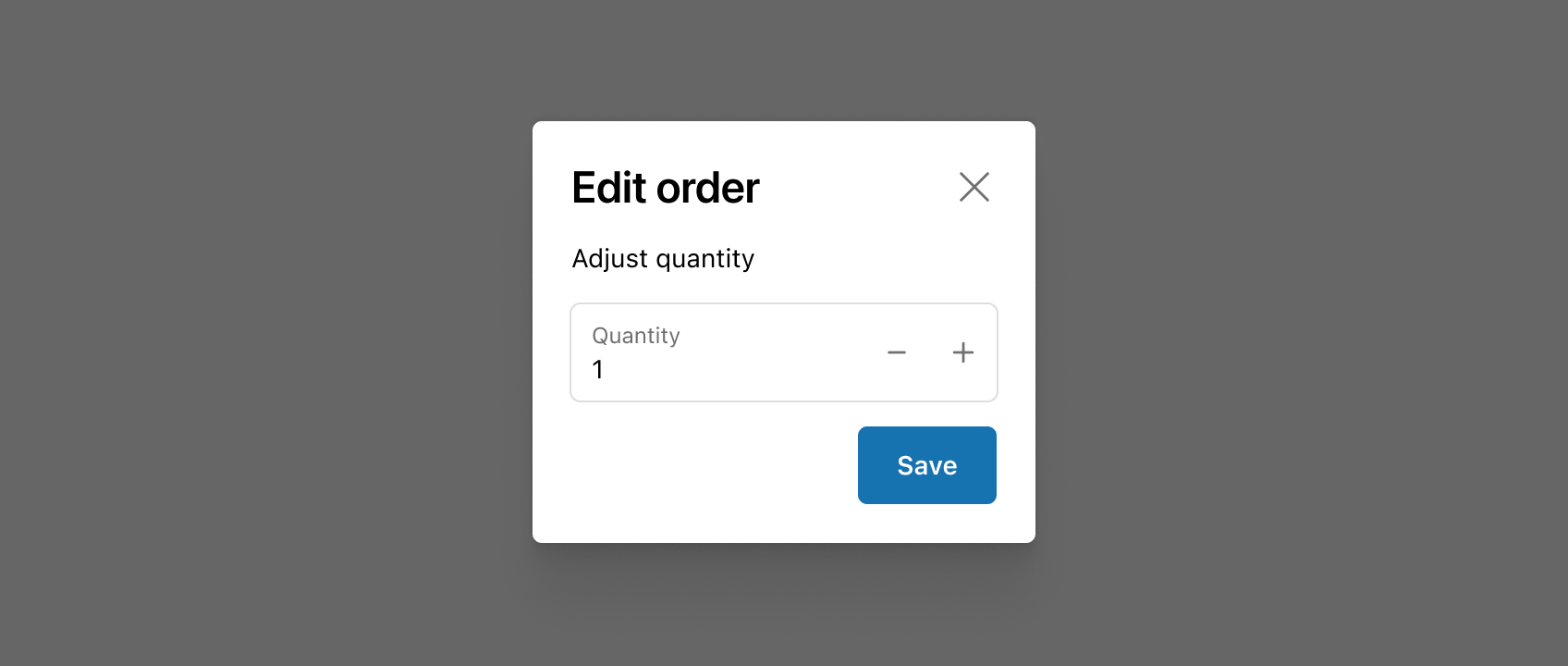
A modal to complete an order action flow. This component can only be used to populate the [customer-account.order.action.render](https://shopify.dev/docs/api/customer-account-ui-extensions/2025-04/targets/order-action-menu/customer-account-order-action-render) extension target, which renders as a result of the customer clicking the order action button rendered via the [customer-account.order.action.menu-item.render](https://shopify.dev/docs/api/customer-account-ui-extensions/2025-04/targets/order-action-menu/customer-account-order-action-menu-item-render) extension target.
## CustomerAccountActionProps
* title
string
required
Sets the title of the Action container.
* primaryAction
RemoteFragment
Sets the Primary action button of the container. This component must be a button component.
* secondaryAction
RemoteFragment
Sets the Secondary action button of the container. This component must be a button component.
## ButtonProps primaryAction
Supported props for Buttons used inside CustomerAccountAction `primaryAction` prop.\
\
`children` only support text.
* accessibilityLabel
string
A label used for buyers using assistive technologies. When set, any `children` supplied to this component will not be announced to screen reader users.
* accessibilityRole
ButtonAccessibilityRole
Default: 'button'
The role of the button that will be rendered.
`button`: renders a regular button.
`submit`: renders a button that submits a form.
* disabled
boolean
Default: false
Disables the button, disallowing any interaction.
* loading
boolean
Default: false
Replaces content with a loading indicator.
* loadingLabel
string
Accessible label for the loading indicator when user prefers reduced motion. This value is only used if `loading` is true.
* onPress
() => void
Callback that is run when the button is pressed.
### ButtonAccessibilityRole
```ts
'button' | 'submit'
```
## ButtonProps secondaryAction
Supported props for Button used inside CustomerAccountAction `secondaryAction` prop.\
\
`children` only support text.
* accessibilityLabel
string
A label used for buyers using assistive technologies. When set, any `children` supplied to this component will not be announced to screen reader users.
* disabled
boolean
Default: false
Disables the button, disallowing any interaction.
* loading
boolean
Default: false
Replaces content with a loading indicator.
* loadingLabel
string
Accessible label for the loading indicator when user prefers reduced motion. This value is only used if `loading` is true.
* onPress
() => void
Callback that is run when the button is pressed.
Examples
## Preview
### Examples
* #### Basic CustomerAccountAction
##### React
```tsx
import {
Button,
CustomerAccountAction,
TextBlock,
reactExtension,
useApi,
} from '@shopify/ui-extensions-react/customer-account';
import React from 'react';
export default reactExtension('customer-account.order.action.render', () => (
));
function App() {
const api = useApi<'customer-account.order.action.render'>();
return (
{
api.close();
}}
>
Click to close
}
>
Extension content
);
}
```
##### JS
```js
import {
Button,
CustomerAccountAction,
extension
} from '@shopify/ui-extensions/customer-account';
export default extension(
'customer-account.order.action.render',
(root, api) => {
renderApp(root, api);
},
)
async function renderApp(root, api) {
const primaryAction = root.createFragment();
await primaryAction.append(root.createComponent(Button, {onPress: () => {api.close()}}, 'Click to close'));
const customerAccountAction = root.createComponent(
CustomerAccountAction,
{
title: 'Extension title',
primaryAction,
},
root.createComponent('TextBlock', {}, 'Extension content')
);
root.append(customerAccountAction);
}
```
## Best Practices
* Use CustomerAccountAction to shift focus toward information and functionality needed to confirm or complete an order action.
* If the order action experience you’re building requires complex forms or large amounts of information, consider building a full-page extension instead.
* See Polaris for more best practices and content guidelines for designing [Modals](https://polaris.shopify.com/components/overlays/modal#best-practices).