---
title: Query container
description: >-
The query container component establishes a container query context for
responsive design. Use query container to define an element as a containment
context, enabling child components or styles to adapt based on the container's
size rather than viewport width.
api_version: 2026-04
source_url:
html: >-
https://shopify.dev/docs/api/customer-account-ui-extensions/latest/web-components/layout-and-structure/query-container
md: >-
https://shopify.dev/docs/api/customer-account-ui-extensions/latest/web-components/layout-and-structure/query-container.md
---
# Query container
The query container component establishes a container query context for responsive design. Use query container to define an element as a containment context, enabling child components or styles to adapt based on the container's size rather than viewport width.
Query containers support modern responsive patterns where components respond to their container dimensions, creating more flexible and reusable layouts. For static layouts that don't need to respond to container size, use [stack](https://shopify.dev/docs/api/customer-account-ui-extensions/latest/web-components/layout-and-structure/stack) or [grid](https://shopify.dev/docs/api/customer-account-ui-extensions/latest/web-components/layout-and-structure/grid) directly.
Query container uses `inline-size` containment only — block-size (height) queries aren't supported. Applying `contain: inline-size` can affect child elements that depend on their parent's intrinsic size, and not all component properties accept container query expressions.
### Support Targets (24)
### Supported targets
* [customer-account.footer.render-after](https://shopify.dev/docs/api/customer-account-ui-extensions/2026-04/targets/footer#footer-render-after-)
* [customer-account.order-index.announcement.render](https://shopify.dev/docs/api/customer-account-ui-extensions/2026-04/targets/order-actions#order-index-announcement-)
* [customer-account.order-index.block.render](https://shopify.dev/docs/api/customer-account-ui-extensions/2026-04/targets/order-actions#order-index-block-)
* [customer-account.order-status.announcement.render](https://shopify.dev/docs/api/customer-account-ui-extensions/2026-04/targets/order-status#order-status-announcement-)
* [customer-account.order-status.block.render](https://shopify.dev/docs/api/customer-account-ui-extensions/2026-04/targets/order-status#order-status-block-)
* [customer-account.order-status.cart-line-item.render-after](https://shopify.dev/docs/api/customer-account-ui-extensions/2026-04/targets/order-status#cart-line-item-render-after-)
* [customer-account.order-status.cart-line-list.render-after](https://shopify.dev/docs/api/customer-account-ui-extensions/2026-04/targets/order-status#cart-line-list-render-after-)
* [customer-account.order-status.customer-information.render-after](https://shopify.dev/docs/api/customer-account-ui-extensions/2026-04/targets/order-status#customer-information-render-after-)
* [customer-account.order-status.fulfillment-details.render-after](https://shopify.dev/docs/api/customer-account-ui-extensions/2026-04/targets/fulfillment-status#fulfillment-status-targets)
* [customer-account.order-status.payment-details.render-after](https://shopify.dev/docs/api/customer-account-ui-extensions/2026-04/targets/payments-and-returns#payments-and-returns-targets)
* [customer-account.order-status.return-details.render-after](https://shopify.dev/docs/api/customer-account-ui-extensions/2026-04/targets/payments-and-returns#return-details-render-after-)
* [customer-account.order-status.unfulfilled-items.render-after](https://shopify.dev/docs/api/customer-account-ui-extensions/2026-04/targets/fulfillment-status#unfulfilled-items-render-after-)
* [customer-account.order.action.menu-item.render](https://shopify.dev/docs/api/customer-account-ui-extensions/2026-04/targets/order-actions#order-action-menu-item-)
* [customer-account.order.action.render](https://shopify.dev/docs/api/customer-account-ui-extensions/2026-04/targets/order-actions#order-action-)
* [customer-account.order.page.render](https://shopify.dev/docs/api/customer-account-ui-extensions/2026-04/targets/full-page#order-specific-full-page-)
* [customer-account.page.render](https://shopify.dev/docs/api/customer-account-ui-extensions/2026-04/targets/full-page#customer-account-full-page-)
* [customer-account.profile.addresses.render-after](https://shopify.dev/docs/api/customer-account-ui-extensions/2026-04/targets/profile-page-default#profile-page-default-targets-)
* [customer-account.profile.announcement.render](https://shopify.dev/docs/api/customer-account-ui-extensions/2026-04/targets/profile-page-default#profile-announcement-)
* [customer-account.profile.block.render](https://shopify.dev/docs/api/customer-account-ui-extensions/2026-04/targets/profile-page-default#profile-block-)
* [customer-account.profile.company-details.render-after](https://shopify.dev/docs/api/customer-account-ui-extensions/2026-04/targets/profile-page-b2b#profile-page-b2b-targets-)
* [customer-account.profile.company-location-addresses.render-after](https://shopify.dev/docs/api/customer-account-ui-extensions/2026-04/targets/profile-page-b2b#company-location-addresses-render-after-)
* [customer-account.profile.company-location-payment.render-after](https://shopify.dev/docs/api/customer-account-ui-extensions/2026-04/targets/profile-page-b2b#company-location-payment-render-after-)
* [customer-account.profile.company-location-staff.render-after](https://shopify.dev/docs/api/customer-account-ui-extensions/2026-04/targets/profile-page-b2b#company-location-staff-render-after-)
* customer-account.profile.payment.render-after
#### Use cases
* **Responsive padding**: Adjust spacing based on the container's width so content has comfortable padding in both wide and narrow contexts.
* **Adaptive layouts**: Switch a stack between horizontal and vertical directions depending on available space, so the same component works in a sidebar or main content area.
* **Collapsible grids**: Transform a multi-column grid into a single-column layout when the container is too narrow for side-by-side content.
* **Contextual styling**: Apply different background colors, border treatments, or font sizes based on the container's inline size.
***
## Properties
Configure the following properties on the query container component.
* **containerName**
**string**
**Default: ''**
A custom name for the container, used in [container queries](https://developer.mozilla.org/en-US/docs/Web/CSS/container-name) to target this container specifically. The value is added alongside the default name `s-default`.
* **id**
**string**
A unique identifier for the element. Use this to reference the element in JavaScript, link labels to form controls, or target specific elements for styling or scripting.
***
## Examples
### Apply responsive padding
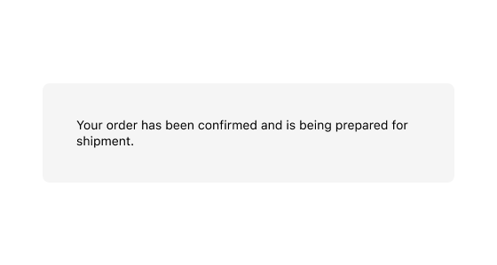
Wrap content in a query container and use container query syntax in the `padding` property. This example applies larger padding when the container is wider than 500px.
## Apply responsive padding
## html
```html
Your order has been confirmed and is being prepared for shipment.
```
### Adapt layout based on container size
Use container query syntax in the `direction` property of a [stack](https://shopify.dev/docs/api/customer-account-ui-extensions/latest/web-components/layout-and-structure/stack) to switch between horizontal and vertical layouts based on the container's width.
## html
```html
Shipping address
123 Main St, Toronto
Billing address
456 King St W, Toronto
```
### Switch grid columns based on container width
Use container query syntax in the `gridTemplateColumns` property of a [grid](https://shopify.dev/docs/api/customer-account-ui-extensions/latest/web-components/layout-and-structure/grid) to switch between a single column and two columns based on the container's width.
## html
```html
Subtotal
$75.00
Shipping
Free
```
***
## Best practices
* **Use container queries instead of viewport queries**: Container queries make components responsive to their parent's size, which is more reliable than viewport width in extension contexts where your component doesn't control the full page.
* **Name containers for clarity**: Set `containerName` when you have nested query containers so child components can target a specific ancestor.
* **Test at multiple sizes**: Verify that your container query breakpoints produce good layouts at small, medium, and large container widths.
***