Menu
Use a menu to display a list of actions in a popover. Actions can open a modal, trigger an event, or link to an external page.
- string
A label to describe the purpose of the menu that is announced by screen readers.
- string
A unique identifier for the component.
- () => void
Callback to run when the Menu is closed
- () => void
Callback to run when the Menu is opened
MenuProps
- accessibilityLabel
A label to describe the purpose of the menu that is announced by screen readers.
string - id
A unique identifier for the component.
string - onClose
Callback to run when the Menu is closed
() => void - onOpen
Callback to run when the Menu is opened
() => void
export interface MenuProps extends IdProps {
  /**
   * A label to describe the purpose of the menu that is announced by screen readers.
   */
  accessibilityLabel?: string;
  /**
   * Callback to run when the Menu is opened
   */
  onOpen?: () => void;
  /**
   * Callback to run when the Menu is closed
   */
  onClose?: () => void;
}The Menu component exclusively accepts Button elements with restricted props as its children. The appearance prop will always be set to monochrome by default.
- string
A label used for buyers using assistive technologies. When set, any
childrensupplied to this component will not be announced to screen reader users.- ButtonAccessibilityRoleDefault: 'button'
The role of the button that will be rendered.
button: renders a regular button.submit: renders a button that submits a form.- 'auto' | 'copy'Default: 'auto' - a default action for the target component.
- string
ID of a component that should respond to activations (e.g. clicks) on this pressable.
See
for how to control the behavior of the target.- Extract<Appearance, 'monochrome' | 'critical'>
Specify the color treatment of the Button.
- booleanDefault: false
Disables the button, disallowing any interaction.
- string
A unique identifier for the component.
- booleanDefault: false
Replaces content with a loading indicator.
- string
Accessible label for the loading indicator when user prefers reduced motion. This value is only used if
loadingis true.- () => void
Callback that is run when the button is pressed.
- RemoteFragment
An overlay component to render when the user interacts with the component.
- string
Destination URL to link to.
- string
The component's identifier whose visibility will be toggled when this component is actioned.
- booleandeprecated
Allows the button to submit a form.
Deprecateduse
instead
Docs_Menu_Button_Action
- accessibilityLabel
A label used for buyers using assistive technologies. When set, any `children` supplied to this component will not be announced to screen reader users.
string - accessibilityRole
The role of the button that will be rendered. `button`: renders a regular button. `submit`: renders a button that submits a form.
ButtonAccessibilityRole - activateAction
Sets the action the `activateTarget` should take when this pressable is activated. Supported actions by component: | Component | Supported Actions | Default ('auto') | |---------------|-------------------|-------------------| | [`ClipboardItem`](/docs/api/checkout-ui-extensions/latest/clipboarditem) | 'copy' | 'copy' |
'auto' | 'copy' - activateTarget
ID of a component that should respond to activations (e.g. clicks) on this pressable. See `activateAction` for how to control the behavior of the target.
string - appearance
Specify the color treatment of the Button.
Extract<Appearance, 'monochrome' | 'critical'> - disabled
Disables the button, disallowing any interaction.
boolean - id
A unique identifier for the component.
string - loading
Replaces content with a loading indicator.
boolean - loadingLabel
Accessible label for the loading indicator when user prefers reduced motion. This value is only used if `loading` is true.
string - onPress
Callback that is run when the button is pressed.
() => void - overlay
An overlay component to render when the user interacts with the component.
RemoteFragment - submit
Allows the button to submit a form.
boolean - to
Destination URL to link to.
string - toggles
The component's identifier whose visibility will be toggled when this component is actioned.
string
export interface Docs_Menu_Button_Action
  extends Omit<
    ButtonProps,
    'kind' | 'textDecoration' | 'inlineAlignment' | 'inlineSize' | 'size'
  > {}
ButtonAccessibilityRole
'button' | 'submit'Appearance
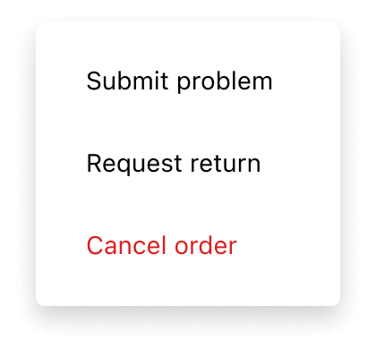
'base' | 'accent' | 'decorative' | 'interactive' | 'subdued' | 'info' | 'success' | 'warning' | 'critical' | 'monochrome'Basic Menu
examples
Basic Menu
React
import {
  reactExtension,
  Button,
  Menu,
} from '@shopify/ui-extensions-react/customer-account';
import React from 'react';

export default reactExtension(
  'customer-account.page.render',
  () => <App />,
);

function App() {
  return (
    <Button
      overlay={
        <Menu>
          <Button
            onPress={() =>
              console.log('Submit problem')
            }
          >
            Submit problem
          </Button>
          <Button to="https://shopify.com">
            Request return
          </Button>
          <Button appearance="critical">
            Cancel order
          </Button>
        </Menu>
      }
    >
      Manage
    </Button>
  );
}
JS
import {Menu, Button, extension} from '@shopify/ui-extensions/customer-account';

export default extension('customer-account.page.render', (root, api) => {
  renderApp(root, api);
});

async function renderApp(root, api) {
  const menuFragment = root.createFragment();
  const menu = root.createComponent(Menu, {}, [
    root.createComponent(
      Button,
      {onPress: () => console.log('Submit problem')},
      'Submit problem',
    ),
    root.createComponent(Button, {to: 'https://shopify.com'}, 'Request return'),
    root.createComponent(Button, {appearance: 'critical'}, 'Cancel order'),
  ]);
  menuFragment.appendChild(menu);
  const button = root.createComponent(
    Button,
    {overlay: menuFragment},
    'Manage',
  );

  root.appendChild(button);
}
Preview
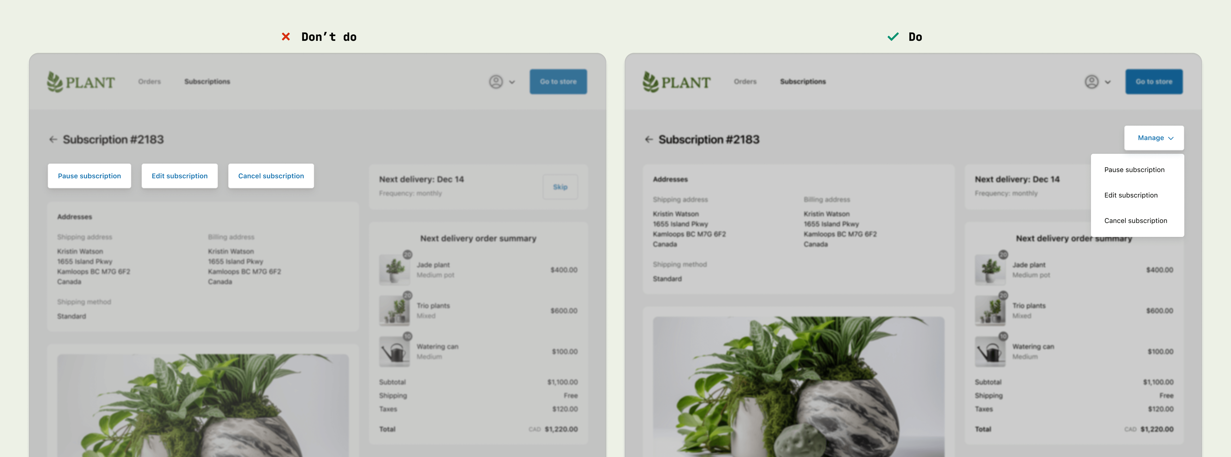
Anchor to best-practicesBest Practices
Consolidate actions into one menu
- Use the menu component in the upper-right corner of full-page extensions, to be consistent with the Order status page.
- Use menus to consolidate page-level actions, instead of adding multiple buttons around the page.
Content guidelines
When writing button labels:
- Aim for 2 words (verb and noun).
- Lead with a strong verb that encourages action.
- Avoid unnecessary words and articles such as “the,” “an,” or “a.”
- Use sentence case.
