---
title: Badge
description: >-
Badges are used to inform merchants of the status of an item or action that’s
been taken.
api_version: 2024-04
api_name: pos-ui-extensions
source_url:
html: 'https://shopify.dev/docs/api/pos-ui-extensions/2024-04/components/badge'
md: 'https://shopify.dev/docs/api/pos-ui-extensions/2024-04/components/badge.md'
---
# Badgecomponent
Badges are used to inform merchants of the status of an item or action that’s been taken.
## Badge
* text
string
required
The text displayed inside the badge.
* variant
BadgeVariant
required
The appearance and function of the badge.
* status
BadgeStatus
A circle icon displaying the status of the badge.
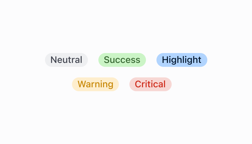
### BadgeVariant
```ts
'neutral' | 'critical' | 'warning' | 'success' | 'highlight'
```
### BadgeStatus
```ts
'empty' | 'partial' | 'complete'
```
### Examples
* #### Badge
##### React
```tsx
import React from 'react';
import {
Badge,
Screen,
reactExtension,
} from '@shopify/ui-extensions-react/point-of-sale';
const SmartGridModal = () => {
return (
);
};
export default reactExtension(
'pos.home.modal.render',
() => ,
);
```
##### TS
```ts
import {
Badge,
Screen,
extension,
} from '@shopify/ui-extensions/point-of-sale';
export default extension(
'pos.home.modal.render',
(root) => {
const mainScreen = root.createComponent(
Screen,
{
name: 'Home',
title: 'Home',
},
);
const badge = root.createComponent(Badge, {
text: 'Badge',
variant: 'success',
status: 'complete',
});
mainScreen.append(badge);
root.append(mainScreen);
},
);
```
## Preview
## Guidelines
* Badges should be positioned as close as possible to the item they’re related to.
## Content guidelines
* Be concise. Use a single word to describe the status of an item.
* Only use two or three words if you need to describe a complex state, for example "partially fulfilled".
✅ fulfilled ❌ order fulfilled
Statuses should ideally be written as adjectives:
✅ unpaid ❌ payment not received