Date
A component that enables users to open a dialog and select a date through a text input.
Anchor to datefieldDateField
- Anchor to labellabelstringrequired
The content to use as the field label.
- Anchor to disableddisabledboolean
Whether the field can be modified.
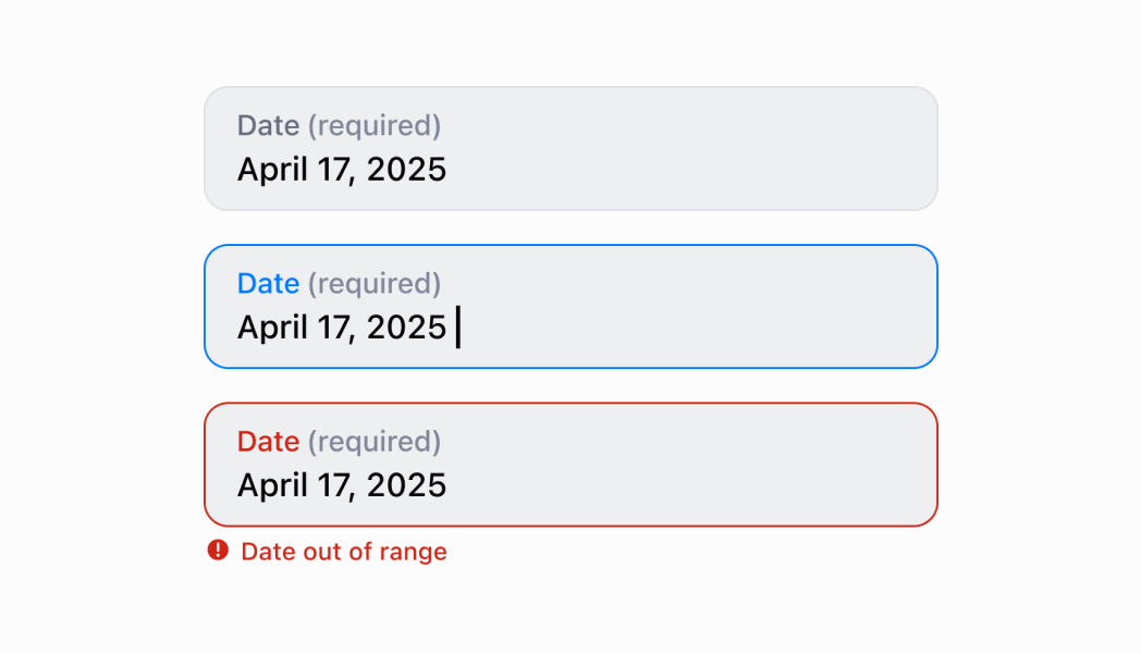
- Anchor to errorerrorstring
Indicates an error to the user. The field is given specific stylistic treatment to communicate problems that have to be resolved immediately.
- Anchor to onBluronBlur() => void
The callback when focus is removed.
- Anchor to onChangeonChange(value: string) => void
The callback when the user has finished editing a field.
- Anchor to onFocusonFocus() => void
The callback when input is focused.
- Anchor to valuevaluestring
The current value for the field. Defaults to now. You should update this value in response to the
callback.- Anchor to helpTexthelpTextstring
The label under the text field which provides guidance or instructions that assist users.
- Anchor to actionactionInputAction
A button under the text field to provide extra functionality.
InputAction
- label
The text displayed in the button.
string - onPress
A callback to be performed.
() => void - disabled
Whether the button can be pressed.
boolean
export interface InputAction {
  /**
   * The text displayed in the button.
   */
  label: string;
  /**
   * A callback to be performed.
   */
  onPress: () => void;
  /**
   * Whether the button can be pressed.
   */
  disabled?: boolean;
}Date input
Examples
Date input
React
import React, {useState} from 'react';
import {
  DateField,
  Screen,
  ScrollView,
  Navigator,
  Text,
  reactExtension,
} from '@shopify/ui-extensions-react/point-of-sale';

const SmartGridModal = () => {
  const [date, setDate] = useState('');
  return (
    <Navigator>
      <Screen name="DateField" title="DateField Example">
        <ScrollView>
          <DateField
            label="Date"
            value={date}
            onChange={setDate}
            action={{
              label: 'Clear',
              onPress: () => setDate(''),
            }}
          />
          <Text>Selected Date: {date}</Text>
        </ScrollView>
      </Screen>
    </Navigator>
  );
};

export default reactExtension('pos.home.modal.render', () => (
  <SmartGridModal />
));
TS
import {
  Navigator,
  Screen,
  ScrollView,
  Text,
  DateField,
  extension,
} from '@shopify/ui-extensions/point-of-sale';

export default extension('pos.home.modal.render', (root, api) => {
  const clearHandler = () => {
    dateField.updateProps({value: ''});
    textBox.replaceChildren('');
  };
  const dateField = root.createComponent(DateField, {
    label: 'Select Date',
    value: '',
    action: {label: 'Clear', onPress: clearHandler},
  });

  const textBox = root.createComponent(Text);

  const onChangeHandler = (newValue: string) => {
    dateField.updateProps({value: newValue});

    const textContent = `Selected Date: ${newValue}`;
    textBox.replaceChildren(textContent);
  };

  dateField.updateProps({onChange: onChangeHandler});

  const scrollView = root.createComponent(ScrollView);
  scrollView.append(dateField);
  scrollView.append(textBox);

  const screen = root.createComponent(Screen, {
    name: 'DateField',
    title: 'Date Field Example',
  });
  screen.append(scrollView);

  const navigator = root.createComponent(Navigator);
  navigator.append(screen);

  root.append(navigator);
});
Preview
Anchor to guidelinesGuidelines
- Use a smart default date for common selections.