---
title: Dialog
description: >-
A dialog is a high-priority, intentionally disruptive message that requires
action from the merchant before they can continue using POS.
api_version: 2024-04
api_name: pos-ui-extensions
source_url:
html: 'https://shopify.dev/docs/api/pos-ui-extensions/2024-04/components/dialog'
md: 'https://shopify.dev/docs/api/pos-ui-extensions/2024-04/components/dialog.md'
---
# Dialogcomponent
A dialog is a high-priority, intentionally disruptive message that requires action from the merchant before they can continue using POS.
## Dialog
* title
string
required
The text displayed in the title of the dialog.
* actionText
string
required
The text displayed in the primary action button of the dialog.
* onAction
() => void
required
A callback that performs when the action is triggered.
* isVisible
boolean
required
Whether the dialog should be presented.
* content
string
The text displayed in the body of the dialog.
* secondaryActionText
string
The text displayed in the secondary action section of the dialog.
* showSecondaryAction
boolean
Whether a secondary action displays.
* type
DialogType
Determines the dialog’s appearance and function.
* onSecondaryAction
() => void
A callback that is executed when the secondary action is triggered.
### DialogType
```ts
'default' | 'alert' | 'error' | 'destructive'
```
### Examples
* #### Dialog example
##### React
```tsx
import React, {useState} from 'react';
import {
Button,
Dialog,
Screen,
reactExtension,
} from '@shopify/ui-extensions-react/point-of-sale';
const SmartGridModal = () => {
const [visible, setVisible] = useState(false);
const handlePrimaryAction = () => {
setVisible(false);
console.log('Primary action pressed');
};
const handleSecondaryAction = () => {
setVisible(false);
console.log('Secondary action pressed');
};
return (
);
};
export default reactExtension(
'pos.home.modal.render',
() => ,
);
```
##### TS
```ts
import {
Button,
Dialog,
Screen,
extension,
} from '@shopify/ui-extensions/point-of-sale';
export default extension(
'pos.home.modal.render',
(root) => {
const mainScreen = root.createComponent(
Screen,
{
name: 'Dialog',
title: 'Dialog Title',
},
);
const button = root.createComponent(Button, {
title: 'Show dialog',
onPress: () =>
dialog.updateProps({visible: true}),
});
const handlePrimaryAction = () => {
dialog.updateProps({visible: false});
console.log('Primary action pressed');
};
const handleSecondaryAction = () => {
dialog.updateProps({visible: false});
console.log('Secondary action pressed');
};
const dialog = root.createComponent(Dialog, {
type: 'error',
title: 'Dialog title',
content: 'Dialog content',
actionText: 'Primary action',
onAction: handlePrimaryAction,
secondaryActionText: 'Secondary action',
onSecondaryAction: handleSecondaryAction,
isVisible: false,
});
mainScreen.append(button);
mainScreen.append(dialog);
root.append(mainScreen);
},
);
```
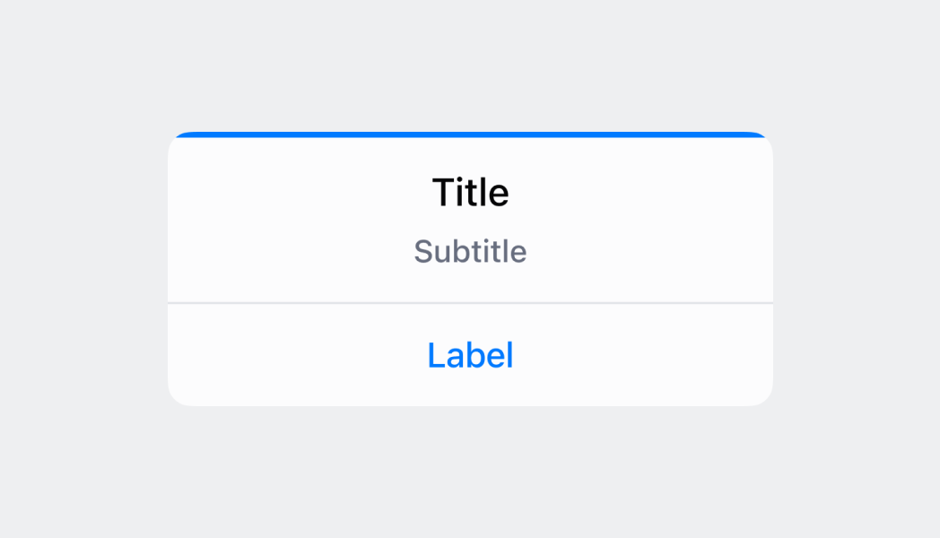
## Preview
## Guidelines
* A dialog appears on top of the view the merchant is currently looking at.
* When a dialog appears, the merchant can only interact with the buttons in the dialog and nothing else in the view.
* A scrim is used to dim the UI in the background, using the surfaceBackground color set to 60% transparency.
* Dialogs always include at least one action, two actions at most.
* Buttons in dialogs work best when stacked to accommodate for longer translated content.
* When buttons are displayed side-by-side, the primary action is on the right. When buttons are stacked, the primary action is at the top.
* For buttons that initiate irreversible actions, the text should be displayed in "destructive" (red) state.
## Content guidelines
For confirmation dialogs, the header should be formed as a question that re-emphasizes the action being taken. Don't write: "Are you sure?"
✅ Log out of Shopify POS?\
❌ Are you sure you want to log out of Shopify POS?\
❌ You’re about to log out of Shopify POS
For confirmation dialogs, the primary button should clearly confirm the action while the secondary button should cancel the action with "Cancel":
✅ \[Primary button] Log out\
❌ \[Primary button] Yes
For errors, the header should clearly communicate the problem rather than the solution (use the body and button to communicate the solution):
✅ \[Header] Transaction declined\
❌ \[Header] Retry transaction
For informational dialogs where there's no action for the merchant to take but to acknowledge the message, the sole button should be "OK":
✅ \[Button] OK\
❌ \[Button] Understood\
❌ \[Button] Dismiss