---
title: Stack
description: >-
A container for other components that allows them to be stacked horizontally
or vertically. When building complex UIs, this will be your primary building
block.
api_version: 2024-04
api_name: pos-ui-extensions
source_url:
html: 'https://shopify.dev/docs/api/pos-ui-extensions/2024-04/components/stack'
md: 'https://shopify.dev/docs/api/pos-ui-extensions/2024-04/components/stack.md'
---
# Stackcomponent
A container for other components that allows them to be stacked horizontally or vertically. When building complex UIs, this will be your primary building block.
## Stack
* direction
"vertical" | "horizontal"
required
The direction of the stack.
* alignment
"flex-end" | "center" | "flex-start" | "space-around" | "space-between" | "space-evenly"
Default: 'flex-end'
The alignment of the children along the cross axis.
* paddingVertical
VerticalSpacing
The vertical padding around the stack.
* paddingHorizontal
HorizontalSpacing
The horizontal padding around the stack.
* spacing
Spacing
Default: 1
The spacing between each child in the stack.
* flexChildren
boolean
Whether the children should be stretched to fill the cross axis.
* flex
number
The flex value for the stack.
* flexWrap
"wrap" | "nowrap" | "wrap-reverse"
Wrap behavior for the children of the stack.
### VerticalSpacing
```ts
'HalfPoint' | 'ExtraSmall' | 'Small' | 'Medium' | 'Large' | 'ExtraLarge'
```
### HorizontalSpacing
```ts
'HalfPoint' | 'ExtraSmall' | 'Small' | 'Medium' | 'Large' | 'ExtraLarge' | 'ExtraExtraLarge'
```
### Spacing
```ts
0.5 | 1 | 2 | 3 | 4 | 5 | 6 | 7 | 8 | 9 | 10 | 11 | 13 | 16
```
### Examples
* #### Stack
##### React
```tsx
;
```
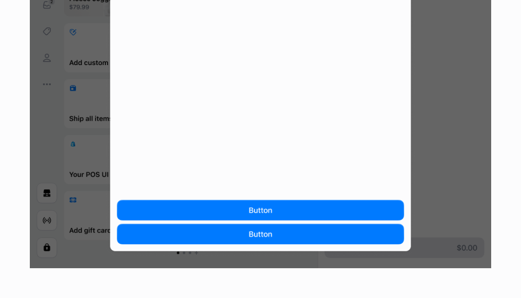
## Preview
## Examples
The following examples will demonstrate some, but not all of the abilities of the `Stack` component. In all the following examples we will be applying `horizontalPadding` of `ExtraExtraLarge`, since this is the default that we use on POS when we wrap our screens. For simplicity, these examples use the React version of the `Stack` component, but the same results will be achieved by using the same props with the regular JS library.
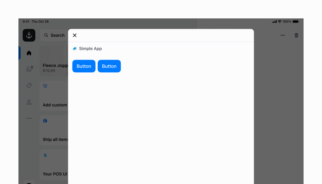
## Horizontal Stack with default values
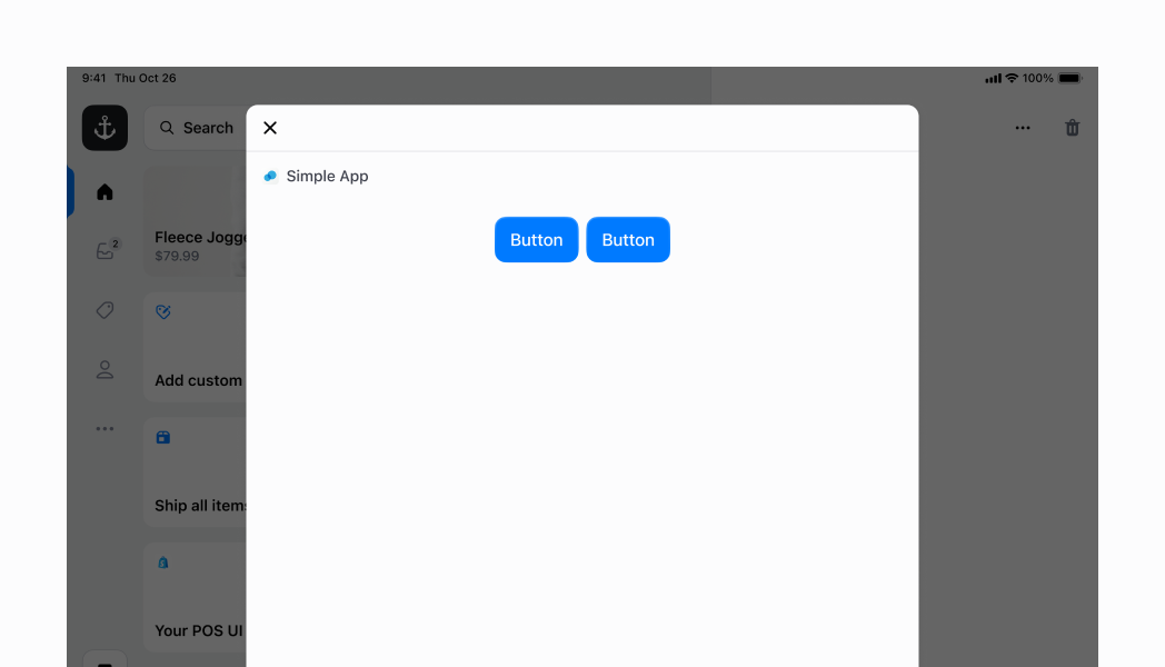
In this example, we specify `horizontal` for the `direction`. We don't specify the `flex`, which means it's 0 by default. However, `horizontal` stacks will always stretch to fill from the left to the right of the screen. As you can see, we have two small buttons occupying just the amount of space that they need, at the left side of the `Stack`. This is because `alignment` is set to `flex-end` by default.
### Examples
* #### Horizontal Stack with default values
##### React
```tsx
;
```
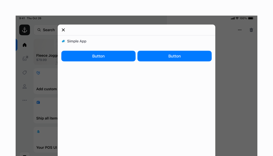
## Horizontal Stack with flexChildren
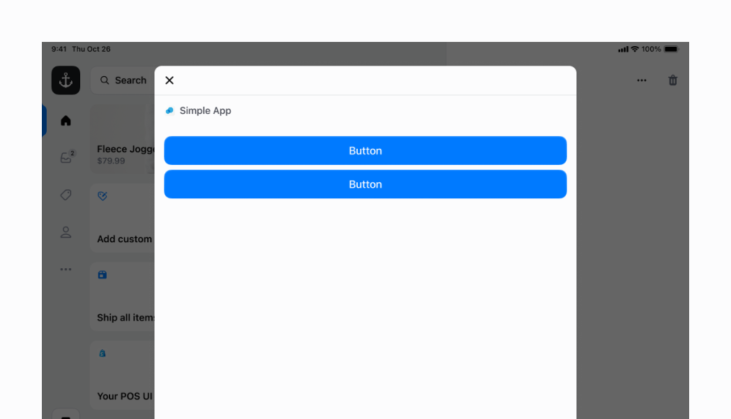
Similar to the example above, but this time we are specifying `flexChildren` to be `true`. This means that the two buttons will take up the max amount of space that they can within the `horizontal` stack.
### Examples
* #### Horizontal Stack with flexChildren
##### React
```tsx
;
```
## Horizontal Stack with centered children
You can also center elements in your `horizontal` stack. For this, you can specify the `alignment` to be `center`. However, in this case you also want `flexChildren` to be `false` (which is the default), so that the children can take up the minimal amount of space that they need, and be centered.
### Examples
* #### Horizontal Stack with centered children
##### React
```tsx
;
```
## Horizontal Stack with children at the end
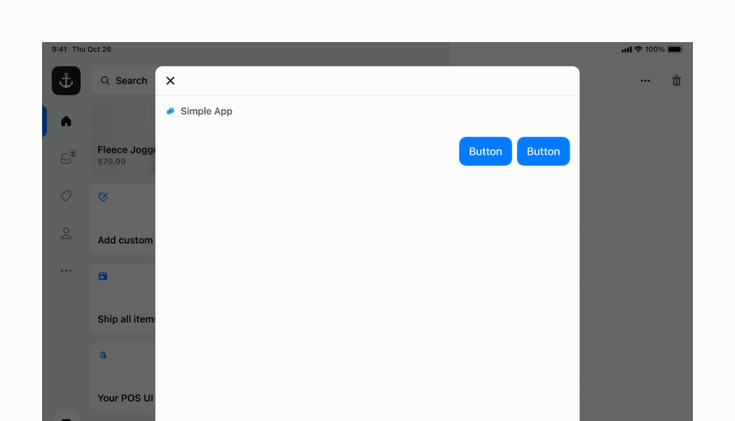
To make the children be aligned to the end of your `horizontal` container, you just need to specify `alignment` to be `flex-end`. Note that in the first example, the children were at the start of the container. This is because the default value is `flex-start`.
### Examples
* #### Horizontal Stack with children at the end
##### React
```tsx
;
```
## Vertical Stack
You can specify your `Stack` to layout its children vertically by setting `direction` to `vertical`.
### Examples
* #### Vertical Stack
##### React
```tsx
;
```
## Vertical Stack with centered children
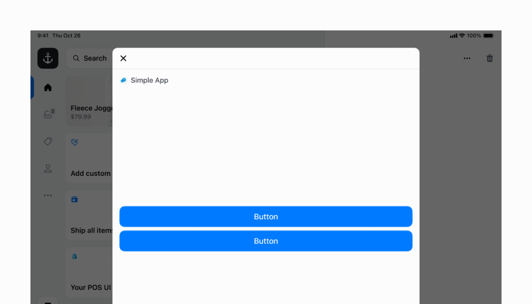
You can center your stack's children along the `vertical` axis by setting the `alignment` to `center`. However, because `vertical` stacks only take up the minimal amount of `vertical` space required when `flex` is set to `0` (which is by default), you will need to set `flex` to `1`
### Examples
* #### Vertical Stack with centered children
##### React
```tsx
;
```
## Vertical Stack with children at the bottom
You can set your children to the bottom of your `vertical` stack by setting `alignment` to `flex-end`. As explained in the previous example, you also need to set `flex` to `1`, since the default is `0`, which will make your container only take up the minimum amount of space it needs.
### Examples
* #### Vertical Stack with children at the bottom
##### React
```tsx
;
```
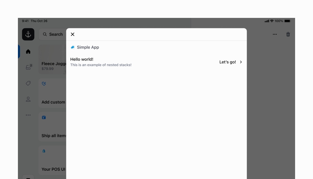
## Nested Stack
Now that we've run through a few examples of what a `Stack` can do, let's move on to something more complex. You can nest multiple Stacks of different configurations to achieve a more complex UI. In this example, we will create a row that displays several labels and an icon. This will mimic some of the basic rows that you can find across different POS screens.
Let's put the `Selectable` aside for now; we'll get to that later. If you look at the first `Stack`, this is our parent `Stack`. We've set its `direction` to `horizontal` and its `alignment` to `space-between`. Then, we've added some vertical and horizontal padding (as highlighted in the screenshot).
As you can see, there are two child Stacks. Because the parent `Stack` is set to `space-between`, these two child Stacks are spread to each end of the parent horizontal `Stack`. Both of these child Stacks occupy the amount of space they need, but not more.
The first child `Stack` is a simple vertical `Stack` that stacks the two left labels. It specifies the `spacing` to be `0.5` (the default is `1`, and this was a bit too much).
The second child `Stack` has another nested `Stack`. Let's discuss the nested `Stack` first. This is a horizontal `Stack` that lays out a text label and an icon horizontally. We then apply a bit of padding. That horizontal `Stack` is wrapped in a vertical `Stack`. The reason for this is to align the horizontal `Stack` on the center of the vertical axis, giving it a nicer appearance. Without it, the horizontal `Stack` would be located at the same height as the "Hello world!" `Text` on the left side of our row. But by specifying a `flex` of `1`, we are telling the vertical `Stack` to take as much vertical space as it can within its parent container. And then we specify an alignment of center, which lays out its child horizontal `Stack` on the center of its vertical axis.
Finally, we can return to the `Selectable`. You'll notice that we've wrapped the entire `Stack` in a `Selectable`. This makes the entire `Stack` within the `Selectable` become a tappable surface, with an `onPress` handler, which is part of the `Selectable` component. It also gives a nice highlight effect when you tap, as you can see in the screenshot.
### Examples
* #### Nested Stack
##### React
```tsx
console.log('You tapped this row!')}>
// Parent stack
// First child stack
Hello world!
This is an example of nested stacks!
// Second child stack
// Horizontal stack for the right label and chevron icon
Let's go!;
```