---
title: Text
description: >-
Text can be rendered in different sizes and colors in order to structure
content.
api_version: 2024-04
api_name: pos-ui-extensions
source_url:
html: 'https://shopify.dev/docs/api/pos-ui-extensions/2024-04/components/text'
md: 'https://shopify.dev/docs/api/pos-ui-extensions/2024-04/components/text.md'
---
# Textcomponent
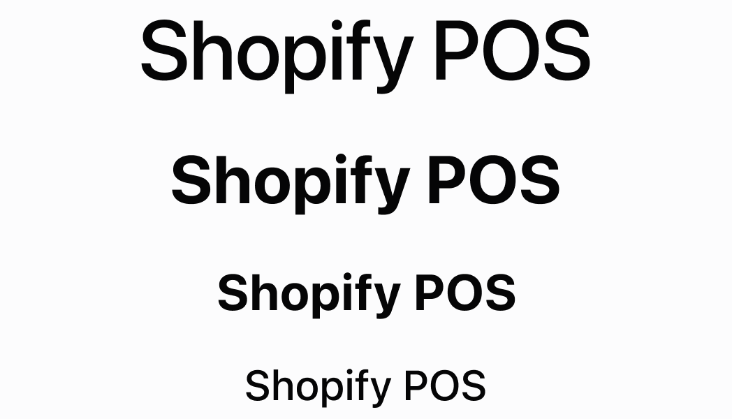
Text can be rendered in different sizes and colors in order to structure content.
## Text
* variant
TextVariant
The text variant.
* color
ColorType
The text color.
### TextVariant
```ts
'sectionHeader' | 'captionRegular' | 'captionRegularTall' | 'captionMedium' | 'body' | 'headingSmall' | 'headingLarge' | 'display'
```
### ColorType
```ts
'TextNeutral' | 'TextSubdued' | 'TextDisabled' | 'TextWarning' | 'TextCritical' | 'TextSuccess' | 'TextInteractive' | 'TextHighlight'
```
## TextVariant
`'sectionHeader' | 'captionRegular' | 'captionRegularTall' | 'captionMedium' | 'body' | 'headingSmall' | 'headingLarge' | 'display'`
## ColorType
`'TextNeutral' | 'TextSubdued' | 'TextDisabled' | 'TextWarning' | 'TextCritical' | 'TextSuccess' | 'TextInteractive' | 'TextHighlight'`
### Examples
* #### Text
##### React
```tsx
import React from 'react';
import { Screen, reactExtension, Text, ScrollView } from '@shopify/ui-extensions-react/point-of-sale';
const SmartGridModal = () => {
return (
body
captionMedium
captionRegular
captionRegularTall
display
headingLarge
headingSmall
sectionHeader
TextCritical
TextDisabled
TextHighlight
TextInteractive
TextNeutral
TextSubdued
TextSuccess
TextWarning
);
}
export default reactExtension('pos.home.modal.render', () => {
return
})
```
##### TS
```ts
import {
extension,
Screen,
ScrollView,
Text,
} from '@shopify/ui-extensions/point-of-sale';
export default extension(
'pos.home.modal.render',
(root) => {
const mainScreen = root.createComponent(
Screen,
{name: 'text', title: 'Text'},
);
const scrollView =
root.createComponent(ScrollView);
scrollView.append(
root.createComponent(
Text,
{variant: 'body'},
'body',
),
);
scrollView.append(
root.createComponent(
Text,
{variant: 'captionMedium'},
'captionMedium',
),
);
scrollView.append(
root.createComponent(
Text,
{variant: 'captionRegular'},
'captionRegular',
),
);
scrollView.append(
root.createComponent(
Text,
{variant: 'captionRegularTall'},
'captionRegularTall',
),
);
scrollView.append(
root.createComponent(
Text,
{variant: 'display'},
'display',
),
);
scrollView.append(
root.createComponent(
Text,
{variant: 'headingLarge'},
'headingLarge',
),
);
scrollView.append(
root.createComponent(
Text,
{variant: 'headingSmall'},
'headingSmall',
),
);
scrollView.append(
root.createComponent(
Text,
{variant: 'sectionHeader'},
'sectionHeader',
),
);
scrollView.append(
root.createComponent(
Text,
{
variant: 'headingSmall',
color: 'TextCritical',
},
'TextCritical',
),
);
scrollView.append(
root.createComponent(
Text,
{
variant: 'headingSmall',
color: 'TextHighlight',
},
'TextHighlight',
),
);
scrollView.append(
root.createComponent(
Text,
{
variant: 'headingSmall',
color: 'TextInteractive',
},
'TextInteractive',
),
);
scrollView.append(
root.createComponent(
Text,
{
variant: 'headingSmall',
color: 'TextNeutral',
},
'TextNeutral',
),
);
scrollView.append(
root.createComponent(
Text,
{
variant: 'headingSmall',
color: 'TextSubdued',
},
'TextSubdued',
),
);
scrollView.append(
root.createComponent(
Text,
{
variant: 'headingSmall',
color: 'TextSuccess',
},
'TextSuccess',
),
);
scrollView.append(
root.createComponent(
Text,
{
variant: 'headingSmall',
color: 'TextWarning',
},
'TextWarning',
),
);
mainScreen.append(scrollView);
root.append(mainScreen);
},
);
```
## Preview