---
title: TextArea
description: Use a text input to allow merchants to input or modify multiline text.
api_version: 2024-04
api_name: pos-ui-extensions
source_url:
html: 'https://shopify.dev/docs/api/pos-ui-extensions/2024-04/components/textarea'
md: >-
https://shopify.dev/docs/api/pos-ui-extensions/2024-04/components/textarea.md
---
# TextAreacomponent
Use a text input to allow merchants to input or modify multiline text.
## TextArea
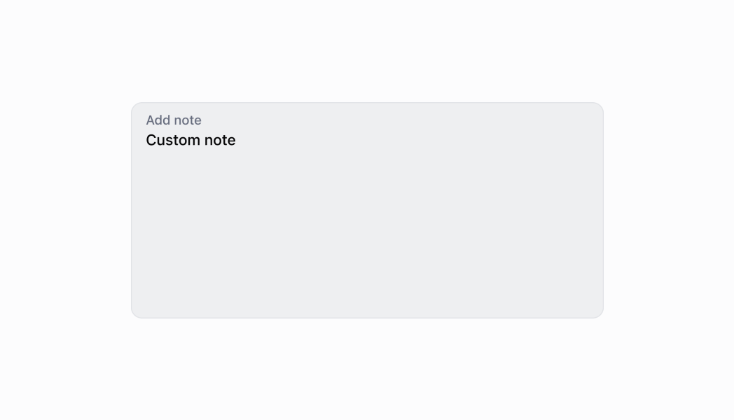
A text field which supports multiple lines.
* label
string
required
The content to use as the field label.
* rows
number
The initial number of lines to be displayed. Maximum of 8 lines.
* disabled
boolean
Whether the field can be modified.
* error
string
Indicates an error to the user. The field is given specific stylistic treatment to communicate problems that have to be resolved immediately.
* onBlur
() => void
The callback when focus is removed.
* onChange
(value: string) => void
The callback when the user has finished editing a field.
* onFocus
() => void
The callback when input is focused.
* onInput
(value: string) => void
Callback when the user makes any changes in the field. As noted in the documentation for `onChange`, you **must not** use this to update `value` — use the `onChange` callback for that purpose. Use the `onInput` prop when you need to do something as soon as the user makes a change, like clearing validation errors that apply to the field as soon as the user begins making the necessary adjustments.
* placeholder
string
A short hint that describes the expected value of the field.
* required
boolean
Whether the field needs a value.
* value
string
The current value for the field. Defaults to now. You should update this value in response to the `onChange` callback.
* helpText
string
The label under the text field which provides guidance or instructions that assist users.
* action
InputAction
A button under the text field to provide extra functionality.
* maxLength
number
The maximum number of characters allowed in the input field.
### InputAction
* label
The text displayed in the button.
```ts
string
```
* onPress
A callback to be performed.
```ts
() => void
```
* disabled
Whether the button can be pressed.
```ts
boolean
```
```ts
export interface InputAction {
/**
* The text displayed in the button.
*/
label: string;
/**
* A callback to be performed.
*/
onPress: () => void;
/**
* Whether the button can be pressed.
*/
disabled?: boolean;
}
```
### Examples
* #### Thumbnail
##### React
```tsx
import React, {useState} from 'react';
import {
TextArea,
Screen,
ScrollView,
Navigator,
reactExtension,
Text,
} from '@shopify/ui-extensions-react/point-of-sale';
const SmartGridModal = () => {
const [text, setText] = useState('');
return (
{text}
);
};
export default reactExtension(
'pos.home.modal.render',
() => ,
);
```
##### TS
```ts
import {
TextArea,
Text,
Screen,
ScrollView,
Navigator,
extension,
} from '@shopify/ui-extensions-react/point-of-sale';
export default extension(
'pos.home.modal.render',
(root) => {
const textArea = root.createComponent(
TextArea,
{
label: 'Text',
placeholder: 'Input your text here',
required: true,
value: '',
},
);
const textBox = root.createComponent(Text);
const onChangeHandler = (
newValue: string,
) => {
textArea.updateProps({value: newValue});
textBox.replaceChildren(newValue);
};
textArea.updateProps({
onChange: onChangeHandler,
});
const scrollView =
root.createComponent(ScrollView);
scrollView.append(textArea);
scrollView.append(textBox);
const screen = root.createComponent(Screen, {
name: 'TextArea',
title: 'Text Area Example',
});
screen.append(scrollView);
const navigator =
root.createComponent(Navigator);
navigator.append(screen);
root.append(navigator);
},
);
```
## Preview