---
title: TimePicker
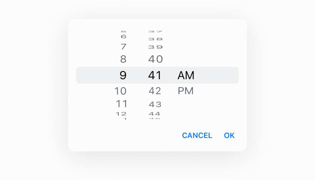
description: A component used to select a time through a dialog.
api_version: 2024-04
api_name: pos-ui-extensions
source_url:
html: 'https://shopify.dev/docs/api/pos-ui-extensions/2024-04/components/timepicker'
md: >-
https://shopify.dev/docs/api/pos-ui-extensions/2024-04/components/timepicker.md
---
# TimePickercomponent
A component used to select a time through a dialog.
## TimePicker
* visibleState
\[boolean, (visible: boolean) => void]
required
Controls the visible state, and a callback to set the visible state as false when the dialog closes.
* selected
string
Default: The current time
The selected time.
* onChange
(selected: string) => void
A callback for changes.
* is24Hour
boolean
Default: false
(Android only) Whether the clock displays in 24 hour time instead of 12 hour time.
* inputMode
"inline" | "spinner"
Default: 'inline'
Whether to display the picker in inline (clock) mode or spinner mode. iOS only supports 'spinner'.
### Examples
* #### TimePicker
##### React
```tsx
import React, {useState} from 'react';
import {
Button,
TimePicker,
Screen,
Text,
reactExtension,
} from '@shopify/ui-extensions-react/point-of-sale';
const SmartGridModal = () => {
const [date, setDate] = useState(
new Date().toDateString(),
);
const visibleState = useState(false);
return (
Selected date: {date}
);
};
export default reactExtension(
'pos.home.modal.render',
() => ,
);
```
##### TS
```ts
import {
Button,
TimePicker,
Screen,
extension,
} from '@shopify/ui-extensions/point-of-sale';
export default extension(
'pos.home.modal.render',
(root) => {
const mainScreen = root.createComponent(
Screen,
{
name: 'Home',
title: 'Home',
},
);
const button = root.createComponent(Button, {
title: 'Show',
onPress: () => {
timePicker.updateProps({
visibleState: [true, () => {}],
});
},
});
const handleOnChange = (selected) => {
timePicker.updateProps({
selected: new Date(
selected,
).toDateString(),
});
};
const timePicker = root.createComponent(
TimePicker,
{
visibleState: [false, () => {}],
onChange: handleOnChange,
selected: new Date().toDateString(),
is24Hour: true,
inputMode: 'spinner',
},
);
mainScreen.append(button);
mainScreen.append(timePicker);
root.append(mainScreen);
},
);
```
## Preview