---
title: Badge
description: >-
The `Badge` component uses color and text to communicate status information
for orders, products, customers, and other business data. Use badges to create
visual hierarchy and help merchants quickly identify important information or
status changes within your POS interface.
The component automatically adjusts its appearance based on the specified
`tone` property, ensuring consistent visual communication across the POS
interface. Badges support different sizes and can display text, numbers, or
status indicators, making them versatile for representing everything from
order counts to inventory alerts in a compact, scannable format.
api_version: 2024-07
api_name: pos-ui-extensions
source_url:
html: >-
https://shopify.dev/docs/api/pos-ui-extensions/2024-07/ui-components/feedback-and-status-indicators/badge
md: >-
https://shopify.dev/docs/api/pos-ui-extensions/2024-07/ui-components/feedback-and-status-indicators/badge.md
---
# Badge
The `Badge` component uses color and text to communicate status information for orders, products, customers, and other business data. Use badges to create visual hierarchy and help merchants quickly identify important information or status changes within your POS interface.
The component automatically adjusts its appearance based on the specified `tone` property, ensuring consistent visual communication across the POS interface. Badges support different sizes and can display text, numbers, or status indicators, making them versatile for representing everything from order counts to inventory alerts in a compact, scannable format.
## Properties
Configure the following properties on the `Badge` component.
* text
string
required
The text content displayed within the badge. Keep this concise and descriptive to clearly communicate status or category information. Examples include "Paid," "Pending," "Out of Stock," or "VIP Customer."
* variant
BadgeVariant
required
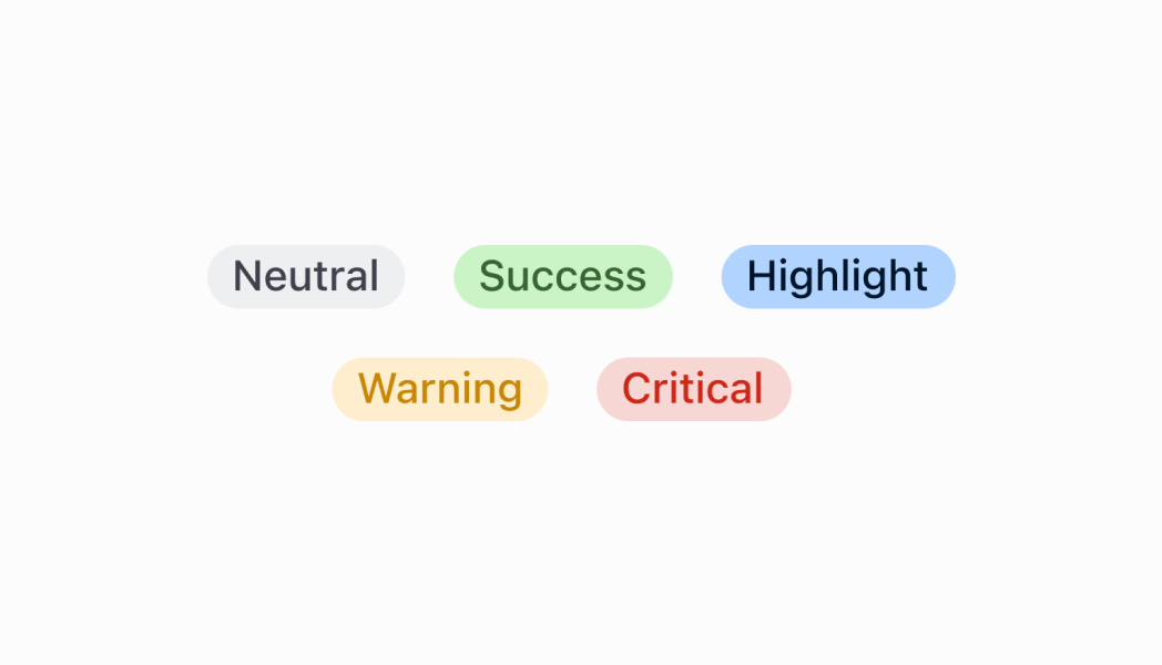
Controls the visual styling and semantic meaning of the badge. Available options:
* `'neutral'` - Gray styling for general status information that doesn't require emphasis. Use for general status updates and standard information.
* `'critical'` - Red styling for errors, failures, and urgent issues requiring immediate action. Use for urgent issues that need immediate merchant attention.
* `'warning'` - Orange styling for important notices that require merchant awareness. Use for situations that need attention but aren't critical.
* `'success'` - Green styling for positive states, completed actions, and successful operations. Use for positive outcomes and successful processes.
* `'highlight'` - Bright styling for featured content, promotions, or emphasized information. Use for featured content that should stand out.
* status
BadgeStatus
deprecated
Displays a circular status indicator alongside the badge text. Available options:
* `'empty'` - Shows an empty circle indicator
* `'partial'` - Shows a partially filled circle indicator
* `'complete'` - Shows a completely filled circle indicator
Deprecated
No longer supported as of POS 10.0.0.
### BadgeStatus
```ts
'empty' | 'partial' | 'complete'
```
### BadgeVariant
```ts
'neutral' | 'critical' | 'warning' | 'success' | 'highlight'
```
### Examples
* #### Show a status badge
##### Description
Show status information using color-coded badges. This example demonstrates rendering badges with different variants (success, warning, critical, info) and status indicators to communicate order, product, or customer status at a glance.
##### React
```tsx
import React from 'react';
import {
Badge,
Screen,
reactExtension,
} from '@shopify/ui-extensions-react/point-of-sale';
const SmartGridModal = () => {
return (
);
};
export default reactExtension(
'pos.home.modal.render',
() => ,
);
```
##### TS
```ts
import {
Badge,
Screen,
extension,
} from '@shopify/ui-extensions/point-of-sale';
export default extension(
'pos.home.modal.render',
(root) => {
const mainScreen = root.createComponent(
Screen,
{
name: 'Home',
title: 'Home',
},
);
const badge = root.createComponent(Badge, {
text: 'Badge',
variant: 'success',
status: 'complete',
});
mainScreen.append(badge);
root.append(mainScreen);
},
);
```
## Preview
## Best practices
* **Keep badge text concise and clear:** Badge text should be brief and immediately understandable. Use single words when possible, or short phrases for complex states. Avoid lengthy descriptions that might not fit well within the badge's compact design.
* **Position badges close to related content:** Place badges near the items they describe to create clear associations. For example, position order status badges next to order numbers, or inventory badges next to product names to maintain visual relationships.
* **Maintain consistency across similar contexts:** Use the same badge variants and terminology for similar states throughout your POS interface. This helps merchants develop familiarity with your status system and reduces cognitive load when processing information.
* **Use badges for status, not actions:** Badges are designed to display information and status, not to trigger actions. For interactive elements, use buttons or clickable components instead of badges to maintain clear interaction patterns.
## Limitations
* Badges aren't interactive elements—they display information but don't respond to user interactions like clicks or taps.
* The component relies on predefined variants for styling, so custom appearances may require different approaches.
* Very long text content may be truncated or cause layout issues depending on the container and screen size.