---
title: Banner
description: >-
The `Banner` component highlights important information or required actions
prominently within the POS interface. Use banners to communicate critical
updates, warnings, informational messages, or success notifications that
require merchant attention in a persistent but non-interruptive way.
The component provides persistent visibility for important messages while
remaining non-intrusive to the main workflow, with support for dismissible and
non-dismissible states. It includes automatic color coding based on message
severity and integrates with the POS design system to maintain visual
consistency across different alert types and use cases.
api_version: 2024-07
api_name: pos-ui-extensions
source_url:
html: >-
https://shopify.dev/docs/api/pos-ui-extensions/2024-07/ui-components/feedback-and-status-indicators/banner
md: >-
https://shopify.dev/docs/api/pos-ui-extensions/2024-07/ui-components/feedback-and-status-indicators/banner.md
---
# Banner
The `Banner` component highlights important information or required actions prominently within the POS interface. Use banners to communicate critical updates, warnings, informational messages, or success notifications that require merchant attention in a persistent but non-interruptive way.
The component provides persistent visibility for important messages while remaining non-intrusive to the main workflow, with support for dismissible and non-dismissible states. It includes automatic color coding based on message severity and integrates with the POS design system to maintain visual consistency across different alert types and use cases.
## Properties
Configure the following properties on the `Banner` component.
* title
string
required
The title text displayed prominently on the banner. This should be concise and clearly communicate the main message or purpose of the banner to merchants.
* variant
BannerVariant
required
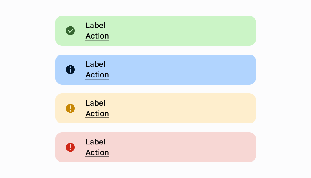
Controls the visual styling and semantic meaning of the banner. Available options:
* `'confirmation'` - Green styling for positive outcomes, successful operations, and completed actions
* `'alert'` - Orange styling for important notices and situations that require merchant attention
* `'error'` - Red styling for critical errors, failures, and urgent issues requiring immediate action
* `'information'` - Blue styling for general information, neutral updates, and helpful tips
* visible
boolean
required
Controls the visibility state of the banner. When set to `true`, the banner is displayed. When `false`, it's hidden. Use this to programmatically show or hide banners based on application state or user interactions.
* action
string
Default: 'Dismiss'
The text displayed on the action button within the banner. This provides a clear call-to-action for merchants to address the banner's message. Default is `'Dismiss'` if not specified.
* hideAction
boolean
Default: true
Determines whether the action button is visible on the banner. When set to `true`, the action button is hidden, creating a display-only banner. When `false`, the action button is shown with the specified action text. Default is `true` (action button hidden).
* onPress
() => void
Default: Callback which dismisses the banner
The callback function executed when the banner or its action button is pressed. Use this to handle user interactions such as dismissing the banner, navigating to relevant screens, or triggering specific actions. Default behavior dismisses the banner if not specified.
### BannerVariant
```ts
'confirmation' | 'alert' | 'error' | 'information'
```
### Examples
* #### Show an information banner
##### Description
Show a persistent informational message using a banner. This example demonstrates rendering a banner with different status variants (info, success, warning, critical) to communicate important information to merchants without interrupting their workflow.
##### React
```tsx
import React from 'react';
import {
Banner,
ScrollView,
Screen,
reactExtension,
} from '@shopify/ui-extensions-react/point-of-sale';
const SmartGridModal = () => {
return (
);
};
export default reactExtension(
'pos.home.modal.render',
() => ,
);
```
##### TS
```ts
import {
Banner,
ScrollView,
Screen,
extension,
} from '@shopify/ui-extensions/point-of-sale';
export default extension(
'pos.home.modal.render',
(root) => {
const screen = root.createComponent(Screen, {
title: 'Home',
name: 'Home',
});
const scrollView =
root.createComponent(ScrollView);
scrollView.appendChild(
root.createComponent(Banner, {
title: 'Information Banner',
variant: 'information',
action: 'Ok',
visible: true,
}),
);
scrollView.appendChild(
root.createComponent(Banner, {
title: 'Confirmation Banner',
variant: 'confirmation',
visible: true,
}),
);
scrollView.appendChild(
root.createComponent(Banner, {
title: 'Alert Banner',
variant: 'alert',
visible: true,
}),
);
scrollView.appendChild(
root.createComponent(Banner, {
title: 'Error Banner',
variant: 'error',
visible: true,
}),
);
screen.appendChild(scrollView);
root.appendChild(screen);
},
);
```
## Preview
## Best practices
* **Keep banner content concise and actionable:** Banner titles should be brief and clearly communicate the main message. If additional detail is needed, consider providing it through the action button or in a subsequent screen. Avoid overwhelming merchants with too much information in a single banner.
* **Manage banner visibility thoughtfully:** Use the `visible` property to control when banners appear and disappear. Show banners when relevant conditions occur and hide them once the situation is resolved or acknowledged. Avoid leaving stale banners visible that no longer apply to the current context.
* **Provide clear actions when needed:** When a banner requires user action, set `hideAction` to `false` and provide clear, actionable text for the action button. Make it obvious what steps merchants need to take to address the situation or get more information.
* **Handle banner interactions appropriately:** Implement meaningful `onPress` handlers that either resolve the banner's condition, provide more information, or guide merchants to the appropriate next steps. For simple informational banners, the default dismiss behavior may be sufficient.
* **Limit banner frequency:** Avoid showing multiple banners simultaneously or in rapid succession, as this can overwhelm the interface and reduce the effectiveness of important messages. Queue banners appropriately and prioritize critical messages.
## Limitations
* Banners require explicit visibility management through the `visible` property—they don't automatically dismiss based on time or user actions unless programmed to do so.
* The action button functionality is limited to a single action per banner—complex workflows may require navigation to dedicated screens.