---
title: Dialog
description: >-
The `Dialog` component displays a modal that requires user attention and
interaction. Use dialogs to present important information, confirm actions, or
collect input from merchants in a focused overlay that interrupts the current
workflow until resolved.
The component creates a modal overlay that focuses user attention on important
decisions or information, blocking interaction with underlying content until
dismissed. It supports various configurations including alert dialogs,
confirmation dialogs, and custom content dialogs, with built-in button layouts
and keyboard shortcuts for efficient navigation and decision-making.
`Dialog` components provide customizable button layouts and keyboard shortcuts
that follow platform conventions, ensuring merchants can quickly approve or
dismiss dialogs through familiar interaction patterns.
api_version: 2024-07
api_name: pos-ui-extensions
source_url:
html: >-
https://shopify.dev/docs/api/pos-ui-extensions/2024-07/ui-components/feedback-and-status-indicators/dialog
md: >-
https://shopify.dev/docs/api/pos-ui-extensions/2024-07/ui-components/feedback-and-status-indicators/dialog.md
---
# Dialog
The `Dialog` component displays a modal that requires user attention and interaction. Use dialogs to present important information, confirm actions, or collect input from merchants in a focused overlay that interrupts the current workflow until resolved.
The component creates a modal overlay that focuses user attention on important decisions or information, blocking interaction with underlying content until dismissed. It supports various configurations including alert dialogs, confirmation dialogs, and custom content dialogs, with built-in button layouts and keyboard shortcuts for efficient navigation and decision-making.
`Dialog` components provide customizable button layouts and keyboard shortcuts that follow platform conventions, ensuring merchants can quickly approve or dismiss dialogs through familiar interaction patterns.
## Properties
Configure the following properties on the `Dialog` component.
* actionText
string
required
The text displayed on the primary action button of the dialog. Use clear, action-oriented language like "Delete," "Confirm," "Save," or "Continue."
* isVisible
boolean
required
Controls whether the dialog is displayed or hidden. Set to `true` to show the dialog, `false` to hide it. Use this to manage dialog visibility based on user interactions or application state.
* onAction
() => void
required
The callback function executed when the primary action button is pressed. This should handle the main action the dialog is confirming or requesting.
* title
string
required
The text displayed in the title of the dialog. This should be concise and clearly communicate the purpose or action being confirmed.
* content
string
The text displayed in the body of the dialog. Use this to provide additional context, instructions, or details about the action being confirmed.
* onSecondaryAction
() => void
The callback function executed when the secondary action button is pressed. Typically used to cancel the dialog or provide an alternative action path.
* secondaryActionText
string
The text displayed on the secondary action button, typically used for "Cancel," "Go Back," or alternative actions. Only displayed when `showSecondaryAction` is `true`.
* showSecondaryAction
boolean
Controls whether a secondary action button is displayed alongside the primary action. Set to `true` to show both buttons, `false` to show only the primary action.
* type
DialogType
Determines the dialog's visual appearance and semantic meaning. Available options:
* `'default'` - Standard styling for general-purpose dialogs and confirmations
* `'alert'` - Warning styling for important notices that require attention
* `'error'` - Error styling for critical issues and failure notifications
* `'destructive'` - Destructive styling for actions that can't be undone, like deletions
### DialogType
```ts
'default' | 'alert' | 'error' | 'destructive'
```
### Examples
* #### Show a confirmation dialog
##### Description
Present important information or confirmations that require user attention. This example demonstrates a Dialog that overlays the interface to display alerts, confirmations, or input prompts with customizable buttons and actions, blocking interaction until merchants respond.
##### React
```tsx
import React, {useState} from 'react';
import {
Button,
Dialog,
Screen,
reactExtension,
} from '@shopify/ui-extensions-react/point-of-sale';
const SmartGridModal = () => {
const [visible, setVisible] = useState(false);
const handlePrimaryAction = () => {
setVisible(false);
console.log('Primary action pressed');
};
const handleSecondaryAction = () => {
setVisible(false);
console.log('Secondary action pressed');
};
return (
);
};
export default reactExtension(
'pos.home.modal.render',
() => ,
);
```
##### TS
```ts
import {
Button,
Dialog,
Screen,
extension,
} from '@shopify/ui-extensions/point-of-sale';
export default extension(
'pos.home.modal.render',
(root) => {
const mainScreen = root.createComponent(
Screen,
{
name: 'Dialog',
title: 'Dialog Title',
},
);
const button = root.createComponent(Button, {
title: 'Show dialog',
onPress: () =>
dialog.updateProps({visible: true}),
});
const handlePrimaryAction = () => {
dialog.updateProps({visible: false});
console.log('Primary action pressed');
};
const handleSecondaryAction = () => {
dialog.updateProps({visible: false});
console.log('Secondary action pressed');
};
const dialog = root.createComponent(Dialog, {
type: 'error',
title: 'Dialog title',
content: 'Dialog content',
actionText: 'Primary action',
onAction: handlePrimaryAction,
secondaryActionText: 'Secondary action',
onSecondaryAction: handleSecondaryAction,
isVisible: false,
});
mainScreen.append(button);
mainScreen.append(dialog);
root.append(mainScreen);
},
);
```
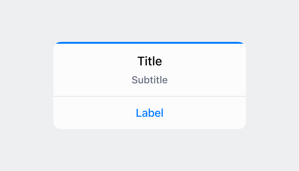
## Preview
## Best practices
* **Write clear, concise content:** Use brief, action-oriented titles and essential context without overwhelming users.
* **Use meaningful button text:** Use specific text like "Delete Order" and "Keep Order" rather than generic "OK" and "Cancel."
* **Frame confirmations as questions:** For confirmations, use questions like "Delete this order?" rather than "Are you sure?"
* **Use destructive type for irreversible actions:** Set `destructive` for deletions to display red buttons as visual warnings.
* **Use "OK" for informational dialogs:** For acknowledgment-only dialogs, use a single "OK" button.
* **Structure error dialogs effectively:** Use the header to communicate the problem, body and button to communicate the solution.
## Limitations
* Content space is limited, so keep dialog text concise and avoid lengthy explanations that might not fit properly on smaller POS displays.
* Dialogs require explicit visibility management through the `isVisible` property and don't automatically dismiss based on time or external events.
* Multiple dialogs can't be displayed simultaneously—showing a new dialog while another is visible may cause unexpected behavior.