---
title: EmailField
description: >-
The `EmailField` component captures email address input from customers with
built-in validation. Use it to collect email information in forms, customer
profiles, or contact workflows.
The component includes built-in email format validation using standard email
patterns to ensure data quality. It provides real-time feedback on invalid
entries and supports features like autocomplete and keyboard optimization for
email input, helping merchants quickly capture valid customer contact
information during checkout or registration workflows.
`EmailField` components integrate with browser autocomplete features to speed
up email entry by suggesting previously used addresses, significantly reducing
typing time during customer registration workflows.
api_version: 2024-07
api_name: pos-ui-extensions
source_url:
html: >-
https://shopify.dev/docs/api/pos-ui-extensions/2024-07/ui-components/forms/emailfield
md: >-
https://shopify.dev/docs/api/pos-ui-extensions/2024-07/ui-components/forms/emailfield.md
---
# EmailField
The `EmailField` component captures email address input from customers with built-in validation. Use it to collect email information in forms, customer profiles, or contact workflows.
The component includes built-in email format validation using standard email patterns to ensure data quality. It provides real-time feedback on invalid entries and supports features like autocomplete and keyboard optimization for email input, helping merchants quickly capture valid customer contact information during checkout or registration workflows.
`EmailField` components integrate with browser autocomplete features to speed up email entry by suggesting previously used addresses, significantly reducing typing time during customer registration workflows.
## Properties
Configure the following properties on the `EmailField` component.
* label
string
required
The content to use as the field label that describes the text information being requested.
* action
InputAction
A button configuration object displayed under the text field to provide extra functionality.
* disabled
boolean
Controls whether the field can be modified. When `true`, the field is disabled and users cannot edit its value.
* error
string
An error message that indicates a problem to the user. The field is given specific stylistic treatment to communicate issues that must be resolved immediately.
* helpText
string
The label text displayed under the field that provides guidance or instructions to assist users.
* maxLength
number
The maximum number of characters allowed in the text field.
* onBlur
() => void
A callback function executed when focus is removed from the field.
* onChange
(value: string) => void
A callback function executed when the user has finished editing the field, receiving the new text value as a parameter. You should update the `value` property in response to this callback.
* onFocus
() => void
A callback function executed when the field receives focus.
* onInput
(value: string) => void
A callback function executed immediately when the user makes any change in the field. Use this for real-time feedback, such as clearing validation errors as soon as the user begins making corrections. Don't use this to update the `value` property—the `onChange` callback is the appropriate handler for updating the field's value.
* placeholder
string
A short hint that describes the expected value of the field.
* required
boolean
Whether the field needs a value for form submission or validation purposes.
* value
string
The current text value for the field. If omitted, the field will be empty. You should update the `value` property in response to the `onChange` callback.
### InputAction
Defines the configuration object for action buttons displayed below input fields to provide extra functionality.
* disabled
Whether the action button can be pressed.
```ts
boolean
```
* label
The text displayed on the action button.
```ts
string
```
* onPress
A callback function executed when the action button is pressed.
```ts
() => void
```
```ts
export interface InputAction {
/**
* The text displayed on the action button.
*/
label: string;
/**
* A callback function executed when the action button is pressed.
*/
onPress: () => void;
/**
* Whether the action button can be pressed.
*/
disabled?: boolean;
}
```
### Examples
* #### Capture email input with validation
##### Description
Capture customer email addresses with built-in format validation. This example shows how to implement an EmailField that validates email syntax in real-time, provides autocomplete support, and optimizes the keyboard for email entry, ensuring accurate customer contact information.
##### React
```tsx
import React, {useState} from 'react';
import {
EmailField,
Screen,
ScrollView,
Navigator,
Text,
reactExtension,
} from '@shopify/ui-extensions-react/point-of-sale';
const SmartGridModal = () => {
const [email, setEmail] = useState('');
return (
setEmail(''),
}}
/>
Entered Email: {email}
);
};
export default reactExtension('pos.home.modal.render', () => (
));
```
##### TS
```ts
import {
Navigator,
Screen,
ScrollView,
Text,
EmailField,
extension,
} from '@shopify/ui-extensions/point-of-sale';
export default extension('pos.home.modal.render', (root, api) => {
const clearHandler = () => {
emailField.updateProps({value: ''});
textBox.replaceChildren('');
};
const emailField = root.createComponent(EmailField, {
label: 'Email',
value: '',
action: {label: 'Clear', onPress: clearHandler},
});
const textBox = root.createComponent(Text);
const onChangeHandler = (newValue: string) => {
emailField.updateProps({value: newValue});
const textContent = `Selected Date: ${newValue}`;
textBox.replaceChildren(textContent);
};
emailField.updateProps({onChange: onChangeHandler});
const scrollView = root.createComponent(ScrollView);
scrollView.append(emailField);
scrollView.append(textBox);
const screen = root.createComponent(Screen, {
name: 'DateField',
title: 'Date Field Example',
});
screen.append(scrollView);
const navigator = root.createComponent(Navigator);
navigator.append(screen);
root.append(navigator);
});
```
## Preview
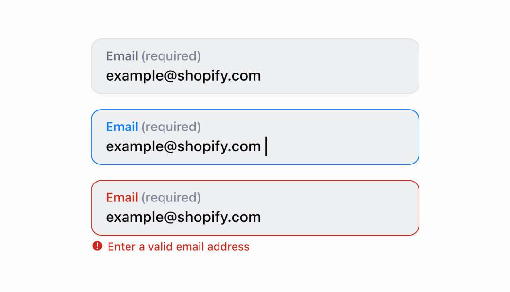
## Best practices
* **Provide helpful guidance with placeholder and helpText:** Use placeholder text for format examples like `customer@example.com` and the `helpText` property for additional context like "Required for digital receipts" or "We'll send order updates to this address."
* **Implement proper email validation:** Use the `error` property to display validation messages when users enter invalid email formats. Provide clear, actionable error messages like "Please enter a valid email address" that help users correct their input.
* **Use the email-optimized keyboard:** `EmailField` automatically display the email-optimized keyboard on mobile devices with easy access to `@` and domain symbols. This improves input speed and reduces errors on touch devices.
* **Use the required property appropriately:** Set `required` to `true` for fields that must have a value. While this adds semantic meaning, you must still implement validation logic and use the `error` property to display validation errors to users.
* **Add action buttons for enhanced functionality:** Use the `action` property to provide helpful actions like "Validate Email," "Use Default Email," or "Clear Field." This enhances usability by providing quick access to common operations.
* **Differentiate between input and change callbacks:** Use `onInput` for immediate feedback like clearing validation errors as soon as users start typing. Reserve `onChange` for updating the field value when editing is complete. Never use `onInput` to update the `value` property.
## Limitations
* `EmailField` provides the input interface but doesn't perform automatic email validation—you must implement validation logic and use the `error` property to display validation results.
* The `required` property adds semantic meaning only—it doesn't trigger automatic error display or prevent form submission without additional validation logic.
* Action buttons are limited to simple press callbacks—complex action workflows require custom implementation or additional components.