---
title: NumberField
description: >-
The `NumberField` component captures numeric input with built-in validation.
Use it to collect quantity, price, or other numeric information with proper
validation.
The component includes built-in number validation, optional min/max
constraints, and step increments to ensure accurate numeric data entry. It
supports various number formats including integers and decimals, with
validation feedback to prevent entry errors during high-volume retail
operations.
api_version: 2024-07
api_name: pos-ui-extensions
source_url:
html: >-
https://shopify.dev/docs/api/pos-ui-extensions/2024-07/ui-components/forms/numberfield
md: >-
https://shopify.dev/docs/api/pos-ui-extensions/2024-07/ui-components/forms/numberfield.md
---
# NumberField
The `NumberField` component captures numeric input with built-in validation. Use it to collect quantity, price, or other numeric information with proper validation.
The component includes built-in number validation, optional min/max constraints, and step increments to ensure accurate numeric data entry. It supports various number formats including integers and decimals, with validation feedback to prevent entry errors during high-volume retail operations.
## Properties
Configure the following properties on the `NumberField` component.
* label
string
required
The content to use as the field label that describes the text information being requested.
* action
InputAction
A button configuration object displayed under the text field to provide extra functionality.
* disabled
boolean
Controls whether the field can be modified. When `true`, the field is disabled and users cannot edit its value.
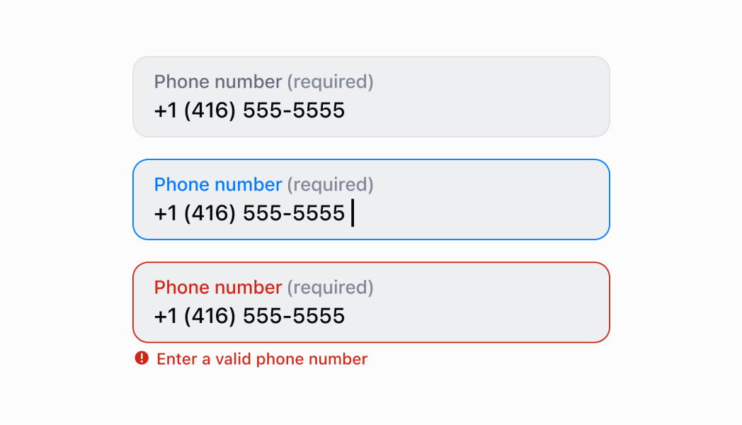
* error
string
An error message that indicates a problem to the user. The field is given specific stylistic treatment to communicate issues that must be resolved immediately.
* helpText
string
The label text displayed under the field that provides guidance or instructions to assist users.
* inputMode
'decimal' | 'numeric'
The virtual keyboard layout to display:
* `decimal`: A keyboard layout that includes decimal point support for entering fractional numbers, prices, or measurements with decimal precision.
* `numeric`: A keyboard layout optimized for integer-only entry without decimal point support, ideal for quantities, counts, or whole number values.
* max
number
The highest decimal or integer to be accepted for the field. Users can still input higher numbers by keyboard—you must add appropriate validation logic.
* maxLength
number
The maximum number of characters allowed in the text field.
* min
number
The lowest decimal or integer to be accepted for the field. Users can still input lower numbers by keyboard—you must add appropriate validation logic.
* onBlur
() => void
A callback function executed when focus is removed from the field.
* onChange
(value: string) => void
A callback function executed when the user has finished editing the field, receiving the new text value as a parameter. You should update the `value` property in response to this callback.
* onFocus
() => void
A callback function executed when the field receives focus.
* onInput
(value: string) => void
A callback function executed immediately when the user makes any change in the field. Use this for real-time feedback, such as clearing validation errors as soon as the user begins making corrections. Don't use this to update the `value` property—the `onChange` callback is the appropriate handler for updating the field's value.
* placeholder
string
A short hint that describes the expected value of the field.
* required
boolean
Whether the field needs a value for form submission or validation purposes.
* value
string
The current text value for the field. If omitted, the field will be empty. You should update the `value` property in response to the `onChange` callback.
### InputAction
Defines the configuration object for action buttons displayed below input fields to provide extra functionality.
* disabled
Whether the action button can be pressed.
```ts
boolean
```
* label
The text displayed on the action button.
```ts
string
```
* onPress
A callback function executed when the action button is pressed.
```ts
() => void
```
```ts
export interface InputAction {
/**
* The text displayed on the action button.
*/
label: string;
/**
* A callback function executed when the action button is pressed.
*/
onPress: () => void;
/**
* Whether the action button can be pressed.
*/
disabled?: boolean;
}
```
### Examples
* #### Capture numeric input with validation
##### Description
Collect numeric data with built-in validation and constraints. This example shows how to implement a NumberField that supports integers and decimals, enforces min/max values, and provides step increments for quantity, price, or measurement inputs.
##### React
```tsx
import React, {useState} from 'react';
import {
NumberField,
Screen,
ScrollView,
Navigator,
Text,
reactExtension,
} from '@shopify/ui-extensions-react/point-of-sale';
const SmartGridModal = () => {
const [number, setNumber] = useState('');
return (
setNumber(''),
}}
/>
Entered Value: {number}
);
};
export default reactExtension('pos.home.modal.render', () => (
));
```
##### TS
```ts
import {
Navigator,
Screen,
ScrollView,
Text,
NumberField,
extension,
} from '@shopify/ui-extensions/point-of-sale';
export default extension('pos.home.modal.render', (root, api) => {
const clearHandler = () => {
numberField.updateProps({value: ''});
textBox.replaceChildren('');
};
const numberField = root.createComponent(NumberField, {
label: 'Number',
placeholder: '1234',
helpText: 'Enter a numeric value.',
value: '',
action: {label: 'Clear', onPress: clearHandler},
});
const textBox = root.createComponent(Text);
const onChangeHandler = (newValue: string) => {
numberField.updateProps({value: newValue});
const textContent = `Selected Date: ${newValue}`;
textBox.replaceChildren(textContent);
};
numberField.updateProps({onChange: onChangeHandler});
const scrollView = root.createComponent(ScrollView);
scrollView.append(numberField);
scrollView.append(textBox);
const screen = root.createComponent(Screen, {
name: 'NumberField',
title: 'Number Field Example',
});
screen.append(scrollView);
const navigator = root.createComponent(Navigator);
navigator.append(screen);
root.append(navigator);
});
```
## Preview
## Best practices
* **Select the right input mode for your data type:** Use `'decimal'` input mode for prices, measurements, or any values requiring decimal precision. Use `'numeric'` for quantities, counts, or integer values where decimal points aren't needed. This optimizes the keyboard layout for the expected input.
* **Provide helpful guidance with helpText:** Use the `helpText` property to explain numeric constraints, valid ranges, units, or formatting expectations. For example, "Enter a quantity between 1 and 999" or "Price in dollars with two decimal places."
* **Implement proper validation logic:** While `min`/`max` properties provide guidance, they don't prevent invalid keyboard input. Implement validation in your `onChange` callback to check bounds, format, and other requirements, then display errors using the `error` property.
* **Use action buttons for enhanced functionality:** Use the `action` property to provide helpful actions like "Clear Field," "Set to Minimum," or "Calculate Total." This enhances usability by providing quick access to common numeric operations.
## Limitations
* `NumberField` provides numeric input but doesn't enforce `min`/`max` constraints for keyboard input—you must implement validation logic to enforce bounds and display appropriate errors.
* The `required` property adds semantic meaning only—it doesn't trigger automatic error display or prevent form submission without additional validation logic.
* Action buttons are limited to simple press callbacks—complex action workflows require custom implementation or additional components.