---
title: SearchBar
description: >-
The `SearchBar` component provides a specialized input field for search
functionality with built-in search button and text change handling. Use it to
enable product searches, customer lookups, or other search-driven workflows in
POS interfaces.
The component includes a dedicated search input with built-in search icon,
clear button, and cancel functionality following platform-specific search
patterns. It provides visual feedback for search states, supports voice input
where available, and integrates with platform search behaviors to deliver
familiar search experiences on both iOS and Android POS devices.
`SearchBar` components maintain search focus during typing and automatically
dismisses the keyboard when search is submitted, streamlining the search
workflow and reducing unnecessary interaction steps.
api_version: 2024-07
api_name: pos-ui-extensions
source_url:
html: >-
https://shopify.dev/docs/api/pos-ui-extensions/2024-07/ui-components/navigation-and-content/searchbar
md: >-
https://shopify.dev/docs/api/pos-ui-extensions/2024-07/ui-components/navigation-and-content/searchbar.md
---
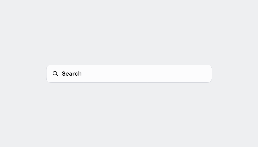
# SearchBar
The `SearchBar` component provides a specialized input field for search functionality with built-in search button and text change handling. Use it to enable product searches, customer lookups, or other search-driven workflows in POS interfaces.
The component includes a dedicated search input with built-in search icon, clear button, and cancel functionality following platform-specific search patterns. It provides visual feedback for search states, supports voice input where available, and integrates with platform search behaviors to deliver familiar search experiences on both iOS and Android POS devices.
`SearchBar` components maintain search focus during typing and automatically dismisses the keyboard when search is submitted, streamlining the search workflow and reducing unnecessary interaction steps.
Support
Targets (6)
### Supported targets
* [pos.customer-details.action.render](https://shopify.dev/docs/api/pos-ui-extensions/2024-07/targets/customer-details#customer-details-action-modal-)
* [pos.draft-order-details.action.render](https://shopify.dev/docs/api/pos-ui-extensions/2024-07/targets/draft-order-details#draft-order-details-action-modal-)
* [pos.home.modal.render](https://shopify.dev/docs/api/pos-ui-extensions/2024-07/targets/home-screen#home-screen-action-modal-)
* [pos.order-details.action.render](https://shopify.dev/docs/api/pos-ui-extensions/2024-07/targets/order-details#order-details-action-modal-)
* [pos.product-details.action.render](https://shopify.dev/docs/api/pos-ui-extensions/2024-07/targets/product-details#product-details-action-modal-)
* [pos.purchase.post.action.render](https://shopify.dev/docs/api/pos-ui-extensions/2024-07/targets/post-purchase#post-purchase-action-modal-)
#### Use cases
* **Product search:** Enable product searches using the Product Search API for inventory lookup.
* **Customer search:** Provide customer search for account lookup or order history access.
* **Search workflows:** Create search-driven workflows for finding orders or historical data.
* **Real-time search:** Implement real-time search with autocomplete or instant filtering.
## Examples
### Search for products
Provide search functionality with a specialized input field. This example demonstrates a SearchBar with built-in search button, clear functionality, and text change handling, enabling product searches, customer lookups, or other search-driven POS workflows.
## Search for products
### Examples
* #### Search for products
##### Description
Provide search functionality with a specialized input field. This example demonstrates a SearchBar with built-in search button, clear functionality, and text change handling, enabling product searches, customer lookups, or other search-driven POS workflows.
##### React
```tsx
import React from 'react';
import {
reactExtension,
Text,
Screen,
SearchBar,
ScrollView,
} from '@shopify/ui-extensions-react/point-of-sale';
const SmartGridModal = () => {
const [searched, setSearched] =
React.useState('');
return (
Searched: {searched}
);
};
export default reactExtension(
'pos.home.modal.render',
() => {
return ;
},
);
```
##### TS
```ts
import {
extension,
Screen,
ScrollView,
SearchBar,
Text,
} from '@shopify/ui-extensions/point-of-sale';
export default extension(
'pos.home.modal.render',
(root) => {
const mainScreen = root.createComponent(
Screen,
{name: 'SearchBar', title: 'SearchBar'},
);
const scrollView =
root.createComponent(ScrollView);
const text = root.createComponent(Text, null);
const onSearch = (value: string) => {
text.replaceChildren(`Searched: ${value}`);
};
const searchBar = root.createComponent(
SearchBar,
{
onSearch,
editable: true,
initialValue: 'initial value',
placeholder: 'placeholder',
},
);
scrollView.append(searchBar);
scrollView.append(text);
mainScreen.append(scrollView);
root.append(mainScreen);
},
);
```
## Properties
Configure the following properties on the `SearchBar` component.
* onSearch
(value: string) => void
required
A callback function executed when the search button is tapped, receiving the current search text as a parameter.
* editable
boolean
Whether the text can be changed by user input.
* initialValue
string
The initial text value displayed in the search bar when first rendered. This differs from placeholder text which appears when the field is empty.
* onBlur
() => void
A callback function executed when focus is removed from the search input field.
* onFocus
() => void
A callback function executed when the search input field receives focus.
* onTextChange
(value: string) => void
A callback function executed whenever the text value changes, receiving the new text value as a parameter for real-time search or filtering.
* placeholder
string
The placeholder text displayed in the search bar when no text is entered, providing guidance about what users can search for.
## Best practices
* **Implement sticky behavior for persistent access:** Make search bars sticky so they remain at the top of the page when merchants scroll.
* **Handle focus states with proper visual feedback:** When merchants select the search bar, ensure it enters the focused state with a blue border and the search icon changes to a back arrow.
* **Optimize inline search bar positioning:** For inline search bars, entering the focused state should move the search bar to the top of the screen for better visibility and easier interaction, especially when the on-screen keyboard appears.
* **Manage search query states effectively:** When merchants start entering text, transition the search bar to the filled state. Implement clear functionality (X button) that deletes the search query but keeps the search bar in focused state, allowing immediate entry of new search terms.
* **Write effective placeholder text:** Use the pattern "Search `{items}`" for placeholder text (for example, "Search staff" not just "Search"). This clearly communicates what type of content can be searched and sets proper user expectations.
* **Implement responsive search patterns:** Use `onTextChange` for real-time search experiences like autocomplete or instant filtering, and `onSearch` for explicit search actions. Consider implementing debouncing for text change events to avoid excessive API calls during typing.
## Limitations
* `SearchBar` provides the input interface but requires integration with the Product Search API or custom search logic for actual search functionality.
* The component handles basic text input and search button interactions—advanced search features like filters, sorting controls, or search history require additional components or custom implementation.
* Search result display and management are not included in the `SearchBar` component—use other components like List or custom layouts to present search results to users.