---
title: Section
description: >-
The `Section` component groups related content into clearly-defined thematic
areas. Sections provide visual boundaries and optional actions to organize
content within POS interfaces.
Use sections to create structured layouts with clear titles and actionable
elements that help users navigate and interact with grouped content.
The component supports customizable section dividers and spacing between
sections, allowing you to create visual rhythm and hierarchy that guides
merchants through complex forms and settings interfaces. Sections can be
nested to create hierarchical content organization, with each level
automatically adjusting its visual styling and semantic meaning to maintain
clear structure and relationships throughout complex interfaces.
The `Section` component no longer has a border as of POS version 10.0.0.
api_version: 2024-07
api_name: pos-ui-extensions
source_url:
html: >-
https://shopify.dev/docs/api/pos-ui-extensions/2024-07/ui-components/layout-and-structure/section
md: >-
https://shopify.dev/docs/api/pos-ui-extensions/2024-07/ui-components/layout-and-structure/section.md
---
# Section
The `Section` component groups related content into clearly-defined thematic areas. Sections provide visual boundaries and optional actions to organize content within POS interfaces.
Use sections to create structured layouts with clear titles and actionable elements that help users navigate and interact with grouped content.
The component supports customizable section dividers and spacing between sections, allowing you to create visual rhythm and hierarchy that guides merchants through complex forms and settings interfaces. Sections can be nested to create hierarchical content organization, with each level automatically adjusting its visual styling and semantic meaning to maintain clear structure and relationships throughout complex interfaces.
The `Section` component no longer has a border as of POS version 10.0.0.
Support
Targets (6)
### Supported targets
* [pos.customer-details.action.render](https://shopify.dev/docs/api/pos-ui-extensions/2024-07/targets/customer-details#customer-details-action-modal-)
* [pos.draft-order-details.action.render](https://shopify.dev/docs/api/pos-ui-extensions/2024-07/targets/draft-order-details#draft-order-details-action-modal-)
* [pos.home.modal.render](https://shopify.dev/docs/api/pos-ui-extensions/2024-07/targets/home-screen#home-screen-action-modal-)
* [pos.order-details.action.render](https://shopify.dev/docs/api/pos-ui-extensions/2024-07/targets/order-details#order-details-action-modal-)
* [pos.product-details.action.render](https://shopify.dev/docs/api/pos-ui-extensions/2024-07/targets/product-details#product-details-action-modal-)
* [pos.purchase.post.action.render](https://shopify.dev/docs/api/pos-ui-extensions/2024-07/targets/post-purchase#post-purchase-action-modal-)
#### Use cases
* **Form organization:** Organize complex forms into logical groups with clear titles.
* **Visual boundaries:** Create visual boundaries between different types of content.
* **Grouped settings:** Group related settings into distinct areas users can easily scan.
* **Contextual actions:** Provide contextual actions through section action buttons.
## Examples
### Group related content
Group related content with clear visual boundaries and optional actions. This example shows how to use Section components to create structured layouts with titles and headers that organize content into logical thematic areas for better navigation and comprehension.
## Group related content
### Examples
* #### Group related content
##### Description
Group related content with clear visual boundaries and optional actions. This example shows how to use Section components to create structured layouts with titles and headers that organize content into logical thematic areas for better navigation and comprehension.
##### React
```tsx
import React from 'react'
import { Text, Navigator, Screen, ScrollView, Stack, reactExtension, Section, useApi, Selectable } from '@shopify/ui-extensions-react/point-of-sale'
const ModalComponent = () => {
const api = useApi<'pos.home.modal.render'>();
return (
api.toast.show('Hello world!')}}>
api.toast.show('Item 1!')}>
Item 1
api.toast.show('Item 2!')}>
Item 2
api.toast.show('Item 3!')}>
Item 3
api.toast.show('Item 4!')}>
Item 4
)
}
export default reactExtension('pos.home.modal.render', () => {
return
})
```
##### TS
```ts
import {
extension,
Screen,
ScrollView,
Stack,
Navigator,
Text,
Section,
Selectable,
} from '@shopify/ui-extensions/point-of-sale';
export default extension(
'pos.home.modal.render',
(root, api) => {
const screen = root.createComponent(Screen, {
name: 'Section',
title: 'Section',
});
const scrollView =
root.createComponent(ScrollView);
const section = root.createComponent(
Section,
{
title: 'Section',
action: {
title: 'Show toast',
onPress: () =>
api.toast.show('Hello world!'),
},
},
);
for (let i = 1; i < 5; i++) {
const selectable = root.createComponent(
Selectable,
{
onPress: () =>
api.toast.show(`Item ${i}!`),
},
);
const stack = root.createComponent(Stack, {
paddingVertical: 'Small',
direction: 'vertical',
paddingHorizontal: 'Small',
});
const textElement =
root.createComponent(Text);
textElement.append(`Item ${i}`);
stack.append(textElement);
selectable.append(stack);
section.append(selectable);
}
const rootStack = root.createComponent(
Stack,
{
paddingHorizontal: 'HalfPoint',
direction: 'vertical',
},
);
rootStack.append(section);
scrollView.append(rootStack);
screen.append(scrollView);
const navigator =
root.createComponent(Navigator);
navigator.append(screen);
root.append(navigator);
},
);
```
## Properties
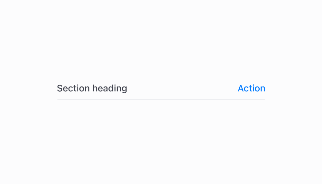
Configure the following properties on the `Section` component.
* action
SectionHeaderAction
An optional action configuration displayed in the top right of the section that can be triggered by user interaction.
* title
string
The title text displayed at the top of the section to describe its content.
### SectionHeaderAction
Defines the configuration object for the action button displayed within the section header.
* onPress
A callback function that is executed when the action button is pressed by the user.
```ts
() => void
```
* title
The title text describing the action that will be displayed on the button.
```ts
string
```
```ts
export interface SectionHeaderAction {
/**
* The title text describing the action that will be displayed on the button.
*/
title: string;
/**
* A callback function that is executed when the action button is pressed by the user.
*/
onPress: () => void;
}
```
## Best practices
* **Design meaningful action buttons:** When providing an action, use clear and descriptive button titles that indicate exactly what will happen when pressed. Avoid generic terms like "Action" in favor of specific actions like "Edit Settings" or "Add Item."
* **Group related content logically:** Use sections to group content that belongs together conceptually. Each section should contain related information or controls that users would expect to find together, creating intuitive content organization.
* **Implement responsive action callbacks:** Consider showing loading states or confirmation messages when actions require network requests or significant processing time.
* **Maintain consistent section patterns:** Establish consistent patterns for how you use sections across your POS UI extension. Similar types of content should be structured similarly, helping users develop familiarity with your interface organization.
* **Consider visual hierarchy and spacing:** Use sections strategically to create clear visual hierarchy in your interface.
## Limitations
* Section content is determined by child components rather than direct content properties—organize your content structure through component composition.
* Only one action button is supported per section to maintain clean, focused interfaces that integrate well with existing POS workflows.
* The component's visual styling and layout are controlled by the POS design system—custom section styling beyond the provided properties is not supported.