---
title: Stack
description: >-
The `Stack` component organizes elements horizontally or vertically along the
block or inline axis. Use it to structure layouts, group related components,
or control spacing between elements with flexible alignment options.
The component simplifies layout creation by automatically managing spacing
between child elements through gap properties, eliminating the need for manual
margin management. It supports both horizontal and vertical arrangements,
flexible alignment options, and wrapping behavior, making it the foundation
for building consistent, responsive layouts throughout POS extensions.
`Stack` components support responsive gap values that automatically adjust
spacing based on screen size, ensuring layouts remain visually balanced and
maintain proper element separation across different devices.
api_version: 2024-07
api_name: pos-ui-extensions
source_url:
html: >-
https://shopify.dev/docs/api/pos-ui-extensions/2024-07/ui-components/layout-and-structure/stack
md: >-
https://shopify.dev/docs/api/pos-ui-extensions/2024-07/ui-components/layout-and-structure/stack.md
---
# Stack
The `Stack` component organizes elements horizontally or vertically along the block or inline axis. Use it to structure layouts, group related components, or control spacing between elements with flexible alignment options.
The component simplifies layout creation by automatically managing spacing between child elements through gap properties, eliminating the need for manual margin management. It supports both horizontal and vertical arrangements, flexible alignment options, and wrapping behavior, making it the foundation for building consistent, responsive layouts throughout POS extensions.
`Stack` components support responsive gap values that automatically adjust spacing based on screen size, ensuring layouts remain visually balanced and maintain proper element separation across different devices.
## Properties
Configure the following properties on the `Stack` component.
* direction
'vertical' | 'horizontal'
required
The direction of the stack.
* alignment
\| 'flex-end' | 'center' | 'flex-start' | 'space-around' | 'space-between' | 'space-evenly'
Default: 'flex-end'
The alignment of the children along the cross axis.
* flex
number
The flex value for the stack.
* flexChildren
boolean
Whether the children should be stretched to fill the cross axis.
* flexWrap
'wrap' | 'nowrap' | 'wrap-reverse'
Wrap behavior for the children of the stack.
* paddingHorizontal
HorizontalSpacing
The horizontal padding around the stack.
* paddingVertical
VerticalSpacing
The vertical padding around the stack.
* spacing
Spacing
Default: 1
The spacing between each child in the stack.
### HorizontalSpacing
```ts
'HalfPoint' | 'ExtraSmall' | 'Small' | 'Medium' | 'Large' | 'ExtraLarge' | 'ExtraExtraLarge'
```
### VerticalSpacing
```ts
'HalfPoint' | 'ExtraSmall' | 'Small' | 'Medium' | 'Large' | 'ExtraLarge'
```
### Spacing
```ts
0.5 | 1 | 2 | 3 | 4 | 5 | 6 | 7 | 8 | 9 | 10 | 11 | 13 | 16
```
### Examples
* #### Layout elements horizontally or vertically
##### Description
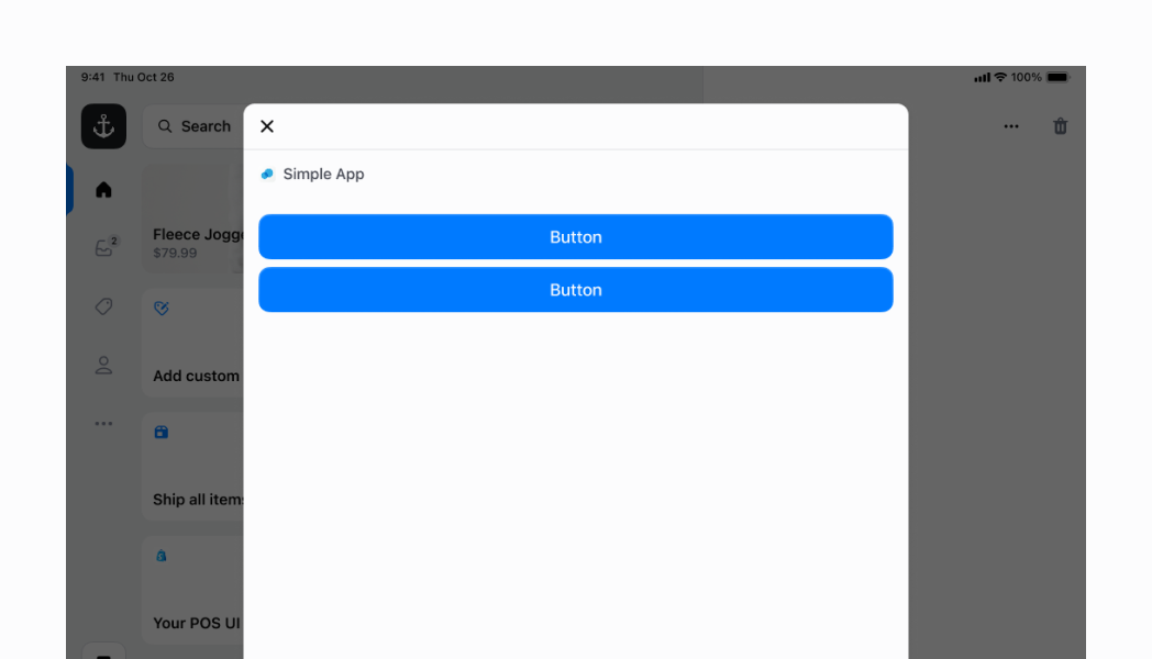
Organize UI elements horizontally or vertically with automatic spacing management. This example shows a Stack with default values, demonstrating how to structure layouts and control element spacing through gap properties without manual margin management.
##### React
```tsx
;
```
## Preview

## Best practices
* **Apply consistent spacing using numeric values:** Use the predefined numeric spacing values (0.5 through 16) to maintain consistency across your interface. Start with 3 or 4 for standard spacing and adjust up or down based on your content hierarchy needs.
* **Use semantic padding for consistent layouts:** Apply `paddingVertical` and `paddingHorizontal` using the semantic spacing values (`HalfPoint` through `ExtraLarge`) to create consistent padding patterns that align with the POS design system.
* **Use alignment properties for professional layouts:** Use the `alignment` property to control cross-axis positioning. Choose `'flex-start'` for natural alignment, `'center'` for centered layouts, or distribution values like `'space-between'` for evenly distributed content.
* **Control flex behavior strategically:** Use the `flex` property to make `Stack` components grow or shrink within their containers, and `flexChildren` to stretch child elements to fill available cross-axis space when needed.
* **Manage wrapping behavior appropriately:** Use `flexWrap` to control how children behave when they exceed container space. Choose `'wrap'` for responsive layouts, `'nowrap'` for fixed layouts, or `'wrap-reverse'` for specialized arrangements.
## Limitations
* Direction is limited to vertical and horizontal orientations—diagonal or complex arrangements require multiple nested `Stack` components or alternative layout approaches.
* Spacing values are predefined numeric constants—custom spacing values outside the provided scale aren't supported to maintain design consistency.
* Flex behavior follows standard CSS flexbox rules—complex layout requirements may need multiple `Stack` components with different configurations for optimal results.
## Examples
Learn how to create flexible layouts with inline and block stacks, control alignment, and nest stacks for complex UIs.
### Examples
* #### Arrange elements vertically
##### Description
Stack elements vertically by setting \`direction="block"\`. This creates a vertical layout with automatic gap spacing between elements, ideal for forms, lists, or any vertically-stacked content.
##### React
```tsx
;
```
* #### Center content on both axes
##### Description
Center elements both horizontally and vertically using \`justifyContent="center"\`, \`alignContent="center"\`, and \`alignItems="center"\` with custom \`blockSize="50%"\` and \`inlineSize="100%"\`. All three alignment properties work together to create perfectly centered content on both axes.
##### React
```tsx
;
```
* #### Center elements horizontally
##### Description
Center elements horizontally using \`justifyContent="center"\` with \`flexChildren={false}\` (default). This positions children in the center while keeping them at their minimum required size, ideal for centered button groups without stretching.
##### React
```tsx
;
```
* #### Expand children to fill available space
##### Description
Make child components expand to fill available space in an inline stack using \`flexChildren={true}\`. This stretches the two buttons to occupy maximum space within the inline container, distributing space evenly across children for full-width layouts.
##### React
```tsx
;
```
* #### Create complex layouts with nested stacks
##### Description
Nest multiple stacks to build sophisticated layouts. This example creates a tappable row using an inline parent stack with \`justifyContent="space-between"\` and \`inlineSize="100%"\` containing two child stacks: a block stack (left) with gap 100 for labels, and an inline stack (right) with gap 600 for text and icon. The entire structure is wrapped in a Selectable component for tap interaction with visual highlight.
##### React
```tsx
console.log('You tapped this row!')}>
// Parent stack
// First child stack
Hello world!
This is an example of nested stacks!
// Second child stack
// Horizontal stack for the right label and chevron icon
Let's go!;
```
* #### Space elements apart vertically
##### Description
Distribute children vertically using \`justifyContent="space-between"\` with \`blockSize="50%"\` for custom height. This example removes the ScrollView wrapper and adds \`inlinePadding="450"\` to mimic screen header padding, spreading children across the available height with maximum spacing.
##### React
```tsx
;
```
## Preview