---
title: TextArea
description: >-
The `TextArea` component captures longer text content with a multi-line,
resizable text input area. Use it to collect descriptions, notes, comments, or
other extended text input in forms and data entry workflows.
The component provides a multi-line text input area that accommodates longer
content. It supports validation and multi-line formatting, making it ideal for
capturing detailed information such as order notes, product descriptions, or
customer feedback that requires more than single-line input.
api_version: 2024-07
api_name: pos-ui-extensions
source_url:
html: >-
https://shopify.dev/docs/api/pos-ui-extensions/2024-07/ui-components/forms/textarea
md: >-
https://shopify.dev/docs/api/pos-ui-extensions/2024-07/ui-components/forms/textarea.md
---
# TextArea
The `TextArea` component captures longer text content with a multi-line, resizable text input area. Use it to collect descriptions, notes, comments, or other extended text input in forms and data entry workflows.
The component provides a multi-line text input area that accommodates longer content. It supports validation and multi-line formatting, making it ideal for capturing detailed information such as order notes, product descriptions, or customer feedback that requires more than single-line input.
## Properties
Configure the following properties on the `TextArea` component.
* label
string
required
The content to use as the field label that describes the text information being requested.
* action
InputAction
A button configuration object displayed under the text field to provide extra functionality.
* disabled
boolean
Controls whether the field can be modified. When `true`, the field is disabled and users cannot edit its value.
* error
string
An error message that indicates a problem to the user. The field is given specific stylistic treatment to communicate issues that must be resolved immediately.
* helpText
string
The label text displayed under the field that provides guidance or instructions to assist users.
* maxLength
number
The maximum number of characters allowed in the text field.
* onBlur
() => void
A callback function executed when focus is removed from the field.
* onChange
(value: string) => void
A callback function executed when the user has finished editing the field, receiving the new text value as a parameter. You should update the `value` property in response to this callback.
* onFocus
() => void
A callback function executed when the field receives focus.
* onInput
(value: string) => void
A callback function executed immediately when the user makes any change in the field. Use this for real-time feedback, such as clearing validation errors as soon as the user begins making corrections. Don't use this to update the `value` property—the `onChange` callback is the appropriate handler for updating the field's value.
* placeholder
string
A short hint that describes the expected value of the field.
* required
boolean
Whether the field needs a value for form submission or validation purposes.
* rows
number
The initial number of visible text lines to be displayed. Maximum of 8 lines.
* value
string
The current text value for the field. If omitted, the field will be empty. You should update the `value` property in response to the `onChange` callback.
### InputAction
Defines the configuration object for action buttons displayed below input fields to provide extra functionality.
* disabled
Whether the action button can be pressed.
```ts
boolean
```
* label
The text displayed on the action button.
```ts
string
```
* onPress
A callback function executed when the action button is pressed.
```ts
() => void
```
```ts
export interface InputAction {
/**
* The text displayed on the action button.
*/
label: string;
/**
* A callback function executed when the action button is pressed.
*/
onPress: () => void;
/**
* Whether the action button can be pressed.
*/
disabled?: boolean;
}
```
### Examples
* #### Capture multi-line text input
##### Description
Collect longer text content with a multi-line input area. This example shows how to implement a TextArea for capturing descriptions, notes, comments, or extended text that requires more than single-line input, supporting validation and multi-line formatting.
##### React
```tsx
import React, {useState} from 'react';
import {
TextArea,
Screen,
ScrollView,
Navigator,
reactExtension,
Text,
} from '@shopify/ui-extensions-react/point-of-sale';
const SmartGridModal = () => {
const [text, setText] = useState('');
return (
{text}
);
};
export default reactExtension(
'pos.home.modal.render',
() => ,
);
```
##### TS
```ts
import {
TextArea,
Text,
Screen,
ScrollView,
Navigator,
extension,
} from '@shopify/ui-extensions-react/point-of-sale';
export default extension(
'pos.home.modal.render',
(root) => {
const textArea = root.createComponent(
TextArea,
{
label: 'Text',
placeholder: 'Input your text here',
required: true,
value: '',
},
);
const textBox = root.createComponent(Text);
const onChangeHandler = (
newValue: string,
) => {
textArea.updateProps({value: newValue});
textBox.replaceChildren(newValue);
};
textArea.updateProps({
onChange: onChangeHandler,
});
const scrollView =
root.createComponent(ScrollView);
scrollView.append(textArea);
scrollView.append(textBox);
const screen = root.createComponent(Screen, {
name: 'TextArea',
title: 'Text Area Example',
});
screen.append(scrollView);
const navigator =
root.createComponent(Navigator);
navigator.append(screen);
root.append(navigator);
},
);
```
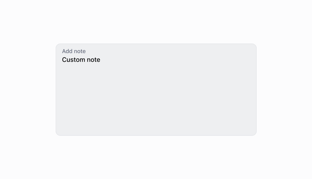
## Preview
## Best practices
* **Provide helpful guidance with helpText and placeholder:** Use `helpText` for explain content expectations, formatting requirements, or character limits. Use placeholder text to provide examples of the expected content format or structure.
* **Implement character limits appropriately:** Set `maxLength` to prevent excessively long input that might cause display or processing issues. Provide feedback about character limits in the `helpText`, especially when users are approaching the limit.
* **Use clear and specific labels:** Provide descriptive labels that indicate what type of text content is expected, like specific examples rather than generic terms.
* **Handle validation for required fields:** The `required` property adds semantic meaning only. Implement validation logic in your onChange callback to check empty values and display errors.
* **Add action buttons for text operations:** Use the `action` property to provide helpful actions like "Clear," "Use Template," or "Format Text." This enhances usability by providing quick access to common text operations.
* **Differentiate between input and change callbacks:** Use `onInput` for immediate responses that need to happen as the user types, such as clearing validation errors or providing real-time feedback. Use `onChange` for updating the field's value and performing actions after editing completes (typically on blur). Don't use `onInput` to update the `value` property—this can cause performance issues and unexpected behavior.
## Limitations
* `TextArea` has a maximum of 8 visible rows—content requiring more vertical space should use scrolling within the text area or alternative layouts with `ScrollView` components.
* The component provides multi-line text input but doesn't include rich text formatting capabilities—complex formatting like bold, italic, or lists requires alternative solutions or plain text representations.
* The `required` property adds semantic meaning only—it doesn't trigger automatic error display or validation, so you must implement validation logic manually.
* Action buttons are limited to simple press callbacks—complex action workflows require custom implementation or additional components.