---
title: TimeField
description: >-
The `TimeField` component captures time input from merchants with a consistent
interface for time selection and proper validation. Use it to collect time
information in scheduling, booking, or data entry workflows.
The component supports both 12-hour and 24-hour time formats based on locale
settings, with built-in validation to ensure valid time entries. It includes
features like time picker integration, keyboard shortcuts, and formatted
display to streamline time entry for scheduling, appointment booking, and
time-sensitive operations in retail environments.
`TimeField` components respects merchant locale settings for default time
format preferences while allowing manual override for specific use cases that
require alternative formats.
api_version: 2024-07
api_name: pos-ui-extensions
source_url:
html: >-
https://shopify.dev/docs/api/pos-ui-extensions/2024-07/ui-components/forms/timefield
md: >-
https://shopify.dev/docs/api/pos-ui-extensions/2024-07/ui-components/forms/timefield.md
---
# TimeField
The `TimeField` component captures time input from merchants with a consistent interface for time selection and proper validation. Use it to collect time information in scheduling, booking, or data entry workflows.
The component supports both 12-hour and 24-hour time formats based on locale settings, with built-in validation to ensure valid time entries. It includes features like time picker integration, keyboard shortcuts, and formatted display to streamline time entry for scheduling, appointment booking, and time-sensitive operations in retail environments.
`TimeField` components respects merchant locale settings for default time format preferences while allowing manual override for specific use cases that require alternative formats.
Support
Targets (6)
### Supported targets
* [pos.customer-details.action.render](https://shopify.dev/docs/api/pos-ui-extensions/2024-07/targets/customer-details#customer-details-action-modal-)
* [pos.draft-order-details.action.render](https://shopify.dev/docs/api/pos-ui-extensions/2024-07/targets/draft-order-details#draft-order-details-action-modal-)
* [pos.home.modal.render](https://shopify.dev/docs/api/pos-ui-extensions/2024-07/targets/home-screen#home-screen-action-modal-)
* [pos.order-details.action.render](https://shopify.dev/docs/api/pos-ui-extensions/2024-07/targets/order-details#order-details-action-modal-)
* [pos.product-details.action.render](https://shopify.dev/docs/api/pos-ui-extensions/2024-07/targets/product-details#product-details-action-modal-)
* [pos.purchase.post.action.render](https://shopify.dev/docs/api/pos-ui-extensions/2024-07/targets/post-purchase#post-purchase-action-modal-)
#### Use cases
* **Scheduling:** Collect appointment times or service hours in booking workflows.
* **Business hours:** Capture opening hours or delivery times in configuration interfaces.
* **Filtering:** Provide time-based filtering for reports or event logs.
* **Shift management:** Enable time entry for shift scheduling or time tracking.
## Examples
### Capture time input with format validation
Collect time information with built-in validation and format support. This example demonstrates a TimeField that handles both 12-hour and 24-hour formats based on locale, providing time picker integration and formatted display for scheduling and booking workflows.
## Capture time input with format validation
### Examples
* #### Capture time input with format validation
##### Description
Collect time information with built-in validation and format support. This example demonstrates a TimeField that handles both 12-hour and 24-hour formats based on locale, providing time picker integration and formatted display for scheduling and booking workflows.
##### React
```tsx
import React, {useState} from 'react';
import {
TimeField,
Screen,
ScrollView,
Navigator,
Text,
reactExtension,
} from '@shopify/ui-extensions-react/point-of-sale';
const SmartGridModal = () => {
const [time, setTime] = useState('');
return (
Selected Time: {time}
);
};
export default reactExtension('pos.home.modal.render', () => (
));
```
##### TS
```ts
import {
Navigator,
Screen,
ScrollView,
Text,
TimeField,
extension,
} from '@shopify/ui-extensions/point-of-sale';
export default extension('pos.home.modal.render', (root, api) => {
const timeField = root.createComponent(TimeField, {
label: 'Select Time',
value: '',
});
const textBox = root.createComponent(Text);
const onChangeHandler = (newValue: string) => {
timeField.updateProps({value: newValue});
const textContent = `Selected Time: ${newValue}`;
textBox.replaceChildren(textContent);
};
timeField.updateProps({onChange: onChangeHandler});
const scrollView = root.createComponent(ScrollView);
scrollView.append(timeField);
scrollView.append(textBox);
const screen = root.createComponent(Screen, {
name: 'TimeField',
title: 'Time Field Example',
});
screen.append(scrollView);
const navigator = root.createComponent(Navigator);
navigator.append(screen);
root.append(navigator);
});
```
## Properties
Configure the following properties on the `TimeField` component.
* label
string
required
The content to use as the field label that describes the text information being requested.
* action
InputAction
A button configuration object displayed under the text field to provide extra functionality.
* disabled
boolean
Controls whether the field can be modified. When `true`, the field is disabled and users cannot edit its value.
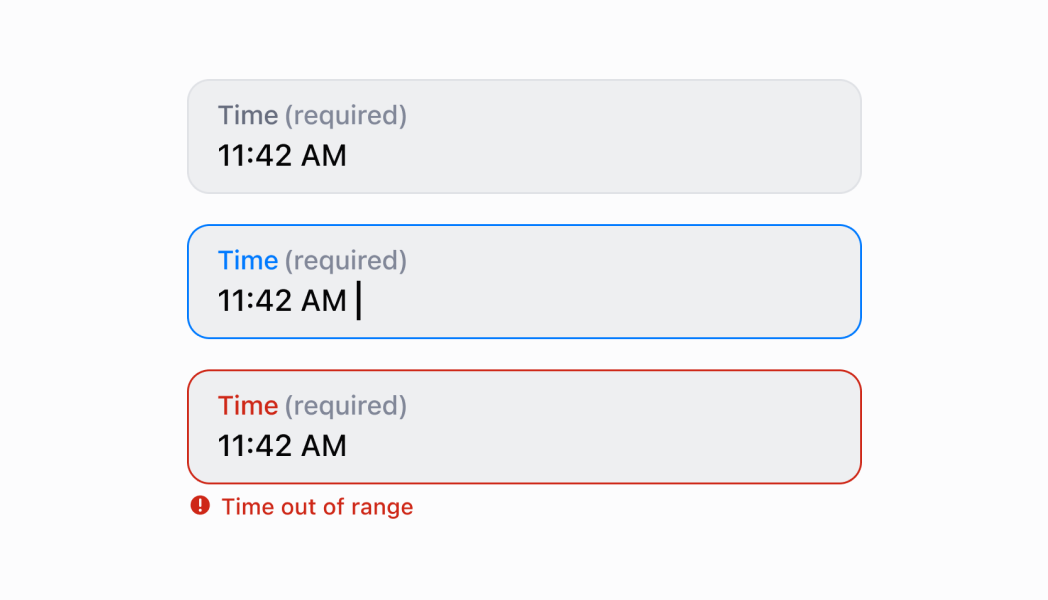
* error
string
An error message that indicates a problem to the user. The field is given specific stylistic treatment to communicate issues that must be resolved immediately.
* helpText
string
The label text displayed under the field that provides guidance or instructions to assist users.
* is24Hour
boolean
Default: false
Whether the clock displays in 24-hour format instead of 12-hour format. This property only affects Android devices.
* onBlur
() => void
A callback function executed when focus is removed from the field.
* onChange
(value: string) => void
A callback function executed when the user has finished editing the field, receiving the new text value as a parameter. You should update the `value` property in response to this callback.
* onFocus
() => void
A callback function executed when the field receives focus.
* value
string
The current text value for the field. If omitted, the field will be empty. You should update the `value` property in response to the `onChange` callback.
### InputAction
Defines the configuration object for action buttons displayed below input fields to provide extra functionality.
* disabled
Whether the action button can be pressed.
```ts
boolean
```
* label
The text displayed on the action button.
```ts
string
```
* onPress
A callback function executed when the action button is pressed.
```ts
() => void
```
```ts
export interface InputAction {
/**
* The text displayed on the action button.
*/
label: string;
/**
* A callback function executed when the action button is pressed.
*/
onPress: () => void;
/**
* Whether the action button can be pressed.
*/
disabled?: boolean;
}
```
## Best practices
* **Provide clear labels for time context:** Use specific labels that indicate what time is being requested, like specific examples rather than generic "Time." This helps users understand the context and purpose.
* **Offer helpful guidance with helpText:** Use the `helpText` property to explain time constraints, business hours, or format expectations. For example, "Business hours only (9 AM - 5 PM)" or "Must be a future time."
* **Implement proper time validation:** Use the `error` property to display validation messages when users enter invalid times or times outside acceptable ranges. Provide clear, actionable error messages that help users correct their input.
* **Add action buttons for time operations:** Use the `action` property to provide helpful actions like "Set to Now," "Clear Time," or "Use Business Hours." This enhances usability by providing quick access to common time operations.
* **Handle focus events for time picker coordination:** Use `onFocus` and `onBlur` callbacks to coordinate with `TimePicker` components or other time selection interfaces. This is useful for showing/hiding time pickers or managing related form fields.
## Limitations
* `TimeField` provides text-based time input—for visual time selection with clock or spinner interfaces, use the `TimePicker` component which offers interactive time selection.
* The `is24Hour` property only affects Android devices—other platforms may use their system-level time format preferences regardless of this setting.
* Action buttons are limited to simple press callbacks—complex action workflows require custom implementation or additional components.