---
title: TimePicker
description: >-
The `TimePicker` component allows merchants to select a specific time using an
interactive picker interface. Use it to provide visual time selection for
improved user experience and reduced input errors.
`TimePicker` offers a more visual and touch-friendly alternative to text-based
time input, making time selection faster and more accurate. The picker
interface provides an intuitive way to select hours and minutes through an
interactive interface.
api_version: 2024-07
api_name: pos-ui-extensions
source_url:
html: >-
https://shopify.dev/docs/api/pos-ui-extensions/2024-07/ui-components/forms/timepicker
md: >-
https://shopify.dev/docs/api/pos-ui-extensions/2024-07/ui-components/forms/timepicker.md
---
# TimePicker
The `TimePicker` component allows merchants to select a specific time using an interactive picker interface. Use it to provide visual time selection for improved user experience and reduced input errors.
`TimePicker` offers a more visual and touch-friendly alternative to text-based time input, making time selection faster and more accurate. The picker interface provides an intuitive way to select hours and minutes through an interactive interface.
## Properties
Configure the following properties on the `TimePicker` component.
* visibleState
\[boolean, (visible: boolean) => void]
required
A tuple that controls the visible state of the picker and provides a callback to set visibility to false when the dialog closes. The first element is the current visibility state, and the second is a setter function.
* inputMode
'inline' | 'spinner'
Default: 'inline'
The display mode for the time picker.
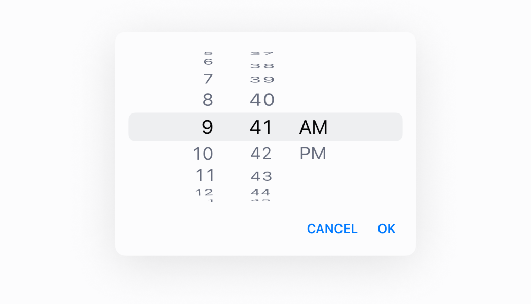
* `inline`: A clock-style interface that displays an analog or digital clock where users can tap to select specific times. Provides visual context about time relationships. Only available on Android devices—iOS always uses spinner mode.
* `spinner`: A spinner-style selector with scrollable columns for hours, minutes, and optionally seconds. Offers a more compact interface suitable for all devices and is the only mode supported on iOS.
* is24Hour
boolean
Default: false
Whether the clock displays in 24-hour format instead of 12-hour format. This property only affects Android devices.
* onChange
(selected: string) => void
A callback for changes.
* selected
string
Default: The current time.
The currently selected time value. Defaults to the current time when not specified.
### Examples
* #### Select a time with a picker
##### Description
Enable time selection using a visual picker interface for improved accuracy. This example demonstrates a TimePicker that provides an intuitive way to select hours and minutes through a touch-friendly interface, reducing input errors and speeding up time selection.
##### React
```tsx
import React, {useState} from 'react';
import {
Button,
TimePicker,
Screen,
Text,
reactExtension,
} from '@shopify/ui-extensions-react/point-of-sale';
const SmartGridModal = () => {
const [date, setDate] = useState(
new Date().toDateString(),
);
const visibleState = useState(false);
return (
Selected date: {date}
);
};
export default reactExtension(
'pos.home.modal.render',
() => ,
);
```
##### TS
```ts
import {
Button,
TimePicker,
Screen,
extension,
} from '@shopify/ui-extensions/point-of-sale';
export default extension(
'pos.home.modal.render',
(root) => {
const mainScreen = root.createComponent(
Screen,
{
name: 'Home',
title: 'Home',
},
);
const button = root.createComponent(Button, {
title: 'Show',
onPress: () => {
timePicker.updateProps({
visibleState: [true, () => {}],
});
},
});
const handleOnChange = (selected) => {
timePicker.updateProps({
selected: new Date(
selected,
).toDateString(),
});
};
const timePicker = root.createComponent(
TimePicker,
{
visibleState: [false, () => {}],
onChange: handleOnChange,
selected: new Date().toDateString(),
is24Hour: true,
inputMode: 'spinner',
},
);
mainScreen.append(button);
mainScreen.append(timePicker);
root.append(mainScreen);
},
);
```
## Preview
## Best practices
* **Choose appropriate input modes for your platform:** Use `'inline'` mode (clock) on Android when users benefit from seeing a clock interface. iOS only supports `'spinner'` mode, so design your time selection experience to work well with spinners across all platforms.
* **Configure time format for Android users:** Use the `is24Hour` property to control whether Android devices display times in 24-hour or 12-hour format. Set this based on your target audience's preferences and regional conventions. This property only affects Android devices.
* **Handle time selection with onChange:** Implement the `onChange` callback to capture selected times and update your application state accordingly. This callback receives the selected time string that you can use to update UI or trigger related actions.
* **Default to current time thoughtfully:** The picker defaults to the current time when no `selected` value is provided. If you need a different starting time or want to guide users to a specific time period, explicitly set the `selected` property.
* **Provide clear triggers for showing the picker:** Since visibility is controlled by `visibleState`, ensure you have clear UI elements like buttons or field interactions that toggle the picker visibility. Users should understand how to open and close the time picker.
## Limitations
* `TimePicker` requires external visibility state management through the `visibleState` tuple—automatic show/hide behavior based on field focus is not built-in.
* The `inputMode` property has platform limitations—iOS only supports spinner mode regardless of the `inputMode` setting, which may affect cross-platform consistency.
* The `is24Hour` property only affects Android devices—iOS and other platforms use their system-level time format preferences regardless of this setting.
* The component provides time selection but doesn't include field labels, help text, or error messaging—combine with other UI elements or text components to provide complete form field experiences.