Sectioncomponent
A component used to group other components together in a card-like UI. Usually, sections will be used inside a ScrollView.
Section no longer has a border as of POS 10.0.0.
Anchor to sectionSection
- Anchor to actionaction
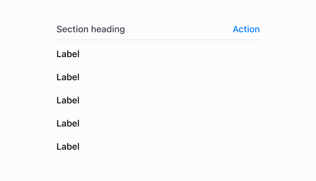
The action in the top right of the section that can be triggered by a tap.
- Anchor to titletitlestring
The title of the section.
SectionProps
Renders content that is bound by a border, with a title and a call to action at the top.
- action
The action in the top right of the section that can be triggered by a tap.
SectionHeaderAction - title
The title of the section.
string
export interface SectionProps {
  /**
   * The title of the section.
   */
  title?: string;
  /**
   * The action in the top right of the section that can be triggered by a tap.
   */
  action?: SectionHeaderAction;
}
SectionHeaderAction
Allows the implementation of an action at the top right of a `Section`.
- onPress
The callback when the action is tapped by the user.
() => void - title
The title describing the action.
string
export interface SectionHeaderAction {
  /**
   * The title describing the action.
   */
  title: string;
  /**
   * The callback when the action is tapped by the user.
   */
  onPress: () => void;
}Anchor to sectionheaderactionSectionHeaderAction
- Anchor to onPressonPress() => voidrequired
The callback when the action is tapped by the user.
- Anchor to titletitlestringrequired
The title describing the action.
SectionHeaderAction
Allows the implementation of an action at the top right of a `Section`.
- onPress
The callback when the action is tapped by the user.
() => void - title
The title describing the action.
string
export interface SectionHeaderAction {
  /**
   * The title describing the action.
   */
  title: string;
  /**
   * The callback when the action is tapped by the user.
   */
  onPress: () => void;
}Section
examples
Section
React
import React from 'react'
import { Text, Navigator, Screen, ScrollView, Stack, reactExtension, Section, useApi, Selectable } from '@shopify/ui-extensions-react/point-of-sale'

const ModalComponent = () => {
  const api = useApi<'pos.home.modal.render'>();

  return (
    <Navigator>
      <Screen title="Section" name="Section">
        <ScrollView>
          <Stack direction="vertical" paddingHorizontal="HalfPoint">
            <Section title='Items' action={{title: "Show toast", onPress: () => api.toast.show('Hello world!')}}>
              <Selectable onPress={() => api.toast.show('Item 1!')}>
                <Stack direction="vertical" paddingHorizontal="Small" paddingVertical="Small">
                  <Text>Item 1</Text>
                </Stack>
              </Selectable>
              <Selectable onPress={() => api.toast.show('Item 2!')}>
                <Stack direction="vertical" paddingHorizontal="Small" paddingVertical="Small">
                  <Text>Item 2</Text>
                </Stack>
              </Selectable>
              <Selectable onPress={() => api.toast.show('Item 3!')}>
                <Stack direction="vertical" paddingHorizontal="Small" paddingVertical="Small">
                  <Text>Item 3</Text>
                </Stack>
              </Selectable>
              <Selectable onPress={() => api.toast.show('Item 4!')}>
                <Stack direction="vertical" paddingHorizontal="Small" paddingVertical="Small">
                  <Text>Item 4</Text>
                </Stack>
              </Selectable>
            </Section>
          </Stack>
        </ScrollView>
      </Screen>
    </Navigator>
  )
}

export default reactExtension('pos.home.modal.render', () => {
  return <ModalComponent />
})
TS
import {
  extension,
  Screen,
  ScrollView,
  Stack,
  Navigator,
  Text,
  Section,
  Selectable,
} from '@shopify/ui-extensions/point-of-sale';

export default extension(
  'pos.home.modal.render',
  (root, api) => {
    const screen = root.createComponent(Screen, {
      name: 'Section',
      title: 'Section',
    });

    const scrollView =
      root.createComponent(ScrollView);

    const section = root.createComponent(
      Section,
      {
        title: 'Section',
        action: {
          title: 'Show toast',
          onPress: () =>
            api.toast.show('Hello world!'),
        },
      },
    );

    for (let i = 1; i < 5; i++) {
      const selectable = root.createComponent(
        Selectable,
        {
          onPress: () =>
            api.toast.show(`Item ${i}!`),
        },
      );
      const stack = root.createComponent(Stack, {
        paddingVertical: 'Small',
        direction: 'vertical',
        paddingHorizontal: 'Small',
      });

      const textElement =
        root.createComponent(Text);
      textElement.append(`Item ${i}`);

      stack.append(textElement);
      selectable.append(stack);
      section.append(selectable);
    }

    const rootStack = root.createComponent(
      Stack,
      {
        paddingHorizontal: 'HalfPoint',
        direction: 'vertical',
      },
    );
    rootStack.append(section);

    scrollView.append(rootStack);
    screen.append(scrollView);
    const navigator =
      root.createComponent(Navigator);
    navigator.append(screen);
    root.append(navigator);
  },
);
Preview