---
title: SectionHeader
description: >-
The `SectionHeader` component displays a title with an optional action button
and divider line. Use it to create consistent section headings with
interactive elements that organize content and provide contextual actions.
The component provides a consistent header layout for section groupings with
support for titles, actions, and dividers following POS design specifications.
It ensures proper visual hierarchy and spacing within forms and settings
interfaces, helping merchants understand content organization and providing
quick access to section-level actions.
`SectionHeader` components ensure consistent header styling and spacing across
all sections while allowing action button customization, maintaining visual
unity while supporting context-specific functionality.
api_version: 2024-10
api_name: pos-ui-extensions
source_url:
html: >-
https://shopify.dev/docs/api/pos-ui-extensions/2024-10/ui-components/layout-and-structure/sectionheader
md: >-
https://shopify.dev/docs/api/pos-ui-extensions/2024-10/ui-components/layout-and-structure/sectionheader.md
---
# SectionHeader
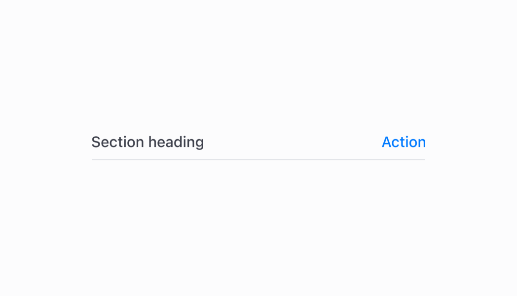
The `SectionHeader` component displays a title with an optional action button and divider line. Use it to create consistent section headings with interactive elements that organize content and provide contextual actions.
The component provides a consistent header layout for section groupings with support for titles, actions, and dividers following POS design specifications. It ensures proper visual hierarchy and spacing within forms and settings interfaces, helping merchants understand content organization and providing quick access to section-level actions.
`SectionHeader` components ensure consistent header styling and spacing across all sections while allowing action button customization, maintaining visual unity while supporting context-specific functionality.
Support
Targets (10)
### Supported targets
* [pos.customer-details.action.render](https://shopify.dev/docs/api/pos-ui-extensions/2024-10/targets/customer-details#customer-details-action-modal-)
* [pos.customer-details.block.render](https://shopify.dev/docs/api/pos-ui-extensions/2024-10/targets/customer-details#customer-details-block-)
* [pos.draft-order-details.action.render](https://shopify.dev/docs/api/pos-ui-extensions/2024-10/targets/draft-order-details#draft-order-details-action-modal-)
* [pos.home.modal.render](https://shopify.dev/docs/api/pos-ui-extensions/2024-10/targets/home-screen#home-screen-action-modal-)
* [pos.order-details.action.render](https://shopify.dev/docs/api/pos-ui-extensions/2024-10/targets/order-details#order-details-action-modal-)
* [pos.order-details.block.render](https://shopify.dev/docs/api/pos-ui-extensions/2024-10/targets/order-details#order-details-block-)
* [pos.product-details.action.render](https://shopify.dev/docs/api/pos-ui-extensions/2024-10/targets/product-details#product-details-action-modal-)
* [pos.product-details.block.render](https://shopify.dev/docs/api/pos-ui-extensions/2024-10/targets/product-details#product-details-block-)
* [pos.purchase.post.action.render](https://shopify.dev/docs/api/pos-ui-extensions/2024-10/targets/post-purchase#post-purchase-action-modal-)
* [pos.purchase.post.block.render](https://shopify.dev/docs/api/pos-ui-extensions/2024-10/targets/post-purchase#post-purchase-block-)
#### Use cases
* **Section headings:** Create section headings for forms or settings with clear titles.
* **Content organization:** Organize content into logical groups with consistent header styling.
* **Contextual actions:** Provide contextual actions like edit or configure buttons.
* **Visual hierarchy:** Establish visual hierarchy by clearly delineating content areas.
## Examples
### Add a section header with actions
Create consistent section headings with titles, optional action buttons, and divider lines. This example shows a SectionHeader that organizes content with proper visual hierarchy, helping merchants understand content structure and providing quick access to section-level actions.
## Add a section header with actions
### Examples
* #### Add a section header with actions
##### Description
Create consistent section headings with titles, optional action buttons, and divider lines. This example shows a SectionHeader that organizes content with proper visual hierarchy, helping merchants understand content structure and providing quick access to section-level actions.
##### React
```tsx
import React from 'react'
import { Navigator, Screen, ScrollView, Stack, reactExtension, useApi, SectionHeader } from '@shopify/ui-extensions-react/point-of-sale'
const ModalComponent = () => {
const api = useApi<'pos.home.modal.render'>();
return (
{ }}} />
)
}
export default reactExtension('pos.home.modal.render', () => {
return
})
```
##### TS
```ts
import {
extension,
Screen,
ScrollView,
Stack,
Navigator,
SectionHeader,
} from '@shopify/ui-extensions/point-of-sale';
export default extension(
'pos.home.modal.render',
(root, api) => {
const screen = root.createComponent(Screen, {
name: 'SectionHeader',
title: 'SectionHeader',
});
const scrollView =
root.createComponent(ScrollView);
const defaultSectionHeader = root.createComponent(
SectionHeader,
{
title: 'Default',
},
);
const actionSectionHeader =
root.createComponent(SectionHeader, {
title: 'With action',
action: {
label: 'Show toast',
onPress: () =>
api.toast.show('Hello world!'),
},
});
const noDividerSectionHeader =
root.createComponent(SectionHeader, {
title: 'Without divider',
hideDivider: true,
});
const rootStack = root.createComponent(
Stack,
{
paddingHorizontal: 'HalfPoint',
direction: 'vertical',
},
);
rootStack.append(defaultSectionHeader);
rootStack.append(actionSectionHeader);
rootStack.append(noDividerSectionHeader);
scrollView.append(rootStack);
screen.append(scrollView);
const navigator =
root.createComponent(Navigator);
navigator.append(screen);
root.append(navigator);
},
);
```
## Properties
Configure the following properties on the `SectionHeader` component.
* title
string
required
The title text displayed in the section header. Provide clear, descriptive text that accurately represents the content section below.
* action
{ label: string; onPress: () => void; disabled?: boolean; }
An optional action button configuration to be displayed alongside the title. The `SectionHeader` must have a title for the action to work properly.
* hideDivider
boolean
Whether the divider line under the `SectionHeader` should be hidden.
## Best practices
* **Design meaningful action buttons:** When providing an action, use clear and descriptive button labels that indicate exactly what will happen when pressed. Avoid generic terms like "Action" in favor of specific actions like "Edit Settings" or "Add Item."
* **Control divider visibility strategically:** Use the `hideDivider` property to control visual separation based on your layout needs. Show dividers when you need clear section boundaries, and hide them when the visual separation might create unnecessary visual clutter.
## Limitations
* Action buttons require a title to function properly—`SectionHeader` can't display actions without an accompanying title.
* Only one action button is supported per `SectionHeader` to maintain clean, focused interfaces that don't overwhelm users.
* The component's visual styling and layout are controlled by the POS design system—custom header styling beyond the provided properties is not supported.
* `SectionHeader` is a standalone component separate from `Section`—it doesn't automatically integrate with `Section` component functionality or provide the same semantic benefits.