---
title: SegmentedControl
description: >-
The `SegmentedControl` component displays a horizontal row of segments that
allow users to switch between different views or filter content. Use it to
provide mutually exclusive options with clear visual selection states.
The component provides mutually exclusive selection within a compact
horizontal layout, with visual highlighting of the active segment and smooth
transition animations, making it ideal for view switching, filter controls, or
any interface requiring clear, space-efficient option selection.
`SegmentedControl` components provide animated transitions between segments
that clearly indicate state changes without being distracting, helping
merchants confirm their selection while maintaining focus on content.
api_version: 2025-01
api_name: pos-ui-extensions
source_url:
html: >-
https://shopify.dev/docs/api/pos-ui-extensions/2025-01/ui-components/navigation-and-content/segmentedcontrol
md: >-
https://shopify.dev/docs/api/pos-ui-extensions/2025-01/ui-components/navigation-and-content/segmentedcontrol.md
---
# SegmentedControl
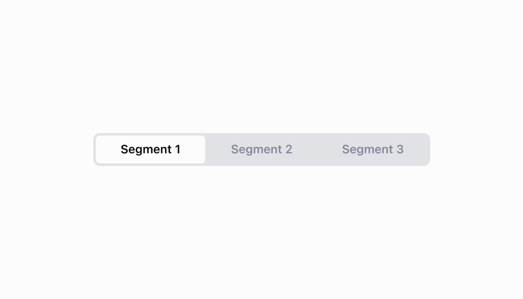
The `SegmentedControl` component displays a horizontal row of segments that allow users to switch between different views or filter content. Use it to provide mutually exclusive options with clear visual selection states.
The component provides mutually exclusive selection within a compact horizontal layout, with visual highlighting of the active segment and smooth transition animations, making it ideal for view switching, filter controls, or any interface requiring clear, space-efficient option selection.
`SegmentedControl` components provide animated transitions between segments that clearly indicate state changes without being distracting, helping merchants confirm their selection while maintaining focus on content.
Support
Targets (6)
### Supported targets
* [pos.customer-details.action.render](https://shopify.dev/docs/api/pos-ui-extensions/2025-01/targets/customer-details#customer-details-action-modal-)
* [pos.draft-order-details.action.render](https://shopify.dev/docs/api/pos-ui-extensions/2025-01/targets/draft-order-details#draft-order-details-action-modal-)
* [pos.home.modal.render](https://shopify.dev/docs/api/pos-ui-extensions/2025-01/targets/home-screen#home-screen-action-modal-)
* [pos.order-details.action.render](https://shopify.dev/docs/api/pos-ui-extensions/2025-01/targets/order-details#order-details-action-modal-)
* [pos.product-details.action.render](https://shopify.dev/docs/api/pos-ui-extensions/2025-01/targets/product-details#product-details-action-modal-)
* [pos.purchase.post.action.render](https://shopify.dev/docs/api/pos-ui-extensions/2025-01/targets/post-purchase#post-purchase-action-modal-)
#### Use cases
* **View switchers:** Create view switchers for different data presentations like list and grid views.
* **Filtering options:** Provide filtering options for showing all, active, or archived items.
* **Settings organization:** Organize configuration options into groups users can switch between.
* **Mode switching:** Enable quick switching between different modes like edit versus view.
## Examples
### Switch between views or filters
Enable view switching or content filtering with mutually exclusive segments. This example shows a SegmentedControl that displays options in a compact horizontal layout with clear visual selection states and smooth transitions, ideal for view toggles or filter controls.
## Switch between views or filters
### Examples
* #### Switch between views or filters
##### Description
Enable view switching or content filtering with mutually exclusive segments. This example shows a SegmentedControl that displays options in a compact horizontal layout with clear visual selection states and smooth transitions, ideal for view toggles or filter controls.
##### React
```tsx
import React from 'react';
import {
reactExtension,
Screen,
SegmentedControl,
Stack,
} from '@shopify/ui-extensions-react/point-of-sale';
export const SmartGridModal = () => {
const [selected, setSelected] =
React.useState('1');
return (
);
};
export default reactExtension(
'pos.home.modal.render',
() => {
return ;
},
);
```
##### TS
```ts
import {
extension,
Screen,
ScrollView,
SegmentedControl,
} from '@shopify/ui-extensions/point-of-sale';
export default extension(
'pos.home.modal.render',
(root) => {
const mainScreen = root.createComponent(
Screen,
{
name: 'SegmentedControl',
title: 'SegmentedControl',
},
);
const scrollView =
root.createComponent(ScrollView);
const onSelect = (id: string) => {
segmentedControl.updateProps({
selected: id,
});
};
const segmentedControl = root.createComponent(
SegmentedControl,
{
onSelect,
selected: '1',
segments: [
{id: '1', label: '1', disabled: false},
{id: '2', label: '2', disabled: false},
{
id: '3',
label: '3 (disabled)',
disabled: true,
},
],
},
);
scrollView.append(segmentedControl);
mainScreen.append(scrollView);
root.append(mainScreen);
},
);
```
## Properties
Configure the following properties on the `SegmentedControl` component.
* onSelect
(id: string) => void
required
A callback function executed when a segment is selected, receiving the selected segment's id as a parameter.
* segments
Segment\[]
required
An array of segment objects that define the available options in the segmented control.
* selected
string
required
The ID of the currently selected segment that determines which option is visually highlighted.
### Segment
Defines the structure and configuration options for individual segments within the \`SegmentedControl\` component.
* disabled
Whether the segment is disabled and non-interactive.
```ts
boolean
```
* id
The unique identifier for the segment used for selection tracking and callback identification.
```ts
string
```
* label
The text label displayed on the segment that users see and interact with.
```ts
string
```
```ts
export interface Segment {
/**
* The unique identifier for the segment used for selection tracking and callback identification.
*/
id: string;
/**
* The text label displayed on the segment that users see and interact with.
*/
label: string;
/**
* Whether the segment is disabled and non-interactive.
*/
disabled: boolean;
}
```
## Best practices
* **Limit the number of segments appropriately:** Use two to five segments for optimal usability. Too few segments may not justify the component, while too many can overwhelm users and reduce touch target sizes on POS devices.
* **Implement meaningful selection logic:** Provide immediate visual feedback by updating content, filters, or views based on the selection.
* **Handle disabled states strategically:** Use the `disabled` property on individual segments when options are temporarily unavailable or contextually inappropriate. Provide clear visual indication and consider alternative messaging when segments are disabled.
* **Design for touch interfaces:** Ensure segments are large enough for comfortable touch interaction on POS devices.
* **Maintain consistent selection patterns:** Keep the same segment selected when users navigate away and return to a screen, unless the context has changed significantly. This helps maintain user orientation and reduces cognitive load.
## Limitations
* `SegmentedControl` is designed for mutually exclusive selections—multiple selection scenarios require different components like checkbox lists or choice lists.
* The component provides the selection interface but doesn't manage content switching—you must implement the logic to show/hide or update content based on the selected segment.
* Visual styling and layout are controlled by the POS design system—custom segment styling or layout modifications beyond the provided properties are not supported.