---
title: Banner
description: >-
The banner component highlights important information or required actions. Use
banners to communicate critical updates, warnings, informational messages, or
success notifications that require merchant attention.
api_version: 2026-01
api_name: pos-ui-extensions
source_url:
html: >-
https://shopify.dev/docs/api/pos-ui-extensions/latest/web-components/feedback-and-status-indicators/banner
md: >-
https://shopify.dev/docs/api/pos-ui-extensions/latest/web-components/feedback-and-status-indicators/banner.md
---
# Banner
The banner component highlights important information or required actions. Use banners to communicate critical updates, warnings, informational messages, or success notifications that require merchant attention.
Banners provide persistent visibility with support for dismissible and non-dismissible states.
### Support Targets (10)
### Supported targets
* [pos.cart.line-item-details.action.render](https://shopify.dev/docs/api/pos-ui-extensions/2026-01/targets/cart-details#cart-details-action-modal-)
* [pos.customer-details.action.render](https://shopify.dev/docs/api/pos-ui-extensions/2026-01/targets/customer-details#customer-details-action-modal-)
* [pos.draft-order-details.action.render](https://shopify.dev/docs/api/pos-ui-extensions/2026-01/targets/draft-order-details#draft-order-details-action-modal-)
* [pos.exchange.post.action.render](https://shopify.dev/docs/api/pos-ui-extensions/2026-01/targets/post-exchange#post-exchange-action-modal-)
* [pos.home.modal.render](https://shopify.dev/docs/api/pos-ui-extensions/2026-01/targets/home-screen#home-screen-action-modal-)
* [pos.order-details.action.render](https://shopify.dev/docs/api/pos-ui-extensions/2026-01/targets/order-details#order-details-action-modal-)
* [pos.product-details.action.render](https://shopify.dev/docs/api/pos-ui-extensions/2026-01/targets/product-details#product-details-action-modal-)
* [pos.purchase.post.action.render](https://shopify.dev/docs/api/pos-ui-extensions/2026-01/targets/post-purchase#post-purchase-action-modal-)
* [pos.register-details.action.render](https://shopify.dev/docs/api/pos-ui-extensions/2026-01/targets/register-details#register-details-action-modal-)
* [pos.return.post.action.render](https://shopify.dev/docs/api/pos-ui-extensions/2026-01/targets/post-return#post-return-action-modal-)
#### Use cases
* **System alerts:** Display alerts about maintenance, outages, or important updates.
* **Error messages:** Show critical errors like payment failures or connectivity issues.
* **Success feedback:** Communicate successful completion of actions like order processing or sync.
* **Warnings:** Alert merchants to low inventory, expired payments, or business-critical conditions.
***
## Properties
Configure the following properties on the banner component.
* **heading**
**string**
**Default: ''**
The title of the banner.
* **hidden**
**boolean**
**Default: false**
Determines whether the banner is hidden.
* **id**
**string**
A unique identifier for the element.
* **tone**
**'auto' | 'info' | 'success' | 'warning' | 'critical'**
**Default: 'auto'**
Sets the tone of the banner, based on the intention of the information being conveyed.
### Slots
The banner component supports slots for additional content placement within the banner. Learn more about [using slots](https://shopify.dev/docs/api/polaris/using-polaris-web-components#slots).
* **primary-action**
**HTMLElement**
The action taken when the banner is pressed.
***
## Examples
### Display important messages with a banner
Display important messages using a banner component with automatic color coding based on message severity. This example shows a basic banner with a heading and descriptive text.
## Display important messages with a banner
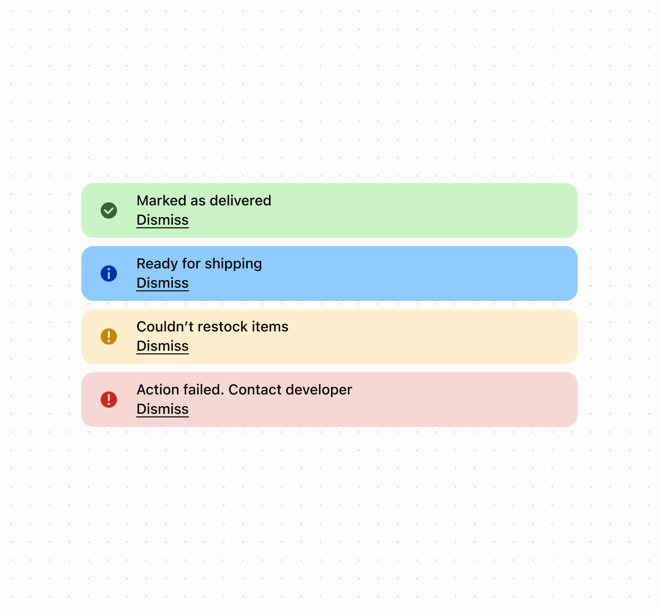
## Display important messages with a banner
```html
Dismiss
Dismiss
Dismiss
Dismiss
```
***
## Best practices
* **Apply appropriate tones:** Use `critical` for errors requiring immediate action, `warning` for important notices, `success` for confirmations, `info` for general information.
* **Keep headings concise:** Write brief headings that clearly communicate the message. Use the collapsible feature for additional detail.
* **Show one banner at a time:** Display only one banner to avoid overwhelming the interface. Prioritize by importance.
* **Make non-critical banners dismissible:** Allow dismissal for non-critical information. Keep critical alerts non-dismissible until resolved.
* **Include clear actions:** If action is needed, use the primaryAction slot to provide clear next steps.
* **Use for persistent messages:** Use banners for messages that need to persist. For temporary notifications, consider toast notifications.
***