---
title: Switch
description: >-
The switch component creates a toggle control that allows merchants to turn an
option on or off. Use switches for settings that take effect immediately, such
as enabling notifications or toggling features.
api_version: 2026-01
api_name: pos-ui-extensions
source_url:
html: >-
https://shopify.dev/docs/api/pos-ui-extensions/latest/web-components/forms/switch
md: >-
https://shopify.dev/docs/api/pos-ui-extensions/latest/web-components/forms/switch.md
---
# Switch
The switch component creates a toggle control that allows merchants to turn an option on or off. Use switches for settings that take effect immediately, such as enabling notifications or toggling features.
Switches provide clear visual feedback about the current state and are ideal for binary choices that don't require confirmation.
### Support Targets (10)
### Supported targets
* [pos.cart.line-item-details.action.render](https://shopify.dev/docs/api/pos-ui-extensions/2026-01/targets/cart-details#cart-details-action-modal-)
* [pos.customer-details.action.render](https://shopify.dev/docs/api/pos-ui-extensions/2026-01/targets/customer-details#customer-details-action-modal-)
* [pos.draft-order-details.action.render](https://shopify.dev/docs/api/pos-ui-extensions/2026-01/targets/draft-order-details#draft-order-details-action-modal-)
* [pos.exchange.post.action.render](https://shopify.dev/docs/api/pos-ui-extensions/2026-01/targets/post-exchange#post-exchange-action-modal-)
* [pos.home.modal.render](https://shopify.dev/docs/api/pos-ui-extensions/2026-01/targets/home-screen#home-screen-action-modal-)
* [pos.order-details.action.render](https://shopify.dev/docs/api/pos-ui-extensions/2026-01/targets/order-details#order-details-action-modal-)
* [pos.product-details.action.render](https://shopify.dev/docs/api/pos-ui-extensions/2026-01/targets/product-details#product-details-action-modal-)
* [pos.purchase.post.action.render](https://shopify.dev/docs/api/pos-ui-extensions/2026-01/targets/post-purchase#post-purchase-action-modal-)
* [pos.register-details.action.render](https://shopify.dev/docs/api/pos-ui-extensions/2026-01/targets/register-details#register-details-action-modal-)
* [pos.return.post.action.render](https://shopify.dev/docs/api/pos-ui-extensions/2026-01/targets/post-return#post-return-action-modal-)
#### Use cases
* **Feature toggles:** Enable or disable features like notifications, auto-print receipts, or display preferences.
* **Settings management:** Control binary settings such as tax-inclusive pricing or email receipt options.
* **Workflow options:** Toggle workflow options like gift wrapping, express shipping, or loyalty point redemption.
* **Quick preferences:** Allow staff to quickly enable or disable options that take effect immediately without confirmation.
***
## Properties
Configure the following properties on the switch component.
* **accessibilityLabel**
**string**
A label used for users using assistive technologies like screen readers. When set, any children or `label` supplied will not be announced. This can also be used to display a control without a visual label, while still providing context to users using screen readers.
* **checked**
**boolean**
**Default: false**
Whether the control is active.
* **defaultChecked**
**boolean**
**Default: false**
Whether the control is active by default.
* **details**
**string**
Additional text to provide context or guidance for the field. This text is displayed along with the field and its label to offer more information or instructions to the user.
This will also be exposed to screen reader users.
* **disabled**
**boolean**
**Default: false**
Disables the control, disallowing any interaction.
* **error**
**string**
Indicate an error to the user. The field will be given a specific stylistic treatment to communicate problems that have to be resolved immediately.
* **label**
**string**
Visual content to use as the control label.
* **labelAccessibilityVisibility**
**'visible' | 'exclusive'**
**Default: 'visible'**
Changes the visibility of the component's label.
* `visible`: the label is visible to all users.
* `exclusive`: the label is visually hidden but remains in the accessibility tree.
* **value**
**string**
The value used in form data when the control is checked.
### Events
The switch component provides event callbacks for handling user interactions. Learn more about [handling events](https://shopify.dev/docs/api/polaris/using-polaris-web-components#handling-events).
* **change**
**(event: CallbackEvent<"s-switch">) => void**
* **input**
**(event: CallbackEvent<"s-switch">) => void**
### CallbackEvent
* bubbles
```ts
boolean
```
* cancelable
```ts
boolean
```
* composed
```ts
boolean
```
* currentTarget
```ts
HTMLElementTagNameMap[T]
```
* detail
```ts
any
```
* eventPhase
```ts
number
```
* target
```ts
HTMLElementTagNameMap[T] | null
```
***
## Examples
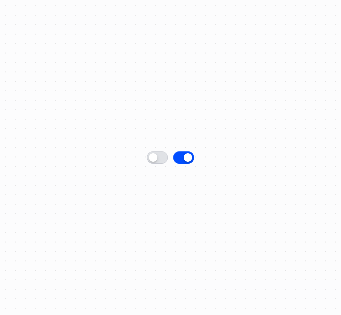
### Create a toggle switch
Toggle settings on or off using a switch component.
## Create a toggle switch
## Create a toggle switch
```html
```
### Handle switch change events
Subscribe to the `onChange` event to respond when merchants toggle the switch. This example shows how to handle state changes and capture the checked value in real time, enabling dynamic behavior based on the switch state.
## Handle switch change events
```html
```
***
## Accessibility
* **Provide descriptive labels:** Use the `label` prop to clearly describe what the switch controls.
* **Use accessibility labels when needed:** If the visual label doesn't provide enough context, use the `accessibilityLabel` prop to provide additional information for screen readers.
* **Indicate disabled state:** When a switch is disabled, ensure the reason is communicated to users through surrounding context or helper text.
***