---
title: Date picker
description: >-
The date picker component allows merchants to select dates using a calendar
interface. Use it when merchants benefit from seeing dates in context of the
full month, such as selecting dates relative
api_version: 2026-04
api_name: pos-ui-extensions
source_url:
html: >-
https://shopify.dev/docs/api/pos-ui-extensions/2026-04-rc/web-components/forms/date-picker
md: >-
https://shopify.dev/docs/api/pos-ui-extensions/2026-04-rc/web-components/forms/date-picker.md
---
# Date picker
The date picker component allows merchants to select dates using a calendar interface. Use it when merchants benefit from seeing dates in context of the full month, such as selecting dates relative to today or needing weekday context.
The component supports single dates, multiple dates, and date ranges. For tight spaces, consider using [date spinner](https://shopify.dev/docs/api/pos-ui-extensions/2026-04-rc/web-components/forms/date-spinner) instead. For text date entry, use [date field](https://shopify.dev/docs/api/pos-ui-extensions/2026-04-rc/web-components/forms/date-field).
### Support Targets (18)
### Supported targets
* [pos.cart.line-item-details.action.render](https://shopify.dev/docs/api/pos-ui-extensions/2026-04-rc/targets/cart-details#cart-details-action-modal-)
* [pos.customer-details.action.render](https://shopify.dev/docs/api/pos-ui-extensions/2026-04-rc/targets/customer-details#customer-details-action-modal-)
* [pos.customer-details.block.render](https://shopify.dev/docs/api/pos-ui-extensions/2026-04-rc/targets/customer-details#customer-details-targets)
* [pos.draft-order-details.action.render](https://shopify.dev/docs/api/pos-ui-extensions/2026-04-rc/targets/draft-order-details#draft-order-details-action-modal-)
* [pos.draft-order-details.block.render](https://shopify.dev/docs/api/pos-ui-extensions/2026-04-rc/targets/draft-order-details#draft-order-details-targets)
* [pos.exchange.post.action.render](https://shopify.dev/docs/api/pos-ui-extensions/2026-04-rc/targets/post-exchange#post-exchange-action-modal-)
* [pos.exchange.post.block.render](https://shopify.dev/docs/api/pos-ui-extensions/2026-04-rc/targets/post-exchange#post-exchange-targets)
* [pos.home.modal.render](https://shopify.dev/docs/api/pos-ui-extensions/2026-04-rc/targets/home-screen#home-screen-action-modal-)
* [pos.order-details.action.render](https://shopify.dev/docs/api/pos-ui-extensions/2026-04-rc/targets/order-details#order-details-action-modal-)
* [pos.order-details.block.render](https://shopify.dev/docs/api/pos-ui-extensions/2026-04-rc/targets/order-details#order-details-targets)
* [pos.product-details.action.render](https://shopify.dev/docs/api/pos-ui-extensions/2026-04-rc/targets/product-details#product-details-action-modal-)
* [pos.product-details.block.render](https://shopify.dev/docs/api/pos-ui-extensions/2026-04-rc/targets/product-details#product-details-targets)
* [pos.purchase.post.action.render](https://shopify.dev/docs/api/pos-ui-extensions/2026-04-rc/targets/post-purchase#post-purchase-action-modal-)
* [pos.purchase.post.block.render](https://shopify.dev/docs/api/pos-ui-extensions/2026-04-rc/targets/post-purchase#post-purchase-targets)
* [pos.register-details.action.render](https://shopify.dev/docs/api/pos-ui-extensions/2026-04-rc/targets/register-details#register-details-action-modal-)
* [pos.register-details.block.render](https://shopify.dev/docs/api/pos-ui-extensions/2026-04-rc/targets/register-details#register-details-block-)
* [pos.return.post.action.render](https://shopify.dev/docs/api/pos-ui-extensions/2026-04-rc/targets/post-return#post-return-action-modal-)
* [pos.return.post.block.render](https://shopify.dev/docs/api/pos-ui-extensions/2026-04-rc/targets/post-return#post-return-targets)
#### Use cases
* **Visual selection:** Provide visual date selection for appointments or scheduling workflows.
* **Report filtering:** Enable quick date selection for filtering reports or analytics.
* **Touch optimization:** Support touch-optimized date input on POS devices.
* **Calendar context:** Allow users to see calendar context like day of week when selecting dates.
***
## Properties
Lets merchants select one or more dates from a calendar.
* **id**
**string**
A unique identifier for the element.
* **value**
**string**
**Default: ""**
Current selected value.
The default means no date is selected.
If the provided value is invalid, no date is selected.
Otherwise:
* If `type="single"`, this is a date in `YYYY-MM-DD` format.
* If `type="multiple"`, this is a comma-separated list of dates in `YYYY-MM-DD` format.
* If `type="range"`, this is a range in `YYYY-MM-DD--YYYY-MM-DD` format. The range is inclusive.
### Events
The date picker component provides event callbacks for handling user interactions. Learn more about [handling events](https://shopify.dev/docs/api/polaris/using-polaris-web-components#handling-events).
* **blur**
**(event: CallbackEvent<"s-date-picker">) => void**
Callback when the date picker is dismissed.
* **change**
**(event: CallbackEvent<"s-date-picker">) => void**
Callback when the user selects a date from the picker that is different to the current value.
* **focus**
**(event: CallbackEvent<"s-date-picker">) => void**
Callback when the date picker is revealed.
* **input**
**(event: CallbackEvent<"s-date-picker">) => void**
Callback when the user selects a date from the picker.
### CallbackEvent
* bubbles
```ts
boolean
```
* cancelable
```ts
boolean
```
* composed
```ts
boolean
```
* currentTarget
```ts
HTMLElementTagNameMap[T]
```
* detail
```ts
any
```
* eventPhase
```ts
number
```
* target
```ts
HTMLElementTagNameMap[T] | null
```
***
## Examples
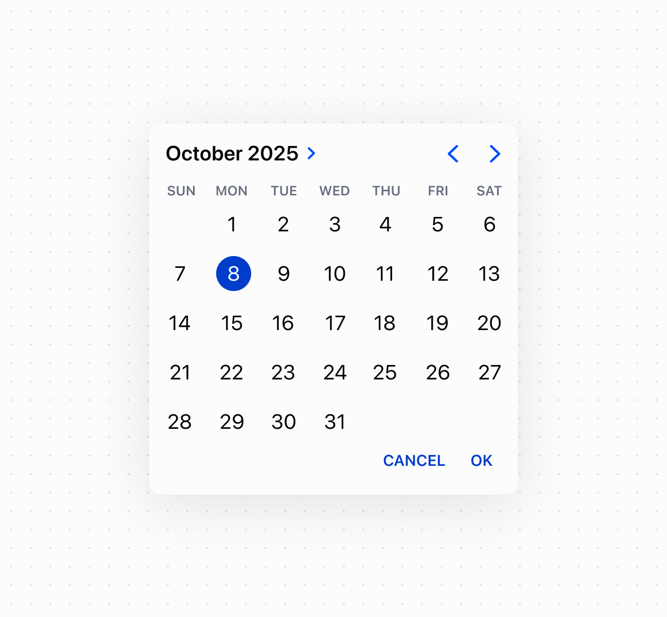
### Select dates with a calendar picker
Enable visual date selection using a date picker component with a calendar interface. This example shows a basic date picker with month view and date selection.
## Select dates with a calendar picker
## Select dates with a calendar picker
```html
Show
```
### Control picker visibility
Control date picker visibility programmatically using the command system with `show` and `hide` methods. This example demonstrates using button commands to display or dismiss the calendar picker, enabling custom trigger patterns for date selection workflows.
## Control picker visibility
```tsx
<>
Select Date
console.log('Date selected:', event.currentTarget.value)}
/>
;
```
### Handle date selection events
Subscribe to date selection events to respond when merchants pick a date from the calendar. This example shows how to handle `onChange` events to capture selected dates, enabling validation, scheduling logic, or dynamic updates based on the chosen date.
## Handle date selection events
```tsx
console.log('Input:', event.currentTarget.value)}
onChange={(event) => console.log('Change:', event.currentTarget.value)}
onFocus={(event) => console.log('Focus')}
onBlur={(event) => console.log('Blur')}
/>
```
***
## Best practices
* **Choose for calendar-based selection:** Use date picker when users benefit from seeing a calendar view, like selecting dates relative to today or needing weekday context. Use [date spinner](https://shopify.dev/docs/api/pos-ui-extensions/2026-04-rc/web-components/forms/date-spinner) for tight spaces or [date field](https://shopify.dev/docs/api/pos-ui-extensions/2026-04-rc/web-components/forms/date-field) when users know the exact date.
* **Provide adequate space:** Ensure sufficient spacing around the picker to avoid interfering with on-screen keyboards or other interactive elements.
***