---
title: Choice list
description: >-
The choice list component presents multiple options for single or multiple
selections. Use it when merchants need to choose from a defined set of
options, such as filtering results or collecting preferences.
api_version: 2026-07-rc
source_url:
html: >-
https://shopify.dev/docs/api/pos-ui-extensions/2026-07-rc/web-components/forms/choice-list
md: >-
https://shopify.dev/docs/api/pos-ui-extensions/2026-07-rc/web-components/forms/choice-list.md
---
# Choice list
The choice list component presents multiple options for single or multiple selections. Use it when merchants need to choose from a defined set of options, such as filtering results or collecting preferences.
The component supports both single selection (radio button behavior) and multiple selection (checkbox behavior) modes. It offers multiple layout variants including list, inline, block, and grid formats to suit different space constraints and visual requirements.
### Support Targets (10)
### Supported targets
* [pos.cart.line-item-details.action.render](https://shopify.dev/docs/api/pos-ui-extensions/2026-07-rc/targets/cart-details#cart-details-action-modal-)
* [pos.customer-details.action.render](https://shopify.dev/docs/api/pos-ui-extensions/2026-07-rc/targets/customer-details#customer-details-action-modal-)
* [pos.draft-order-details.action.render](https://shopify.dev/docs/api/pos-ui-extensions/2026-07-rc/targets/draft-order-details#draft-order-details-action-modal-)
* [pos.exchange.post.action.render](https://shopify.dev/docs/api/pos-ui-extensions/2026-07-rc/targets/post-exchange#post-exchange-action-modal-)
* [pos.home.modal.render](https://shopify.dev/docs/api/pos-ui-extensions/2026-07-rc/targets/home-screen#home-screen-action-modal-)
* [pos.order-details.action.render](https://shopify.dev/docs/api/pos-ui-extensions/2026-07-rc/targets/order-details#order-details-action-modal-)
* [pos.product-details.action.render](https://shopify.dev/docs/api/pos-ui-extensions/2026-07-rc/targets/product-details#product-details-action-modal-)
* [pos.purchase.post.action.render](https://shopify.dev/docs/api/pos-ui-extensions/2026-07-rc/targets/post-purchase#post-purchase-action-modal-)
* [pos.register-details.action.render](https://shopify.dev/docs/api/pos-ui-extensions/2026-07-rc/targets/register-details#register-details-action-modal-)
* [pos.return.post.action.render](https://shopify.dev/docs/api/pos-ui-extensions/2026-07-rc/targets/post-return#post-return-action-modal-)
#### Use cases
* **Option selection:** Create fields where users select one or multiple options from a list.
* **Filtering:** Implement filtering where users select categories or attributes to refine content.
* **Settings:** Provide configuration options where users choose preferences.
* **Multi-select:** Enable scenarios like choosing multiple product variants or categories.
***
## Properties
Groups one or more selectable choices.
* **id**
**string**
A unique identifier for the element.
* **multiple**
**boolean**
**Default: false**
Whether multiple choices can be selected.
* **values**
**string\[]**
An array of the `value`s of the selected options.
This is a convenience prop for setting the `selected` prop on child options.
### Events
The choice list component provides event callbacks for handling user interactions. Learn more about [handling events](https://shopify.dev/docs/api/polaris/using-polaris-web-components#handling-events).
* **change**
**(event: CallbackEvent<"s-choice-list">) => void**
Callback when the user changes a choice. Fires simultaneously with onInput.
* **input**
**(event: CallbackEvent<"s-choice-list">) => void**
Callback when the user changes a choice. Fires simultaneously with onChange.
### CallbackEvent
* bubbles
```ts
boolean
```
* cancelable
```ts
boolean
```
* composed
```ts
boolean
```
* currentTarget
```ts
HTMLElementTagNameMap[T]
```
* detail
```ts
any
```
* eventPhase
```ts
number
```
* target
```ts
HTMLElementTagNameMap[T] | null
```
***
## Choice
Represents a selectable option within a choice list.
* **disabled**
**boolean**
**Default: false**
Disables the control, disallowing any interaction.
* **id**
**string**
A unique identifier for the element.
* **selected**
**boolean**
**Default: false**
Whether the control is active.
* **value**
**string**
The value used in form data when the control is checked.
***
## Examples
### Create a choice list for selections
Present options using a choice list component. This example shows a basic choice list for single selection.
## Create a choice list for selections
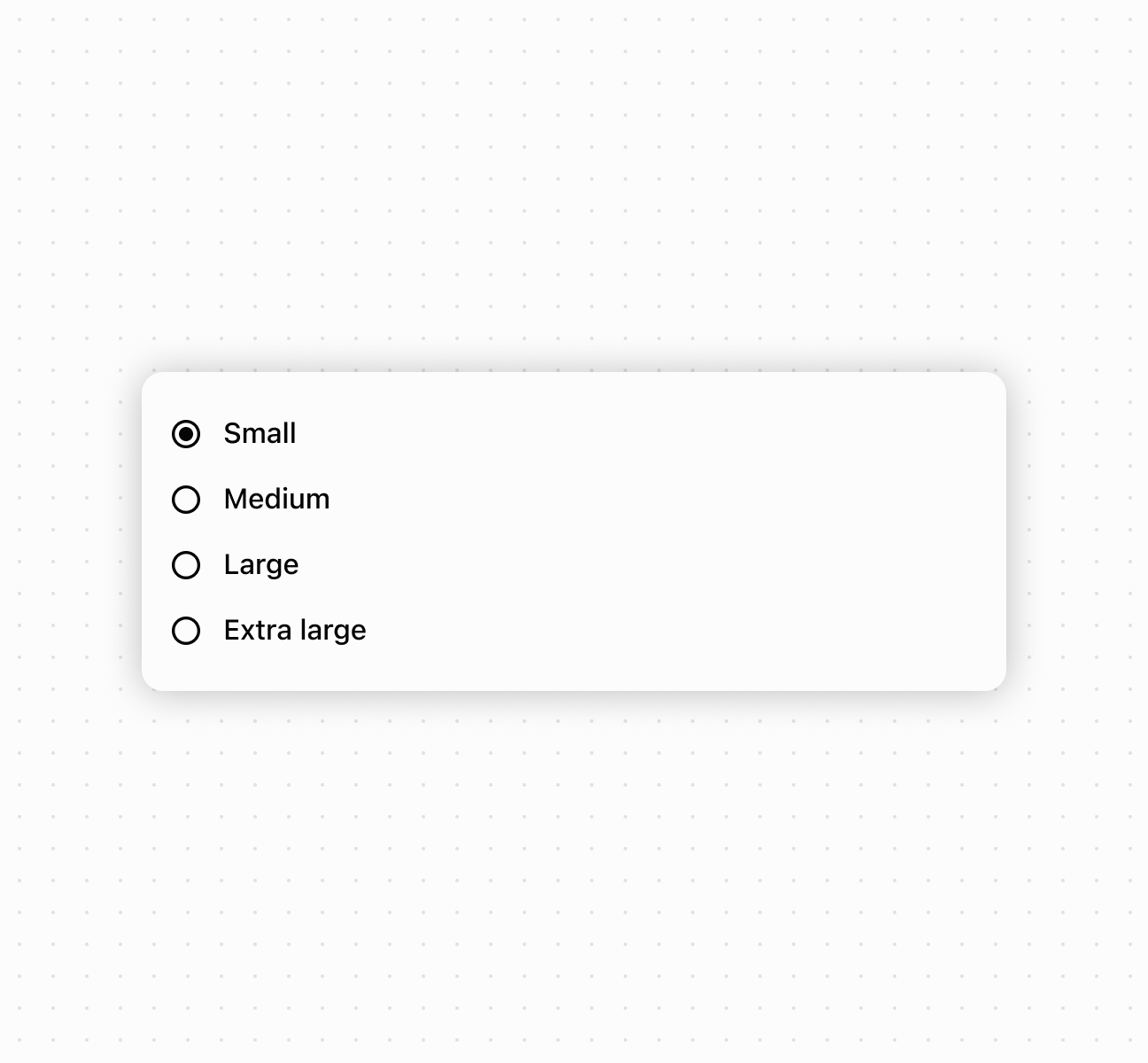
## Create a choice list for selections
```html
Small
Medium
Large
Extra large
```
### Enable multiple selection mode
Enable multiple selection mode to allow merchants to select multiple options from the list. This example demonstrates using controlled values with the `multiple` property, perfect for filtering interfaces or collecting multiple preferences in forms.
## Enable multiple selection mode
```tsx
console.log('Selected:', event.currentTarget.values)}
>
Small
Medium
Large
```
### Handle selection events
Subscribe to `onChange` and `onInput` events to respond when merchants select options. This example shows how to handle selection changes and capture user input in real time, enabling dynamic behavior and form validation based on merchant choices.
## Handle selection events
```tsx
console.log('onChange:', event.currentTarget.values)}
onInput={(event) => console.log('onInput:', event.currentTarget.values)}
>
Option 1
Option 2 (disabled)
Option 3
```
### Compose rich choice content
Compose rich choice content by nesting other components within choice elements. This example demonstrates combining images, text, and layout components to create visually enhanced choice options with descriptions and supporting images.
## Compose rich choice content
```tsx
{/* Composed choice with image and text */}
Option 1
Additional details for option 1
{/* Composed choice with nested text */}
Option 2
Additional details for option 2
{/* Mix of text and composed elements */}
Option 3
(disabled)
Additional details for option 3
```
***
## Best practices
* **Choose appropriate selection modes:** Use single selection for mutually exclusive options. Enable `multiple` when merchants can select more than one.
* **Write clear, concise choice labels:** Keep labels short but descriptive enough that merchants understand each option without additional explanation.
***
## Limitations
Choice list component types other than choice can't be used as options within the choice list.
***