---
title: Date spinner
description: >-
The date spinner component enables merchants to select dates using a spinner
interface with scrollable columns for month, day, and year. Use it for compact
date selection in space-constrained layouts or when selecting dates close to
the current date.
api_version: 2026-07-rc
source_url:
html: >-
https://shopify.dev/docs/api/pos-ui-extensions/2026-07-rc/web-components/forms/date-spinner
md: >-
https://shopify.dev/docs/api/pos-ui-extensions/2026-07-rc/web-components/forms/date-spinner.md
---
# Date spinner
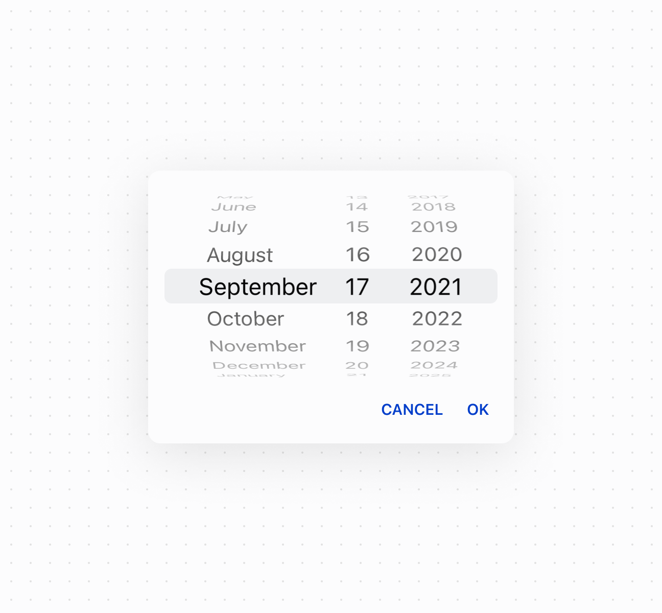
The date spinner component enables merchants to select dates using a spinner interface with scrollable columns for month, day, and year. Use it for compact date selection in space-constrained layouts or when selecting dates close to the current date.
For visual calendar context, consider using [date picker](https://shopify.dev/docs/api/pos-ui-extensions/2026-07-rc/web-components/forms/date-picker) instead. For text date entry, use [date field](https://shopify.dev/docs/api/pos-ui-extensions/2026-07-rc/web-components/forms/date-field).
### Support Targets (18)
### Supported targets
* [pos.cart.line-item-details.action.render](https://shopify.dev/docs/api/pos-ui-extensions/2026-07-rc/targets/cart-details#cart-details-action-modal-)
* [pos.customer-details.action.render](https://shopify.dev/docs/api/pos-ui-extensions/2026-07-rc/targets/customer-details#customer-details-action-modal-)
* [pos.customer-details.block.render](https://shopify.dev/docs/api/pos-ui-extensions/2026-07-rc/targets/customer-details#customer-details-targets)
* [pos.draft-order-details.action.render](https://shopify.dev/docs/api/pos-ui-extensions/2026-07-rc/targets/draft-order-details#draft-order-details-action-modal-)
* [pos.draft-order-details.block.render](https://shopify.dev/docs/api/pos-ui-extensions/2026-07-rc/targets/draft-order-details#draft-order-details-targets)
* [pos.exchange.post.action.render](https://shopify.dev/docs/api/pos-ui-extensions/2026-07-rc/targets/post-exchange#post-exchange-action-modal-)
* [pos.exchange.post.block.render](https://shopify.dev/docs/api/pos-ui-extensions/2026-07-rc/targets/post-exchange#post-exchange-targets)
* [pos.home.modal.render](https://shopify.dev/docs/api/pos-ui-extensions/2026-07-rc/targets/home-screen#home-screen-action-modal-)
* [pos.order-details.action.render](https://shopify.dev/docs/api/pos-ui-extensions/2026-07-rc/targets/order-details#order-details-action-modal-)
* [pos.order-details.block.render](https://shopify.dev/docs/api/pos-ui-extensions/2026-07-rc/targets/order-details#order-details-targets)
* [pos.product-details.action.render](https://shopify.dev/docs/api/pos-ui-extensions/2026-07-rc/targets/product-details#product-details-action-modal-)
* [pos.product-details.block.render](https://shopify.dev/docs/api/pos-ui-extensions/2026-07-rc/targets/product-details#product-details-targets)
* [pos.purchase.post.action.render](https://shopify.dev/docs/api/pos-ui-extensions/2026-07-rc/targets/post-purchase#post-purchase-action-modal-)
* [pos.purchase.post.block.render](https://shopify.dev/docs/api/pos-ui-extensions/2026-07-rc/targets/post-purchase#post-purchase-targets)
* [pos.register-details.action.render](https://shopify.dev/docs/api/pos-ui-extensions/2026-07-rc/targets/register-details#register-details-action-modal-)
* [pos.register-details.block.render](https://shopify.dev/docs/api/pos-ui-extensions/2026-07-rc/targets/register-details#register-details-block-)
* [pos.return.post.action.render](https://shopify.dev/docs/api/pos-ui-extensions/2026-07-rc/targets/post-return#post-return-action-modal-)
* [pos.return.post.block.render](https://shopify.dev/docs/api/pos-ui-extensions/2026-07-rc/targets/post-return#post-return-targets)
#### Use cases
* **Compact selection:** Provide compact date selection in space-constrained interfaces.
* **Quick navigation:** Enable quick date selection by scrolling through nearby dates.
* **Modal dialogs:** Support date input in modal dialogs where a spinner is more appropriate.
* **Touch optimization:** Offer touch-optimized scrolling date selection for POS devices.
***
## Properties
Lets merchants select a date using spinner controls.
* **id**
**string**
A unique identifier for the element.
* **value**
**string**
**Default: ""**
Current selected value for the spinner.
This uses a date in `YYYY-MM-DD` format.
### Events
The date spinner component provides event callbacks for handling user interactions. Learn more about [handling events](https://shopify.dev/docs/api/polaris/using-polaris-web-components#handling-events).
* **blur**
**(event: CallbackEvent<"s-date-spinner">) => void**
Callback when the date spinner is dismissed.
* **change**
**(event: CallbackEvent<"s-date-spinner">) => void**
Callback when the value changes. Only called when a different value is selected.
* **focus**
**(event: CallbackEvent<"s-date-spinner">) => void**
Callback when the date spinner is revealed.
* **input**
**(event: CallbackEvent<"s-date-spinner">) => void**
Callback when the user makes a selection.
### CallbackEvent
* bubbles
```ts
boolean
```
* cancelable
```ts
boolean
```
* composed
```ts
boolean
```
* currentTarget
```ts
HTMLElementTagNameMap[T]
```
* detail
```ts
any
```
* eventPhase
```ts
number
```
* target
```ts
HTMLElementTagNameMap[T] | null
```
***
## Examples
### Select dates with a spinner
Enable compact date selection using a date spinner component with scrollable columns for month, day, and year. This example shows a basic date spinner for space-constrained layouts.
## Select dates with a spinner
## Select dates with a spinner
```html
Show
```
### Control spinner visibility
Control date spinner visibility programmatically using the command system with `show` and `hide` methods. This example demonstrates using button commands to display or dismiss the spinner picker, enabling custom trigger patterns for date selection in constrained layouts.
## Control spinner visibility
```tsx
<>
Select Date
console.log('Date selected:', event.currentTarget.value)}
/>
;
```
### Handle date selection events
Subscribe to date selection events to respond when merchants pick a date from the spinner columns. This example shows how to handle `onChange` events to capture selected dates, enabling validation, scheduling logic, or dynamic updates based on the chosen date.
## Handle date selection events
```tsx
console.log('Input:', event.currentTarget.value)}
onChange={(event) => console.log('Change:', event.currentTarget.value)}
onFocus={(event) => console.log('Focus')}
onBlur={(event) => console.log('Blur')}
/>
```
***
## Best practices
* **Use for space-constrained layouts:** Choose date spinner for narrow layouts or split-screen interfaces where a calendar view would be impractical.
* **Best for nearby dates:** Use when selecting dates close to the current date. For distant dates, [date picker](https://shopify.dev/docs/api/pos-ui-extensions/2026-07-rc/web-components/forms/date-picker) provides faster navigation.
* **Provide interaction cues:** Consider labels or instructions to help first-time users understand the scrollable column interface.
***