---
title: Tabs
description: >-
The tabs component organizes content into separate views, allowing merchants
to switch between related information without leaving the current page. Use
tabs when you need to present multiple categories of content in a
space-efficient manner.
api_version: 2026-07-rc
source_url:
html: >-
https://shopify.dev/docs/api/pos-ui-extensions/2026-07-rc/web-components/layout-and-structure/tabs
md: >-
https://shopify.dev/docs/api/pos-ui-extensions/2026-07-rc/web-components/layout-and-structure/tabs.md
---
# Tabs
The tabs component organizes content into separate views, allowing merchants to switch between related information without leaving the current page. Use tabs when you need to present multiple categories of content in a space-efficient manner.
Tabs consist of a tab list containing clickable tab buttons and corresponding tab panels that display the content. Only one panel is visible at a time, reducing cognitive load and keeping the interface clean.
### Support Targets (10)
### Supported targets
* [pos.cart.line-item-details.action.render](https://shopify.dev/docs/api/pos-ui-extensions/2026-07-rc/targets/cart-details#cart-details-action-modal-)
* [pos.customer-details.action.render](https://shopify.dev/docs/api/pos-ui-extensions/2026-07-rc/targets/customer-details#customer-details-action-modal-)
* [pos.draft-order-details.action.render](https://shopify.dev/docs/api/pos-ui-extensions/2026-07-rc/targets/draft-order-details#draft-order-details-action-modal-)
* [pos.exchange.post.action.render](https://shopify.dev/docs/api/pos-ui-extensions/2026-07-rc/targets/post-exchange#post-exchange-action-modal-)
* [pos.home.modal.render](https://shopify.dev/docs/api/pos-ui-extensions/2026-07-rc/targets/home-screen#home-screen-action-modal-)
* [pos.order-details.action.render](https://shopify.dev/docs/api/pos-ui-extensions/2026-07-rc/targets/order-details#order-details-action-modal-)
* [pos.product-details.action.render](https://shopify.dev/docs/api/pos-ui-extensions/2026-07-rc/targets/product-details#product-details-action-modal-)
* [pos.purchase.post.action.render](https://shopify.dev/docs/api/pos-ui-extensions/2026-07-rc/targets/post-purchase#post-purchase-action-modal-)
* [pos.register-details.action.render](https://shopify.dev/docs/api/pos-ui-extensions/2026-07-rc/targets/register-details#register-details-action-modal-)
* [pos.return.post.action.render](https://shopify.dev/docs/api/pos-ui-extensions/2026-07-rc/targets/post-return#post-return-action-modal-)
#### Use cases
* **Content categories:** Organize product information, customer details, or order data into categorized views.
* **Workflow sections:** Separate different stages or aspects of a workflow into distinct tabbed panels.
* **Dashboard views:** Present multiple data views like analytics, inventory, and reports in a space-efficient layout.
* **Settings groups:** Group related settings or preferences into tabs for easier navigation and management.
***
## Tabs Properties
Groups related content into selectable tabbed views.
* **defaultValue**
**string**
The default value of the selected tab.
This should match the `id` prop of one of the tab panel components. If not provided, the first tab will be selected by default.
Reflects to the `value` attribute
* **disabled**
**boolean**
Disables all tabs and prevents user interaction.
* **value**
**string**
The value of the selected tab.
This should match the `id` prop of one of the tab panel components. If not provided, the first tab will be selected by default.
### Tabs Events
The tabs component provides event callbacks for handling user interactions. Learn more about [handling events](https://shopify.dev/docs/api/polaris/using-polaris-web-components#handling-events).
* **change**
**(event: CallbackEvent<"s-tabs">) => void**
### CallbackEvent
* bubbles
```ts
boolean
```
* cancelable
```ts
boolean
```
* composed
```ts
boolean
```
* currentTarget
```ts
HTMLElementTagNameMap[T]
```
* detail
```ts
any
```
* eventPhase
```ts
number
```
* target
```ts
HTMLElementTagNameMap[T] | null
```
***
## TabList
* **children**
**ComponentChildren**
Accepts only tabs components.
### ComponentChildren
TODO: Update \`any\` type here after this is resolved https://github.com/Shopify/ui-api-design/issues/139
```ts
any
```
***
## Tab
Represents an individual tab inside a tabs component.
* **controls**
**string**
Corresponds to the `id` property of the tab panel component that will be displayed when selected
* **disabled**
**boolean**
**Default: false**
Disables the control, disallowing any interaction.
***
## TabPanel
Represents content associated with a selected tab.
* **id**
**string**
The id of the tab panel used for identification in the tabs component. Must match the `controls` prop of the corresponding tab component.
***
## Examples
### Create a tabbed interface
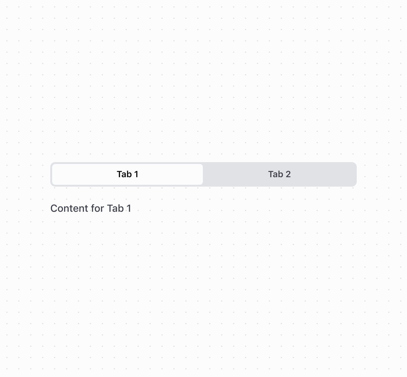
Organize content into tabs using the tabs component with tab list, tab, and tab panel components. This example shows a basic tabbed interface with two tabs.
## Create a tabbed interface
## Create a tabbed interface
```html
Tab 1
Tab 2
Content for Tab 1
Content for Tab 2
```
### Handle tab change events
Subscribe to the `onChange` event to respond when merchants select different tabs. This example shows how to handle tab changes and capture the selected tab value in real time, enabling dynamic behavior based on which tab is active.
## Handle tab change events
```html
console.log('Tab changed to:', event.currentTarget.value)}
>
Details
History
Notes
Customer details and information
Order and purchase history
Customer notes and comments
```
***
## Accessibility
* **Provide accessibility labels:** Use the `accessibilityLabel` prop on the tabs component to describe the purpose of the tab group.
* **Ensure keyboard navigation:** The component supports arrow key navigation between tabs and Enter/Space to activate tabs.
* **Connect tabs and panels:** Always use matching `controls` (on tab) and `id` (on tab panel) properties to maintain proper semantic relationships.
***