---
title: NumberField
description: >-
The `NumberField` component captures numeric input with built-in number
validation. Use it to collect quantities, prices, or other numeric
information.
The component supports optional stepper controls, min/max constraints, and
step increments for guided numeric entry.
api_version: 2025-10
api_name: pos-ui-extensions
source_url:
html: >-
https://shopify.dev/docs/api/pos-ui-extensions/latest/polaris-web-components/forms/numberfield
md: >-
https://shopify.dev/docs/api/pos-ui-extensions/latest/polaris-web-components/forms/numberfield.md
---
# NumberField
The `NumberField` component captures numeric input with built-in number validation. Use it to collect quantities, prices, or other numeric information.
The component supports optional stepper controls, min/max constraints, and step increments for guided numeric entry.
Support
Targets (9)
### Supported targets
* [pos.cart.line-item-details.action.render](https://shopify.dev/docs/api/pos-ui-extensions/2025-10/targets/cart-details#cart-details-action-modal-)
* [pos.customer-details.action.render](https://shopify.dev/docs/api/pos-ui-extensions/2025-10/targets/customer-details#customer-details-action-modal-)
* [pos.draft-order-details.action.render](https://shopify.dev/docs/api/pos-ui-extensions/2025-10/targets/draft-order-details#draft-order-details-action-modal-)
* [pos.exchange.post.action.render](https://shopify.dev/docs/api/pos-ui-extensions/2025-10/targets/post-exchange#post-exchange-action-modal-)
* [pos.home.modal.render](https://shopify.dev/docs/api/pos-ui-extensions/2025-10/targets/home-screen#home-screen-action-modal-)
* [pos.order-details.action.render](https://shopify.dev/docs/api/pos-ui-extensions/2025-10/targets/order-details#order-details-action-modal-)
* [pos.product-details.action.render](https://shopify.dev/docs/api/pos-ui-extensions/2025-10/targets/product-details#product-details-action-modal-)
* [pos.purchase.post.action.render](https://shopify.dev/docs/api/pos-ui-extensions/2025-10/targets/post-purchase#post-purchase-action-modal-)
* [pos.return.post.action.render](https://shopify.dev/docs/api/pos-ui-extensions/2025-10/targets/post-return#post-return-action-modal-)
#### Use cases
* **Quantities:** Collect product quantities, inventory counts, or stock levels.
* **Pricing:** Capture pricing information, discounts, or monetary amounts.
* **Stepper controls:** Provide `stepper` controls for intuitive increment/decrement interactions.
* **Validation:** Support form submissions with proper min/max validation.
## Examples
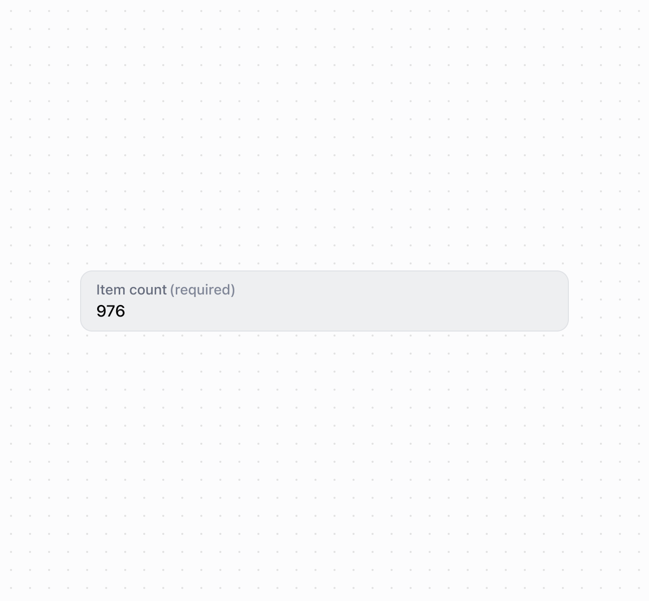
### Capture numeric input with a number field
Capture numeric input using a `NumberField` component. This example shows a basic number field with a label for collecting numeric values.
## Capture numeric input with a number field
### Add stepper controls and constraints
Enable stepper controls with increment and decrement buttons and set min/max constraints to limit valid input ranges. This example demonstrates using the `controls` property with `min` and `max` values to create bounded numeric inputs with visual stepper controls, ideal for quantity selection or limited-range numeric entry.
### Configure keyboard input modes
Configure the keyboard layout by specifying `inputMode` for decimal or numeric entry. This example shows how to use the `inputMode` property to display appropriate mobile keyboards—numeric for integers or decimal for numbers with fractional parts—improving data entry speed and accuracy.
### Examples
* #### Capture numeric input with a number field
##### Description
Capture numeric input using a \`NumberField\` component. This example shows a basic number field with a label for collecting numeric values.
##### Default
```html
```
* #### Add stepper controls and constraints
##### Description
Enable stepper controls with increment and decrement buttons and set min/max constraints to limit valid input ranges. This example demonstrates using the \`controls\` property with \`min\` and \`max\` values to create bounded numeric inputs with visual stepper controls, ideal for quantity selection or limited-range numeric entry.
##### Default
```jsx
console.log('Input:', event.currentTarget.value)}
onChange={(event) => console.log('Change:', event.currentTarget.value)}
/>;
```
* #### Configure keyboard input modes
##### Description
Configure the keyboard layout by specifying \`inputMode\` for decimal or numeric entry. This example shows how to use the \`inputMode\` property to display appropriate mobile keyboards—numeric for integers or decimal for numbers with fractional parts—improving data entry speed and accuracy.
##### Default
```jsx
console.log('Value:', event.currentTarget.value)}
/>
console.log('Value:', event.currentTarget.value)}
/>
;
```
## Properties
Configure the following properties on the `NumberField` component.
* controls
'auto' | 'stepper' | 'none'
Default: 'auto'
The type of controls displayed for the field:
* `'auto'` - An automatic setting where the presence of controls depends on the surface and context. The system determines the most appropriate control type based on the usage scenario.
* `'stepper'` - Displays increment (+) and decrement (-) buttons for adjusting the numeric value. When `stepper` controls are enabled, the field behavior is constrained: it accepts only integer values, always contains a value (never empty), and automatically validates against `min` and `max` bounds. The `label`, `details`, `placeholder`, `error`, `required`, and `inputMode` properties aren't supported with `stepper` controls.
* `'none'` - A control type with no visible controls where users must input the value manually using the keyboard.
* details
string
The additional text to provide context or guidance for the field. This text is displayed along with the field and its label to offer more information or instructions to the user. This will also be exposed to screen reader users.
* disabled
boolean
Default: false
Whether the field is disabled, preventing user interaction. Use when the field is temporarily unavailable due to application state, permissions, or dependencies.
* error
string
An error message to indicate a problem to the user. The field will be given specific stylistic treatment to communicate issues that must be resolved immediately.
* id
string
A unique identifier for the element used for targeting with CSS, JavaScript, or accessibility features.
* inputMode
'decimal' | 'numeric'
Default: 'decimal'
The virtual keyboard layout that the field displays for numeric input. This property isn't supported when using `stepper` controls.
* `'decimal'` - A keyboard layout that includes decimal point support for entering fractional numbers, prices, or measurements with decimal precision.
* `'numeric'` - A keyboard layout optimized for integer-only entry without decimal point support, ideal for quantities, counts, or whole number values.
* label
string
The content to use as the field label that describes the numeric information being requested.
* max
number
Default: Infinity
The highest decimal or integer value that the field accepts. When used with `stepper` controls, the value rounds down to the max number. Users can still input higher numbers by keyboard—validation should be implemented.
* min
number
Default: -Infinity
The lowest decimal or integer value that the field accepts. When used with `stepper` controls, the value rounds up to the min number. Users can still input lower numbers by keyboard—validation should be implemented.
* placeholder
string
A short hint that provides guidance about the expected value of the field.
* required
boolean
Default: false Required isn't supported when using Stepper controls
Whether the field needs a value. This requirement adds semantic value to the field but doesn't cause an error to appear automatically. Use the `error` property to present validation errors.
* value
string
The current numeric value entered in the field. An empty string means no value is entered.
## Slots
The `NumberField` component supports slots for additional content placement within the field. Learn more about [using slots](https://shopify.dev/docs/api/polaris/using-polaris-web-components#slots).
* accessory
HTMLElement
The additional content to be displayed in the field. Commonly used to display clickable text or action elements. Only `Button` and `Clickable` components with text content only are supported in this slot. Use the `slot="accessory"` attribute to place elements in this area.
## Events
The `NumberField` component provides event callbacks for handling user interactions. Learn more about [handling events](https://shopify.dev/docs/api/polaris/using-polaris-web-components#handling-events).
* blur
(event: CallbackEvent<"s-number-field">) => void
Called when the element loses focus.
* change
(event: CallbackEvent<"s-number-field">) => void
Called after editing completes, typically on blur.
* focus
(event: CallbackEvent<"s-number-field">) => void
Called when the element receives focus.
* input
(event: CallbackEvent<"s-number-field">) => void
Called when the user makes any changes in the field.
### CallbackEvent
Represents the event object passed to callback functions when interactive events occur. Contains metadata about the event, including the target element, event phase, and propagation behavior.
* bubbles
Whether the event bubbles up through the DOM tree.
```ts
boolean
```
* cancelable
Whether the event can be canceled.
```ts
boolean
```
* composed
Whether the event will trigger listeners outside of a shadow root.
```ts
boolean
```
* currentTarget
The element that the event listener is attached to.
```ts
HTMLElementTagNameMap[T]
```
* detail
Additional data associated with the event.
```ts
any
```
* eventPhase
The current phase of the event flow.
```ts
number
```
* target
The element that triggered the event.
```ts
HTMLElementTagNameMap[T] | null
```
```ts
interface CallbackEvent {
/**
* The element that the event listener is attached to.
*/
currentTarget: HTMLElementTagNameMap[T];
/**
* Whether the event bubbles up through the DOM tree.
*/
bubbles?: boolean;
/**
* Whether the event can be canceled.
*/
cancelable?: boolean;
/**
* Whether the event will trigger listeners outside of a shadow root.
*/
composed?: boolean;
/**
* Additional data associated with the event.
*/
detail?: any;
/**
* The current phase of the event flow.
*/
eventPhase: number;
/**
* The element that triggered the event.
*/
target: HTMLElementTagNameMap[T] | null;
}
```
## Best practices
* **Choose appropriate controls:** Use `stepper` for quantities or small adjustments. Use `none` for prices or large values where steppers are impractical.
* **Select the right input mode:** Use `decimal` for prices and measurements. Use `numeric` for quantities and counts.
* **Explain constraints in details:** Use `details` to clarify valid ranges or formatting, like "Enter a quantity between 1 and 999."