---
title: Box
description: >-
The `Box` component provides a container for layout and visual styling. Use it
to apply padding, borders, and background colors, or to nest and group other
components.
For user interaction, use `Box` in combination with interactive components
like
[`Button`](/docs/api/pos-ui-extensions/2025-10/polaris-web-components/actions/button)
or
[`Clickable`](/docs/api/pos-ui-extensions/2025-10/polaris-web-components/actions/clickable).
For scrollable content, use
[`ScrollBox`](/docs/api/pos-ui-extensions/2025-10/polaris-web-components/layout-and-structure/scrollbox).
api_version: 2025-10
api_name: pos-ui-extensions
source_url:
html: >-
https://shopify.dev/docs/api/pos-ui-extensions/latest/polaris-web-components/layout-and-structure/box
md: >-
https://shopify.dev/docs/api/pos-ui-extensions/latest/polaris-web-components/layout-and-structure/box.md
---
# Box
The `Box` component provides a container for layout and visual styling. Use it to apply padding, borders, and background colors, or to nest and group other components.
For user interaction, use `Box` in combination with interactive components like [`Button`](https://shopify.dev/docs/api/pos-ui-extensions/2025-10/polaris-web-components/actions/button) or [`Clickable`](https://shopify.dev/docs/api/pos-ui-extensions/2025-10/polaris-web-components/actions/clickable). For scrollable content, use [`ScrollBox`](https://shopify.dev/docs/api/pos-ui-extensions/2025-10/polaris-web-components/layout-and-structure/scrollbox).
Support
Targets (16)
### Supported targets
* [pos.cart.line-item-details.action.render](https://shopify.dev/docs/api/pos-ui-extensions/2025-10/targets/cart-details#cart-details-action-modal-)
* [pos.customer-details.action.render](https://shopify.dev/docs/api/pos-ui-extensions/2025-10/targets/customer-details#customer-details-action-modal-)
* [pos.customer-details.block.render](https://shopify.dev/docs/api/pos-ui-extensions/2025-10/targets/customer-details#customer-details-block-)
* [pos.draft-order-details.action.render](https://shopify.dev/docs/api/pos-ui-extensions/2025-10/targets/draft-order-details#draft-order-details-action-modal-)
* [pos.draft-order-details.block.render](https://shopify.dev/docs/api/pos-ui-extensions/2025-10/targets/draft-order-details#draft-order-details-block-)
* [pos.exchange.post.action.render](https://shopify.dev/docs/api/pos-ui-extensions/2025-10/targets/post-exchange#post-exchange-action-modal-)
* [pos.exchange.post.block.render](https://shopify.dev/docs/api/pos-ui-extensions/2025-10/targets/post-exchange#post-exchange-block-)
* [pos.home.modal.render](https://shopify.dev/docs/api/pos-ui-extensions/2025-10/targets/home-screen#home-screen-action-modal-)
* [pos.order-details.action.render](https://shopify.dev/docs/api/pos-ui-extensions/2025-10/targets/order-details#order-details-action-modal-)
* [pos.order-details.block.render](https://shopify.dev/docs/api/pos-ui-extensions/2025-10/targets/order-details#order-details-block-)
* [pos.product-details.action.render](https://shopify.dev/docs/api/pos-ui-extensions/2025-10/targets/product-details#product-details-action-modal-)
* [pos.product-details.block.render](https://shopify.dev/docs/api/pos-ui-extensions/2025-10/targets/product-details#product-details-block-)
* [pos.purchase.post.action.render](https://shopify.dev/docs/api/pos-ui-extensions/2025-10/targets/post-purchase#post-purchase-action-modal-)
* [pos.purchase.post.block.render](https://shopify.dev/docs/api/pos-ui-extensions/2025-10/targets/post-purchase#post-purchase-block-)
* [pos.return.post.action.render](https://shopify.dev/docs/api/pos-ui-extensions/2025-10/targets/post-return#post-return-action-modal-)
* [pos.return.post.block.render](https://shopify.dev/docs/api/pos-ui-extensions/2025-10/targets/post-return#post-return-block-)
#### Use cases
* **Spacing control:** Create consistent spacing and padding around content groups.
* **Structured layouts:** Build layouts by nesting components within Box containers.
* **Responsive sizing:** Apply sizing that adapts to different screen sizes and orientations.
* **Visual grouping:** Group related interface elements with consistent boundaries.
## Examples
### Create a container with a box
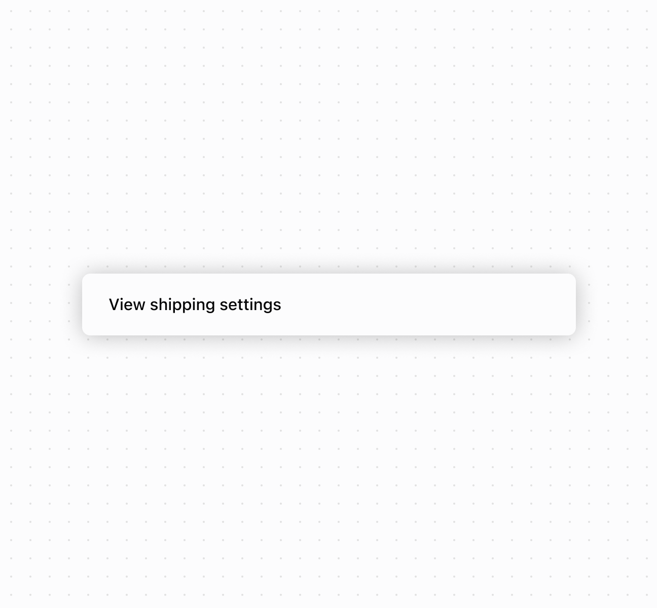
Create layouts using a `Box` component. This example demonstrates a basic box container with padding and styling.
## Create a container with a box
### Examples
* #### Create a container with a box
##### Description
Create layouts using a \`Box\` component. This example demonstrates a basic box container with padding and styling.
##### Default
```html
View shipping settings
```
## Properties
Configure the following properties on the `Box` component.
* blockSize
SizeUnitsOrAuto
Default: 'auto'
The block size of the container. Auto automatically sizes based on the container's children.
* id
string
A unique identifier for the element used for targeting with CSS or JavaScript.
* inlineSize
SizeUnitsOrAuto
Default: 'auto'
The inline size of the container. Auto automatically sizes based on the container's children.
* maxBlockSize
SizeUnitsOrNone
Default: 'none'
The maximum block size constraint for the container.
* maxInlineSize
SizeUnitsOrNone
Default: 'none'
The maximum inline size constraint for the container.
* minBlockSize
SizeUnits
Default: '0'
The minimum block size constraint for the container.
* minInlineSize
SizeUnits
Default: '0'
The minimum inline size constraint for the container.
* padding
MaybeAllValuesShorthandProperty\
Default: 'none'
The padding applied to all edges of the container. Supports [1-to-4-value syntax](https://developer.mozilla.org/en-US/docs/Web/CSS/Guides/Cascade/Shorthand_properties#edges_of_a_box) using flow-relative values in the order:
* 4 values: `block-start inline-end block-end inline-start`
* 3 values: `block-start inline block-end`
* 2 values: `block inline`
For example:
* `large` means block-start, inline-end, block-end and inline-start paddings are `large`.
* `large none` means block-start and block-end paddings are `large`, inline-start and inline-end paddings are `none`.
* `large none large` means block-start padding is `large`, inline-end padding is `none`, block-end padding is `large` and inline-start padding is `none`.
* `large none large small` means block-start padding is `large`, inline-end padding is `none`, block-end padding is `large` and inline-start padding is `small`.
An `auto` value inherits the default padding from the closest container that has removed its usual padding.
* paddingBlock
'' | MaybeTwoValuesShorthandProperty\
Default: '' - meaning no override
The block-axis padding for the container. Overrides the block value of the `padding` property.
* paddingBlockEnd
'' | PaddingKeyword
Default: '' - meaning no override
The block-end padding for the container. Overrides the block-end value of the `paddingBlock` property.
* paddingBlockStart
'' | PaddingKeyword
Default: '' - meaning no override
The block-start padding for the container. Overrides the block-start value of the `paddingBlock` property.
* paddingInline
'' | MaybeTwoValuesShorthandProperty\
Default: '' - meaning no override
The inline-axis padding for the container. Supports two-value syntax where `large none` sets inline-start to `large` and inline-end to `none`. Overrides the inline value of the `padding` property.
* paddingInlineEnd
'' | PaddingKeyword
Default: '' - meaning no override
The inline-end padding for the container. Overrides the inline-end value of the `paddingInline` property.
* paddingInlineStart
'' | PaddingKeyword
Default: '' - meaning no override
The inline-start padding for the container. Overrides the inline-start value of the `paddingInline` property.
### SizeUnitsOrAuto
Defines size values that can be specified as exact measurements or automatic sizing. Supports pixel values, percentages, zero, or automatic sizing based on content.
```ts
SizeUnits | 'auto'
```
### SizeUnits
Defines exact size measurements without automatic or unconstrained options. Limited to specific pixel values, percentages, or zero.
```ts
`${number}px` | `${number}%` | `0`
```
### SizeUnitsOrNone
Defines size values that can be specified as exact measurements or no constraint. Supports pixel values, percentages, zero, or no maximum limit.
```ts
SizeUnits | 'none'
```
### MaybeAllValuesShorthandProperty
A utility type for properties that support \[1-to-4-value shorthand syntax]\(https://developer.mozilla.org/en-US/docs/Web/CSS/Guides/Cascade/Shorthand\_properties#edges\_of\_a\_box).
```ts
T | `${T} ${T}` | `${T} ${T} ${T}` | `${T} ${T} ${T} ${T}`
```
### PaddingKeyword
Defines the available padding size options using a semantic scale. Provides consistent spacing values that align with the POS design system.
```ts
SizeKeyword | 'none'
```
### SizeKeyword
Defines the available size options for icons using a semantic scale. Provides granular control over icon dimensions from compact inline sizes to prominent display sizes.
```ts
'small-500' | 'small-400' | 'small-300' | 'small-200' | 'small-100' | 'small' | 'base' | 'large' | 'large-100' | 'large-200' | 'large-300' | 'large-400' | 'large-500'
```
### MaybeTwoValuesShorthandProperty
Defines a shorthand property that accepts either a single value or two space-separated values for directional properties like padding and spacing.
```ts
T | `${T} ${T}`
```
## Best practices
* **Use semantic sizing:** Choose `auto` to adapt to content, percentages for responsive layouts, pixels only for exact dimensions.
* **Use design system padding:** Use predefined padding keywords (`small`, `base`, `large`) for consistency.
* **Use directional padding for asymmetry:** Use `paddingInline` and `paddingBlock` when different spacing is needed on different sides.
* **Understand block vs inline:** `block` refers to content flow direction (usually vertical), `inline` to text direction (usually horizontal).