---
title: DateField
description: >-
The `DateField` component captures date input with a consistent interface for
date selection and proper validation. Use it to collect date information in
forms, scheduling interfaces, or data entry workflows.
The component supports manual text entry. For visual calendar-based selection,
consider using
[`DatePicker`](/docs/api/pos-ui-extensions/2025-10/polaris-web-components/forms/datepicker)
or
[`DateSpinner`](/docs/api/pos-ui-extensions/2025-10/polaris-web-components/forms/datespinner)
components.
api_version: 2025-10
api_name: pos-ui-extensions
source_url:
html: >-
https://shopify.dev/docs/api/pos-ui-extensions/latest/polaris-web-components/forms/datefield
md: >-
https://shopify.dev/docs/api/pos-ui-extensions/latest/polaris-web-components/forms/datefield.md
---
# DateField
The `DateField` component captures date input with a consistent interface for date selection and proper validation. Use it to collect date information in forms, scheduling interfaces, or data entry workflows.
The component supports manual text entry. For visual calendar-based selection, consider using [`DatePicker`](https://shopify.dev/docs/api/pos-ui-extensions/2025-10/polaris-web-components/forms/datepicker) or [`DateSpinner`](https://shopify.dev/docs/api/pos-ui-extensions/2025-10/polaris-web-components/forms/datespinner) components.
Support
Targets (9)
### Supported targets
* [pos.cart.line-item-details.action.render](https://shopify.dev/docs/api/pos-ui-extensions/2025-10/targets/cart-details#cart-details-action-modal-)
* [pos.customer-details.action.render](https://shopify.dev/docs/api/pos-ui-extensions/2025-10/targets/customer-details#customer-details-action-modal-)
* [pos.draft-order-details.action.render](https://shopify.dev/docs/api/pos-ui-extensions/2025-10/targets/draft-order-details#draft-order-details-action-modal-)
* [pos.exchange.post.action.render](https://shopify.dev/docs/api/pos-ui-extensions/2025-10/targets/post-exchange#post-exchange-action-modal-)
* [pos.home.modal.render](https://shopify.dev/docs/api/pos-ui-extensions/2025-10/targets/home-screen#home-screen-action-modal-)
* [pos.order-details.action.render](https://shopify.dev/docs/api/pos-ui-extensions/2025-10/targets/order-details#order-details-action-modal-)
* [pos.product-details.action.render](https://shopify.dev/docs/api/pos-ui-extensions/2025-10/targets/product-details#product-details-action-modal-)
* [pos.purchase.post.action.render](https://shopify.dev/docs/api/pos-ui-extensions/2025-10/targets/post-purchase#post-purchase-action-modal-)
* [pos.return.post.action.render](https://shopify.dev/docs/api/pos-ui-extensions/2025-10/targets/post-return#post-return-action-modal-)
#### Use cases
* **Scheduling:** Collect appointment dates, delivery dates, or scheduling information.
* **Transaction dates:** Capture transaction dates or expiration dates in financial interfaces.
* **Filtering:** Provide date-based filtering controls for reports or transaction histories.
* **Validation:** Support form submissions with proper date validation.
## Examples
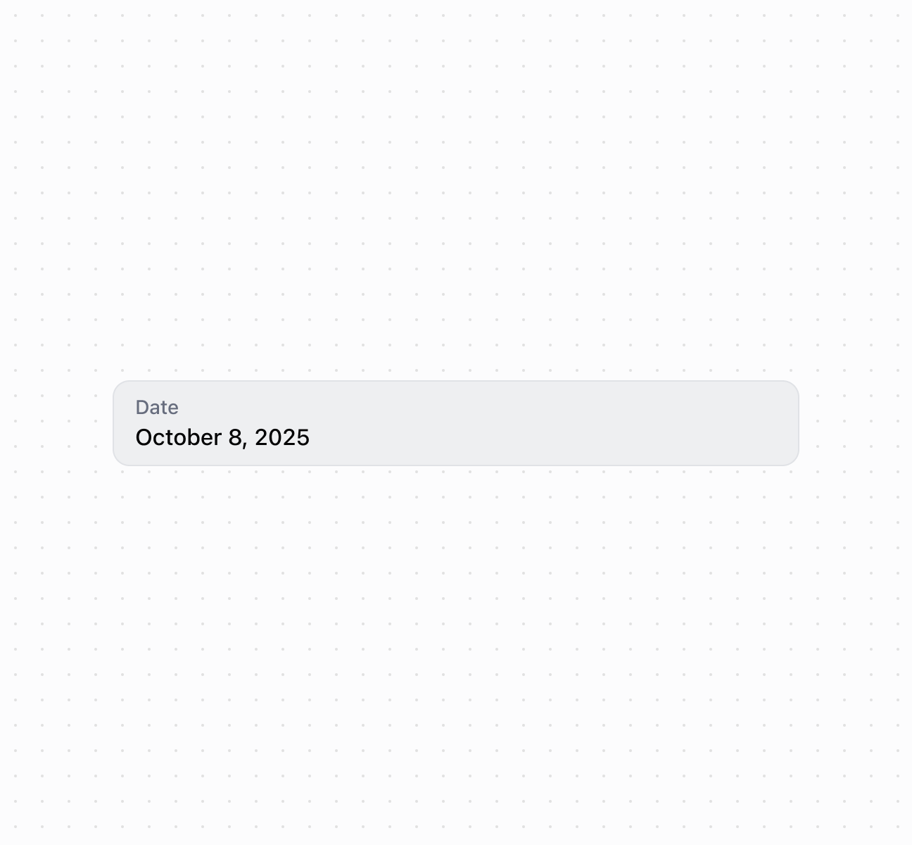
### Capture date input with a date field
Capture date input using a `DateField` component with built-in validation and picker integration. This example shows a basic date field with label and placeholder text.
## Capture date input with a date field
### Handle date selection events
Subscribe to date input events to respond when merchants select or enter dates. This example shows how to handle `onChange` events to capture date selections, enabling real-time validation, date range checks, or dynamic scheduling behavior based on merchant input.
### Examples
* #### Capture date input with a date field
##### Description
Capture date input using a \`DateField\` component with built-in validation and picker integration. This example shows a basic date field with label and placeholder text.
##### Default
```html
```
* #### Handle date selection events
##### Description
Subscribe to date input events to respond when merchants select or enter dates. This example shows how to handle \`onChange\` events to capture date selections, enabling real-time validation, date range checks, or dynamic scheduling behavior based on merchant input.
##### Default
```jsx
console.log('Input:', event.currentTarget.value)}
onChange={(event) => console.log('Change:', event.currentTarget.value)}
onFocus={(event) => console.log('Focused with:', event.currentTarget.value)}
onBlur={(event) => console.log('Blurred with:', event.currentTarget.value)}
/>
```
## Properties
Configure the following properties on the `DateField` component.
* details
string
The additional text to provide context or guidance for the field. This text is displayed along with the field and its label to offer more information or instructions to the user. This will also be exposed to screen reader users.
* disabled
boolean
Default: false
Whether the field is disabled, preventing user interaction. Use when the field is temporarily unavailable due to application state, permissions, or dependencies.
* error
string
An error message to indicate a problem to the user. The field will be given specific stylistic treatment to communicate issues that must be resolved immediately.
* id
string
A unique identifier for the element used for targeting with CSS, JavaScript, or accessibility features.
* label
string
The content to use as the field label that describes the date information being requested.
* value
string
The currently selected date value in [ISO 8601](https://en.wikipedia.org/wiki/ISO_8601) format (`YYYY-MM-DD`, for example, `"2024-05-15"`). An empty string means no date is selected. Other date formats require conversion before setting this property. Validation occurs when the user finishes editing (on blur), rather than on every keystroke, so invalid dates are flagged after completing entry.
## Events
The `DateField` component provides event callbacks for handling user interactions. Learn more about [handling events](https://shopify.dev/docs/api/polaris/using-polaris-web-components#handling-events).
* blur
(event: CallbackEvent<"s-date-field">) => void
Called when the element loses focus.
* change
(event: CallbackEvent<"s-date-field">) => void
Called after editing completes, typically on blur.
* focus
(event: CallbackEvent<"s-date-field">) => void
Called when the element receives focus.
* input
(event: CallbackEvent<"s-date-field">) => void
Called when the user makes any changes in the field.
### CallbackEvent
Represents the event object passed to callback functions when interactive events occur. Contains metadata about the event, including the target element, event phase, and propagation behavior.
* bubbles
Whether the event bubbles up through the DOM tree.
```ts
boolean
```
* cancelable
Whether the event can be canceled.
```ts
boolean
```
* composed
Whether the event will trigger listeners outside of a shadow root.
```ts
boolean
```
* currentTarget
The element that the event listener is attached to.
```ts
HTMLElementTagNameMap[T]
```
* detail
Additional data associated with the event.
```ts
any
```
* eventPhase
The current phase of the event flow.
```ts
number
```
* target
The element that triggered the event.
```ts
HTMLElementTagNameMap[T] | null
```
```ts
interface CallbackEvent {
/**
* The element that the event listener is attached to.
*/
currentTarget: HTMLElementTagNameMap[T];
/**
* Whether the event bubbles up through the DOM tree.
*/
bubbles?: boolean;
/**
* Whether the event can be canceled.
*/
cancelable?: boolean;
/**
* Whether the event will trigger listeners outside of a shadow root.
*/
composed?: boolean;
/**
* Additional data associated with the event.
*/
detail?: any;
/**
* The current phase of the event flow.
*/
eventPhase: number;
/**
* The element that triggered the event.
*/
target: HTMLElementTagNameMap[T] | null;
}
```
## Best practices
* **Choose for direct text input:** Use `DateField` when users know the exact date and can type it efficiently. Use [`DatePicker`](https://shopify.dev/docs/api/pos-ui-extensions/2025-10/polaris-web-components/forms/datepicker) for calendar selection or [`DateSpinner`](https://shopify.dev/docs/api/pos-ui-extensions/2025-10/polaris-web-components/forms/datespinner) for space-constrained layouts.
* **Explain date constraints:** Use `details` to clarify requirements like "Select a date within the next 30 days" or "Must be a future date."
* **Write actionable error messages:** Provide clear validation messages for invalid dates that help users correct their input.