---
title: TimeField
description: >-
The `TimeField` component captures time input through direct text entry. Use
it when merchants know the exact time they want to enter or for quick time
data entry.
For visual time selection with clock or spinner interfaces, use
[`TimePicker`](/docs/api/pos-ui-extensions/2025-10/polaris-web-components/forms/timepicker).
api_version: 2025-10
api_name: pos-ui-extensions
source_url:
html: >-
https://shopify.dev/docs/api/pos-ui-extensions/latest/polaris-web-components/forms/timefield
md: >-
https://shopify.dev/docs/api/pos-ui-extensions/latest/polaris-web-components/forms/timefield.md
---
# TimeField
The `TimeField` component captures time input through direct text entry. Use it when merchants know the exact time they want to enter or for quick time data entry.
For visual time selection with clock or spinner interfaces, use [`TimePicker`](https://shopify.dev/docs/api/pos-ui-extensions/2025-10/polaris-web-components/forms/timepicker).
Support
Targets (9)
### Supported targets
* [pos.cart.line-item-details.action.render](https://shopify.dev/docs/api/pos-ui-extensions/2025-10/targets/cart-details#cart-details-action-modal-)
* [pos.customer-details.action.render](https://shopify.dev/docs/api/pos-ui-extensions/2025-10/targets/customer-details#customer-details-action-modal-)
* [pos.draft-order-details.action.render](https://shopify.dev/docs/api/pos-ui-extensions/2025-10/targets/draft-order-details#draft-order-details-action-modal-)
* [pos.exchange.post.action.render](https://shopify.dev/docs/api/pos-ui-extensions/2025-10/targets/post-exchange#post-exchange-action-modal-)
* [pos.home.modal.render](https://shopify.dev/docs/api/pos-ui-extensions/2025-10/targets/home-screen#home-screen-action-modal-)
* [pos.order-details.action.render](https://shopify.dev/docs/api/pos-ui-extensions/2025-10/targets/order-details#order-details-action-modal-)
* [pos.product-details.action.render](https://shopify.dev/docs/api/pos-ui-extensions/2025-10/targets/product-details#product-details-action-modal-)
* [pos.purchase.post.action.render](https://shopify.dev/docs/api/pos-ui-extensions/2025-10/targets/post-purchase#post-purchase-action-modal-)
* [pos.return.post.action.render](https://shopify.dev/docs/api/pos-ui-extensions/2025-10/targets/post-return#post-return-action-modal-)
#### Use cases
* **Scheduling:** Collect appointment times or service hours in booking workflows.
* **Business hours:** Capture opening hours or time-based preferences in configuration interfaces.
* **Filtering:** Provide time-based filtering controls for reports or event logs.
* **Shift management:** Enable time entry for shift scheduling or time tracking.
## Examples
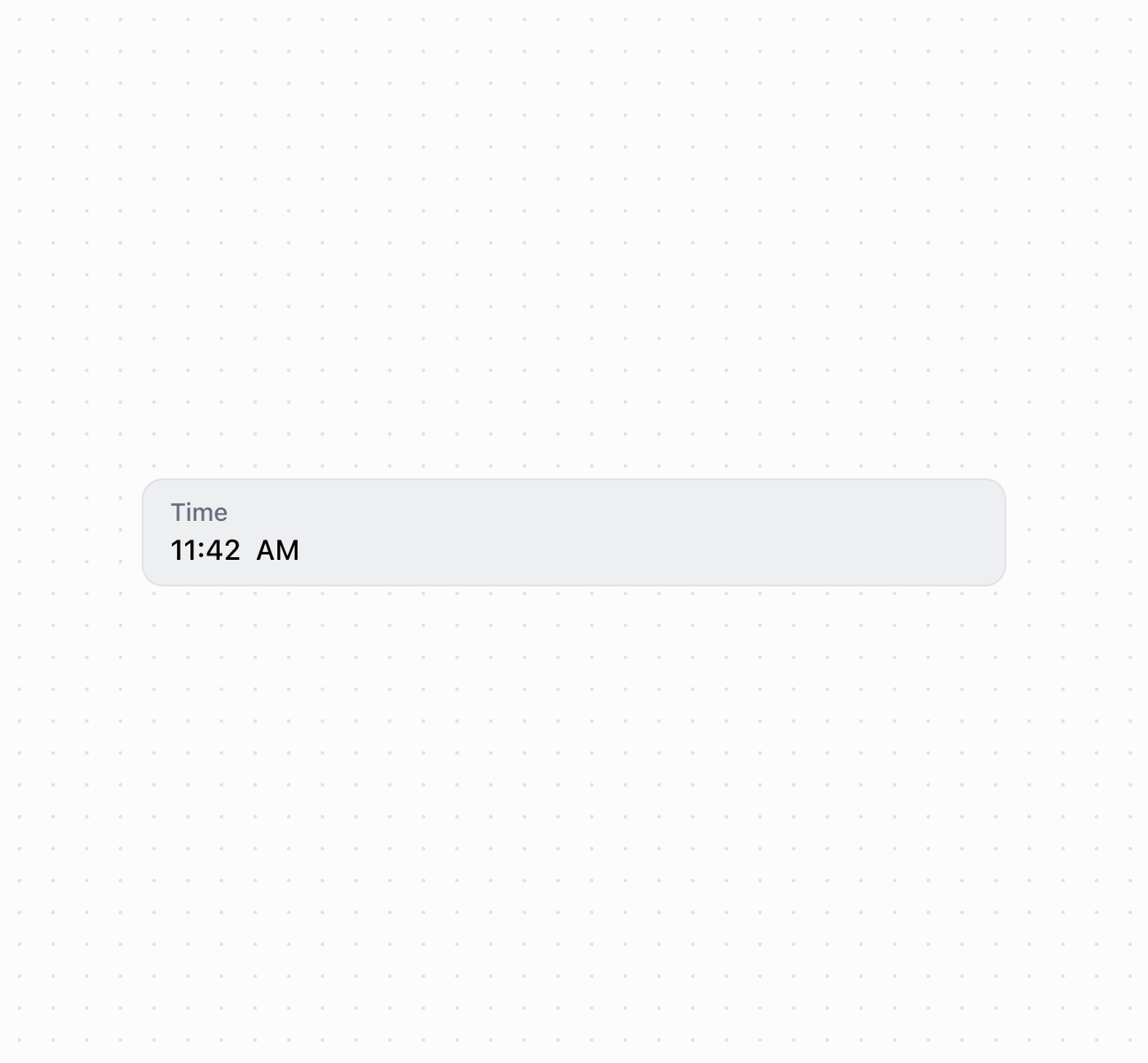
### Capture time input with a time field
Capture time input using a `TimeField` component. This example shows a basic time field with a label for time entry.
## Capture time input with a time field
### Handle time selection events
Subscribe to time input events to respond when merchants select or enter times. This example shows how to handle `onChange` events to capture time selections, enabling real-time validation, time range checks, or dynamic scheduling behavior based on merchant input.
### Examples
* #### Capture time input with a time field
##### Description
Capture time input using a \`TimeField\` component. This example shows a basic time field with a label for time entry.
##### Default
```html
```
* #### Handle time selection events
##### Description
Subscribe to time input events to respond when merchants select or enter times. This example shows how to handle \`onChange\` events to capture time selections, enabling real-time validation, time range checks, or dynamic scheduling behavior based on merchant input.
##### Default
```jsx
console.log('Input:', event.currentTarget.value)}
onChange={(event) => console.log('Change:', event.currentTarget.value)}
onFocus={(event) => console.log('Focused')}
onBlur={(event) => console.log('Blurred')}
/>
```
## Properties
Configure the following properties on the `TimeField` component.
* details
string
The additional text to provide context or guidance for the field. This text is displayed along with the field and its label to offer more information or instructions to the user. This will also be exposed to screen reader users.
* disabled
boolean
Default: false
Whether the field is disabled, preventing user interaction. Use when the field is temporarily unavailable due to application state, permissions, or dependencies.
* error
string
An error message to indicate a problem to the user. The field will be given specific stylistic treatment to communicate issues that must be resolved immediately.
* id
string
A unique identifier for the element used for targeting with CSS, JavaScript, or accessibility features.
* label
string
The content to use as the field label that describes the time information being requested.
* value
string
The current selected value in 24-hour format. An empty string means no time is selected. The value must be in `HH:mm:ss` format with leading zeros (for example, `"00:00:00"`, `"09:05:00"`, `"23:59:00"`, `"14:03:30"`). This follows the [HTML time input value format](https://developer.mozilla.org/en-US/docs/Web/HTML/Element/input/time#value), which is always 24-hour with leading zeros regardless of UI presentation.
## Events
The `TimeField` component provides event callbacks for handling user interactions. Learn more about [handling events](https://shopify.dev/docs/api/polaris/using-polaris-web-components#handling-events).
* blur
(event: CallbackEvent<"s-time-field">) => void
Called when the element loses focus.
* change
(event: CallbackEvent<"s-time-field">) => void
Called after editing completes, typically on blur.
* focus
(event: CallbackEvent<"s-time-field">) => void
Called when the element receives focus.
* input
(event: CallbackEvent<"s-time-field">) => void
Called when the user makes any changes in the field.
### CallbackEvent
Represents the event object passed to callback functions when interactive events occur. Contains metadata about the event, including the target element, event phase, and propagation behavior.
* bubbles
Whether the event bubbles up through the DOM tree.
```ts
boolean
```
* cancelable
Whether the event can be canceled.
```ts
boolean
```
* composed
Whether the event will trigger listeners outside of a shadow root.
```ts
boolean
```
* currentTarget
The element that the event listener is attached to.
```ts
HTMLElementTagNameMap[T]
```
* detail
Additional data associated with the event.
```ts
any
```
* eventPhase
The current phase of the event flow.
```ts
number
```
* target
The element that triggered the event.
```ts
HTMLElementTagNameMap[T] | null
```
```ts
interface CallbackEvent {
/**
* The element that the event listener is attached to.
*/
currentTarget: HTMLElementTagNameMap[T];
/**
* Whether the event bubbles up through the DOM tree.
*/
bubbles?: boolean;
/**
* Whether the event can be canceled.
*/
cancelable?: boolean;
/**
* Whether the event will trigger listeners outside of a shadow root.
*/
composed?: boolean;
/**
* Additional data associated with the event.
*/
detail?: any;
/**
* The current phase of the event flow.
*/
eventPhase: number;
/**
* The element that triggered the event.
*/
target: HTMLElementTagNameMap[T] | null;
}
```
## Best practices
* **Use correct format:** Always use `HH:mm:ss` format with leading zeros (like `"09:05:00"` not `"9:5:0"`).
* **Explain time constraints:** Use `details` to clarify requirements like "Business hours only (09:00-17:00)" or "Must be a future time."