---
title: TimePicker
description: >-
The `TimePicker` component allows merchants to select times using an
interactive picker interface. Use it when merchants benefit from visual time
selection rather than typing exact times.
For direct text entry when merchants know the exact time, use
[`TimeField`](/docs/api/pos-ui-extensions/2025-10/polaris-web-components/forms/timefield).
api_version: 2025-10
api_name: pos-ui-extensions
source_url:
html: >-
https://shopify.dev/docs/api/pos-ui-extensions/latest/polaris-web-components/forms/timepicker
md: >-
https://shopify.dev/docs/api/pos-ui-extensions/latest/polaris-web-components/forms/timepicker.md
---
# TimePicker
The `TimePicker` component allows merchants to select times using an interactive picker interface. Use it when merchants benefit from visual time selection rather than typing exact times.
For direct text entry when merchants know the exact time, use [`TimeField`](https://shopify.dev/docs/api/pos-ui-extensions/2025-10/polaris-web-components/forms/timefield).
Support
Targets (16)
### Supported targets
* [pos.cart.line-item-details.action.render](https://shopify.dev/docs/api/pos-ui-extensions/2025-10/targets/cart-details#cart-details-action-modal-)
* [pos.customer-details.action.render](https://shopify.dev/docs/api/pos-ui-extensions/2025-10/targets/customer-details#customer-details-action-modal-)
* [pos.customer-details.block.render](https://shopify.dev/docs/api/pos-ui-extensions/2025-10/targets/customer-details#customer-details-block-)
* [pos.draft-order-details.action.render](https://shopify.dev/docs/api/pos-ui-extensions/2025-10/targets/draft-order-details#draft-order-details-action-modal-)
* [pos.draft-order-details.block.render](https://shopify.dev/docs/api/pos-ui-extensions/2025-10/targets/draft-order-details#draft-order-details-block-)
* [pos.exchange.post.action.render](https://shopify.dev/docs/api/pos-ui-extensions/2025-10/targets/post-exchange#post-exchange-action-modal-)
* [pos.exchange.post.block.render](https://shopify.dev/docs/api/pos-ui-extensions/2025-10/targets/post-exchange#post-exchange-block-)
* [pos.home.modal.render](https://shopify.dev/docs/api/pos-ui-extensions/2025-10/targets/home-screen#home-screen-action-modal-)
* [pos.order-details.action.render](https://shopify.dev/docs/api/pos-ui-extensions/2025-10/targets/order-details#order-details-action-modal-)
* [pos.order-details.block.render](https://shopify.dev/docs/api/pos-ui-extensions/2025-10/targets/order-details#order-details-block-)
* [pos.product-details.action.render](https://shopify.dev/docs/api/pos-ui-extensions/2025-10/targets/product-details#product-details-action-modal-)
* [pos.product-details.block.render](https://shopify.dev/docs/api/pos-ui-extensions/2025-10/targets/product-details#product-details-block-)
* [pos.purchase.post.action.render](https://shopify.dev/docs/api/pos-ui-extensions/2025-10/targets/post-purchase#post-purchase-action-modal-)
* [pos.purchase.post.block.render](https://shopify.dev/docs/api/pos-ui-extensions/2025-10/targets/post-purchase#post-purchase-block-)
* [pos.return.post.action.render](https://shopify.dev/docs/api/pos-ui-extensions/2025-10/targets/post-return#post-return-action-modal-)
* [pos.return.post.block.render](https://shopify.dev/docs/api/pos-ui-extensions/2025-10/targets/post-return#post-return-block-)
#### Use cases
* **Visual selection:** Provide visual time selection for appointments or scheduling workflows.
* **Quick selection:** Enable quick time selection for business hours or delivery windows.
* **Touch optimization:** Support touch-optimized time input on POS devices.
* **User-friendly:** Allow users to select times without remembering specific formats.
## Examples
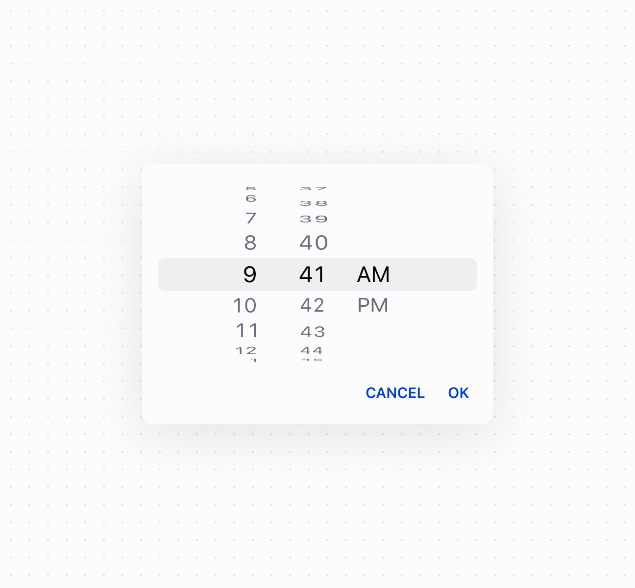
### Select times with a time picker
Select times using a `TimePicker` component. This example shows a basic time picker for selecting hours and minutes.
## Select times with a time picker
### Control picker visibility
Control `TimePicker` visibility programmatically using the command system with `show` and `hide` methods. This example demonstrates using button commands to display or dismiss the time picker, enabling custom trigger patterns for time selection workflows.
### Handle time selection events
Subscribe to time selection events to respond when merchants pick a time. This example shows how to handle `onChange` events to capture selected times, enabling validation, scheduling logic, or dynamic updates based on the chosen time.
### Examples
* #### Select times with a time picker
##### Description
Select times using a \`TimePicker\` component. This example shows a basic time picker for selecting hours and minutes.
##### Default
```html
Show
```
* #### Control picker visibility
##### Description
Control \`TimePicker\` visibility programmatically using the command system with \`show\` and \`hide\` methods. This example demonstrates using button commands to display or dismiss the time picker, enabling custom trigger patterns for time selection workflows.
##### Default
```jsx
<>
Select Time
console.log('Time selected:', event.currentTarget.value)}
/>
;
```
* #### Handle time selection events
##### Description
Subscribe to time selection events to respond when merchants pick a time. This example shows how to handle \`onChange\` events to capture selected times, enabling validation, scheduling logic, or dynamic updates based on the chosen time.
##### Default
```jsx
console.log('Input:', event.currentTarget.value)}
onChange={(event) => console.log('Change:', event.currentTarget.value)}
onFocus={(event) => console.log('Focused')}
onBlur={(event) => console.log('Blurred')}
/>
```
## Properties
Configure the following properties on the `TimePicker` component.
* id
string
A unique identifier for the element used for targeting with CSS, JavaScript, or accessibility features.
* value
string
Default: ''
The current selected value in 24-hour format. An empty string means no time is selected. The value must be in `HH:mm:ss` format with leading zeros (for example, `"00:00:00"`, `"09:05:00"`, `"23:59:00"`, `"14:03:30"`). This follows the [HTML time input value format](https://developer.mozilla.org/en-US/docs/Web/HTML/Element/input/time#value), which is always 24-hour with leading zeros regardless of UI presentation.
## Events
The `TimePicker` component provides event callbacks for handling user interactions. Learn more about [handling events](https://shopify.dev/docs/api/polaris/using-polaris-web-components#handling-events).
* blur
(event: CallbackEvent<"s-time-picker">) => void
Called when the element loses focus.
* change
(event: CallbackEvent<"s-time-picker">) => void
Called after editing completes, typically on blur.
* focus
(event: CallbackEvent<"s-time-picker">) => void
Called when the element receives focus.
* input
(event: CallbackEvent<"s-time-picker">) => void
Called when the user makes any changes in the field.
### CallbackEvent
Represents the event object passed to callback functions when interactive events occur. Contains metadata about the event, including the target element, event phase, and propagation behavior.
* bubbles
Whether the event bubbles up through the DOM tree.
```ts
boolean
```
* cancelable
Whether the event can be canceled.
```ts
boolean
```
* composed
Whether the event will trigger listeners outside of a shadow root.
```ts
boolean
```
* currentTarget
The element that the event listener is attached to.
```ts
HTMLElementTagNameMap[T]
```
* detail
Additional data associated with the event.
```ts
any
```
* eventPhase
The current phase of the event flow.
```ts
number
```
* target
The element that triggered the event.
```ts
HTMLElementTagNameMap[T] | null
```
```ts
interface CallbackEvent {
/**
* The element that the event listener is attached to.
*/
currentTarget: HTMLElementTagNameMap[T];
/**
* Whether the event bubbles up through the DOM tree.
*/
bubbles?: boolean;
/**
* Whether the event can be canceled.
*/
cancelable?: boolean;
/**
* Whether the event will trigger listeners outside of a shadow root.
*/
composed?: boolean;
/**
* Additional data associated with the event.
*/
detail?: any;
/**
* The current phase of the event flow.
*/
eventPhase: number;
/**
* The element that triggered the event.
*/
target: HTMLElementTagNameMap[T] | null;
}
```
## Best practices
* **Choose for visual time selection:** Use `TimePicker` when users benefit from a visual picker interface. Use [`TimeField`](https://shopify.dev/docs/api/pos-ui-extensions/2025-10/polaris-web-components/forms/timefield) when users know the exact time.
* **Use correct format:** Always use `HH:mm:ss` format with leading zeros. The internal format is always 24-hour regardless of UI presentation.
* **Validate before setting values:** Invalid values reset to empty string. Implement validation to show appropriate error messages.