---
title: Heading
description: >-
The `Heading` component renders hierarchical titles to communicate the
structure and organization of page content and help users navigate complex
interfaces.
Heading levels adjust automatically based on nesting within parent
[`Section`](/docs/api/pos-ui-extensions/2025-10/polaris-web-components/layout-and-structure/section)
components, ensuring a meaningful page outline.
api_version: 2025-10
api_name: pos-ui-extensions
source_url:
html: >-
https://shopify.dev/docs/api/pos-ui-extensions/latest/polaris-web-components/layout-and-structure/heading
md: >-
https://shopify.dev/docs/api/pos-ui-extensions/latest/polaris-web-components/layout-and-structure/heading.md
---
# Heading
The `Heading` component renders hierarchical titles to communicate the structure and organization of page content and help users navigate complex interfaces.
Heading levels adjust automatically based on nesting within parent [`Section`](https://shopify.dev/docs/api/pos-ui-extensions/2025-10/polaris-web-components/layout-and-structure/section) components, ensuring a meaningful page outline.
## Properties
Configure the following properties on the `Heading` component.
* id
string
A unique identifier for the element used for targeting with CSS, JavaScript, or accessibility features.
### Examples
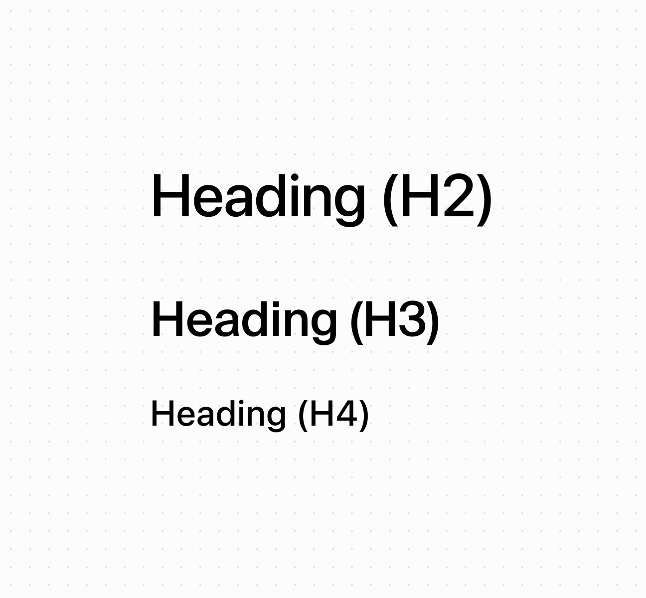
* #### Display hierarchical headings
##### Description
Create hierarchical titles using a \`Heading\` component that adjusts levels automatically based on nesting. This example shows a basic heading with automatic level management.
##### Default
```html
Heading (H2)
Heading (H3)
Heading (H4)
```
## Preview
## Best practices
* **Create logical hierarchy:** Start with higher-level headings for main sections, nested headings for subsections. Nested sections automatically adjust heading levels.
* **Write specific headings:** Avoid generic terms like "Details." Use specific descriptions like "Customer Contact Information" or "Transaction Summary."
* **Keep text concise:** Headings don't truncate, so keep them brief enough to display across different screen sizes.